Designing and launching a calming financial experience. Brand New Day's very first mobile app designed for assurance in this chaotic market.
(Role)
Interface Design, Design System
(Team)
Rōnin Amsterdam
(Year)
2023
Designing and launching a calming financial experience. Brand New Day's very first mobile app designed for assurance in this chaotic market.
(Role)
Interface Design, Design System
(Team)
Rōnin Amsterdam
(Year)
2023
Designing and launching a calming financial experience. Brand New Day's very first mobile app designed for assurance in this chaotic market.
(Role)
Interface Design, Design System
(Team)
Rōnin Amsterdam
(Year)
2023
Designing and launching a calming financial experience. Brand New Day's very first mobile app designed for assurance in this chaotic market.
(Role)
Interface Design, Design System
(Team)
Rōnin Amsterdam
(Year)
2023
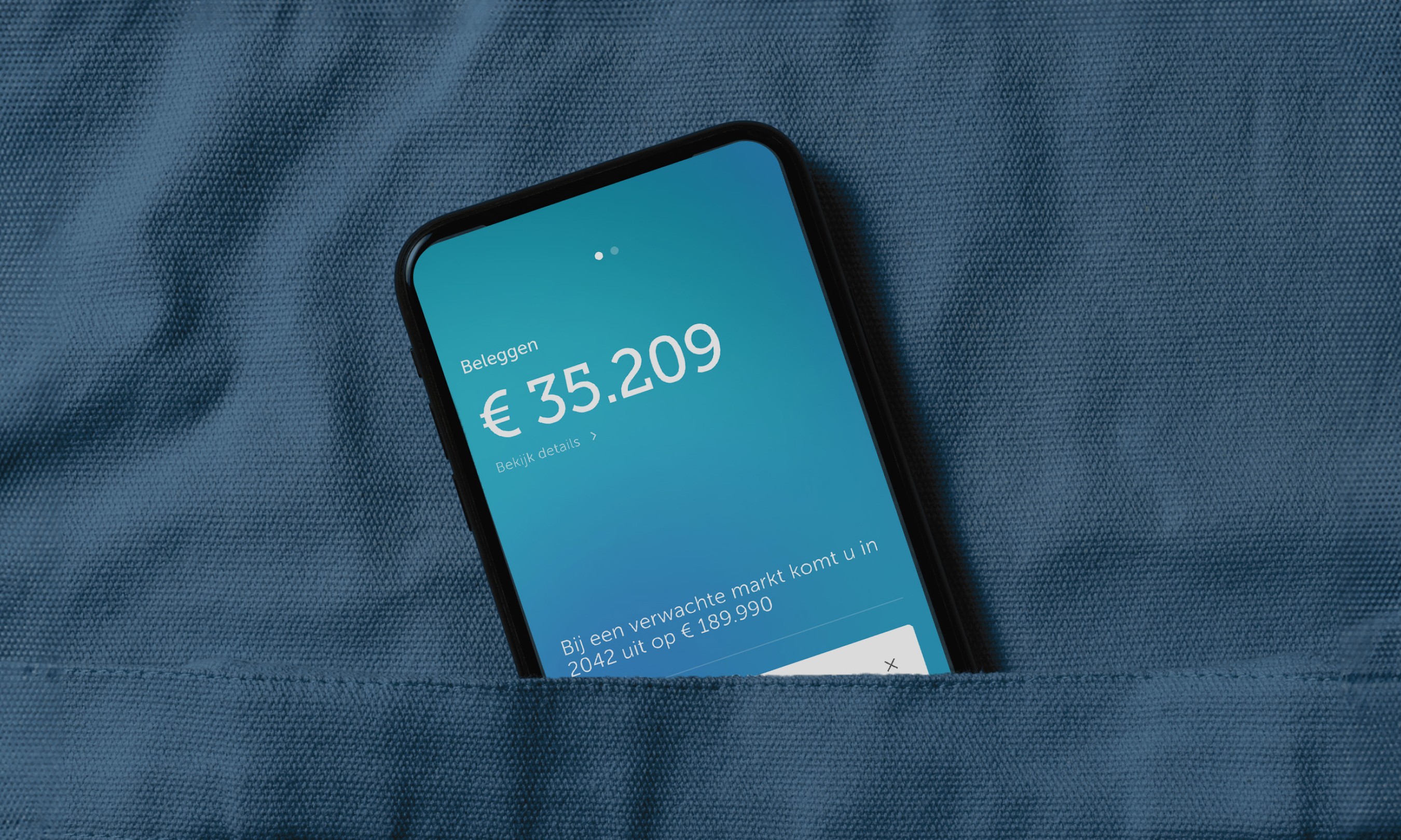
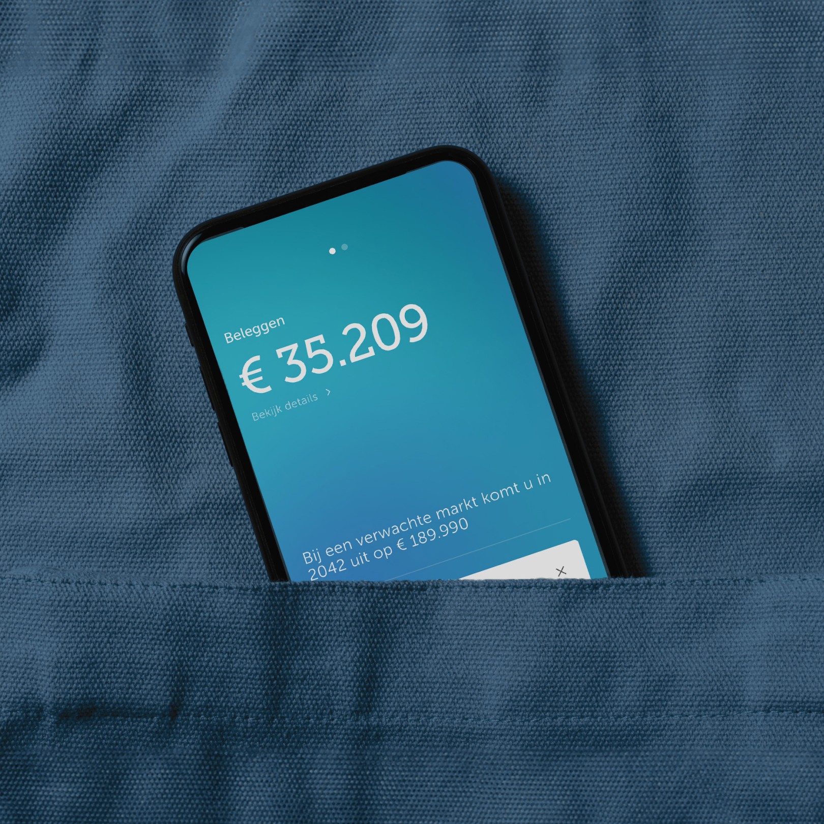
Designing for the chaotic world out there
Designing for the chaotic world out there
Designing for the chaotic world out there
Designing for the chaotic world out there
When the financial market is suddenly on the rise or takes a deep plunge, it is hard to keep your composure. App design and content has a big impact on app usage and together with Brand New Day, we make a conscious choice to not design for interaction, but for assurance.
When the financial market is suddenly on the rise or takes a deep plunge, it is hard to keep your composure. App design and content has a big impact on app usage and together with Brand New Day, we make a conscious choice to not design for interaction, but for assurance.
When the financial market is suddenly on the rise or takes a deep plunge, it is hard to keep your composure. App design and content has a big impact on app usage and together with Brand New Day, we make a conscious choice to not design for interaction, but for assurance.
When the financial market is suddenly on the rise or takes a deep plunge, it is hard to keep your composure. App design and content has a big impact on app usage and together with Brand New Day, we make a conscious choice to not design for interaction, but for assurance.
A visual language that upholds the brand's values
A visual language that upholds the brand's values
A visual language that upholds the brand's values
A visual language that upholds the brand's values
The best thing a financial service can do is to provide users clarity and instil calmness during market volatility. Enter calming gradients, simple illustrations, neumorphic details to elevate what is important for the user.
The best thing a financial service can do is to provide users clarity and instil calmness during market volatility. Enter calming gradients, simple illustrations, neumorphic details to elevate what is important for the user.
The best thing a financial service can do is to provide users clarity and instil calmness during market volatility. Enter calming gradients, simple illustrations, neumorphic details to elevate what is important for the user.
The best thing a financial service can do is to provide users clarity and instil calmness during market volatility. Enter calming gradients, simple illustrations, neumorphic details to elevate what is important for the user.


Assurance through simplicity
Assurance through simplicity
Assurance through simplicity
Assurance through simplicity
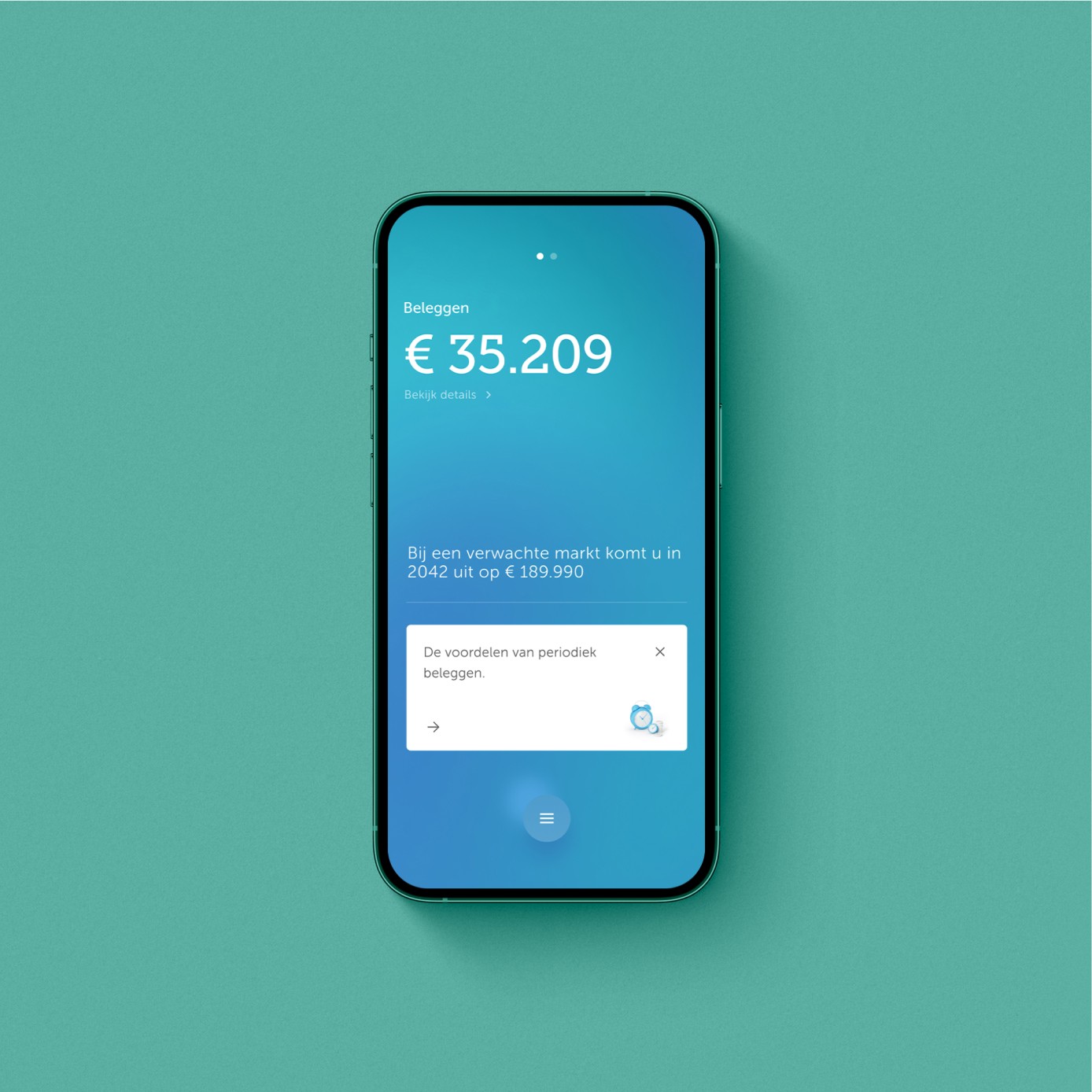
Users will be greeted with calm yet energised gradients where they will be able to get an overview of the information that matters to them.
Users will be greeted with calm yet energised gradients where they will be able to get an overview of the information that matters to them.
Users will be greeted with calm yet energised gradients where they will be able to get an overview of the information that matters to them.
Users will be greeted with calm yet energised gradients where they will be able to get an overview of the information that matters to them.


Clarity through emphasis
Clarity through emphasis
Clarity through emphasis
Clarity through emphasis
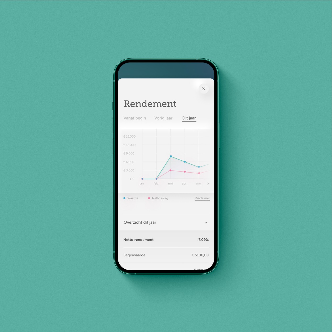
Data visualisations need not be overwhelming. This is why we use soft elevations to enhance and emphasise what is important to the user, without overwhelming them.
Data visualisations need not be overwhelming. This is why we use soft elevations to enhance and emphasise what is important to the user, without overwhelming them.
Data visualisations need not be overwhelming. This is why we use soft elevations to enhance and emphasise what is important to the user, without overwhelming them.
Data visualisations need not be overwhelming. This is why we use soft elevations to enhance and emphasise what is important to the user, without overwhelming them.


Accessible financial knowledge
Accessible financial knowledge
Accessible financial knowledge
Accessible financial knowledge
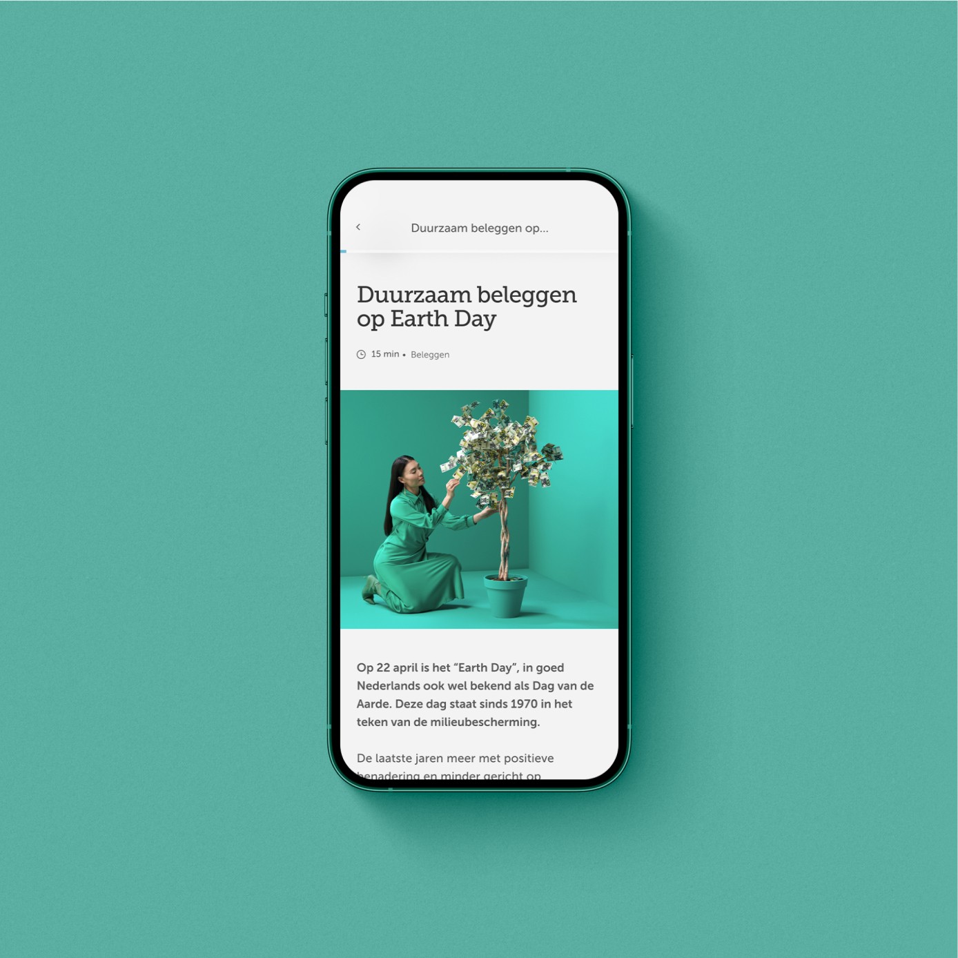
Brand New Day wanted to make financial knowledge accessible. We brought this to life through assets like photography and illustrations that are easy to understand and complements the content.
Brand New Day wanted to make financial knowledge accessible. We brought this to life through assets like photography and illustrations that are easy to understand and complements the content.
Brand New Day wanted to make financial knowledge accessible. We brought this to life through assets like photography and illustrations that are easy to understand and complements the content.
Brand New Day wanted to make financial knowledge accessible. We brought this to life through assets like photography and illustrations that are easy to understand and complements the content.
Giving the design system a clear, material structure
Giving the design system a clear, material structure
Giving the design system a clear, material structure
Giving the design system a clear, material structure
To form an overall calming feeling and distinguish between the branded and functional worlds, the app had two distinct visual language: The neumorphic and frosted look.
This meant that it was important that despite looking different, the base elements had to be flexible and easily understood.
My role was to create scalable components, maintain and document the behaviours of the components and interaction patterns. Through the delivery of the app, we were able to establish a unified design system for Brand New Day.
We collaborated closely with the internal design team within Brand New Day for on-boarding, handover and guidance so they were able to continue with the app's new features in future.
Team at Rōnin Amsterdam
Team at Rōnin Amsterdam
Team at Rōnin Amsterdam
Team at Rōnin Amsterdam
Creative Direction: Toby Mok, Yordy van der Werff
UX: Joeri Kiekebosch, Elian Duits
Copywriting: Yordy van der Werff, Toby Mok
Design, Art Direction: Cassie Ng, Toby Mok
Project Management: Fernanda Arouca
Creative Direction: Toby Mok, Yordy van der Werff
UX: Joeri Kiekebosch, Elian Duits
Copywriting: Yordy van der Werff, Toby Mok
Design, Art Direction: Cassie Ng, Toby Mok
Project Management: Fernanda Arouca
Creative Direction: Toby Mok, Yordy van der Werff
UX: Joeri Kiekebosch, Elian Duits
Copywriting: Yordy van der Werff, Toby Mok
Design, Art Direction: Cassie Ng, Toby Mok
Project Management: Fernanda Arouca
Creative Direction: Toby Mok, Yordy van der Werff
UX: Joeri Kiekebosch, Elian Duits
Copywriting: Yordy van der Werff, Toby Mok
Design, Art Direction: Cassie Ng, Toby Mok
Project Management: Fernanda Arouca
(Contact)
Email
hey@thisiscas.com
Phone
06.196.414.78
(Social)
(Contact)
Email
hey@thisiscas.com
Phone
06.196.414.78
(Social)
(Contact)
Email
hey@thisiscas.com
Phone
06.196.414.78
(Social)
(Contact)
Email
hey@thisiscas.com
Phone
06.196.414.78
(Social)