Taking a progressive bank into a new day. A Brand Identity refresh for Brand New Day, a neobank that challenges the major banks in the field of savings and investments.
(Role)
Design, Art Direction
(Team)
Rōnin Amsterdam
(Year)
2023
Taking a progressive bank into a new day. A Brand Identity refresh for Brand New Day, a neobank that challenges the major banks in the field of savings and investments.
(Role)
Design, Art Direction
(Team)
Rōnin Amsterdam
(Year)
2023
Taking a progressive bank into a new day. A Brand Identity refresh for Brand New Day, a neobank that challenges the major banks in the field of savings and investments.
(Role)
Design, Art Direction
(Team)
Rōnin Amsterdam
(Year)
2023
Taking a progressive bank into a new day. A Brand Identity refresh for Brand New Day, a neobank that challenges the major banks in the field of savings and investments.
(Role)
Design, Art Direction
(Team)
Rōnin Amsterdam
(Year)
2023
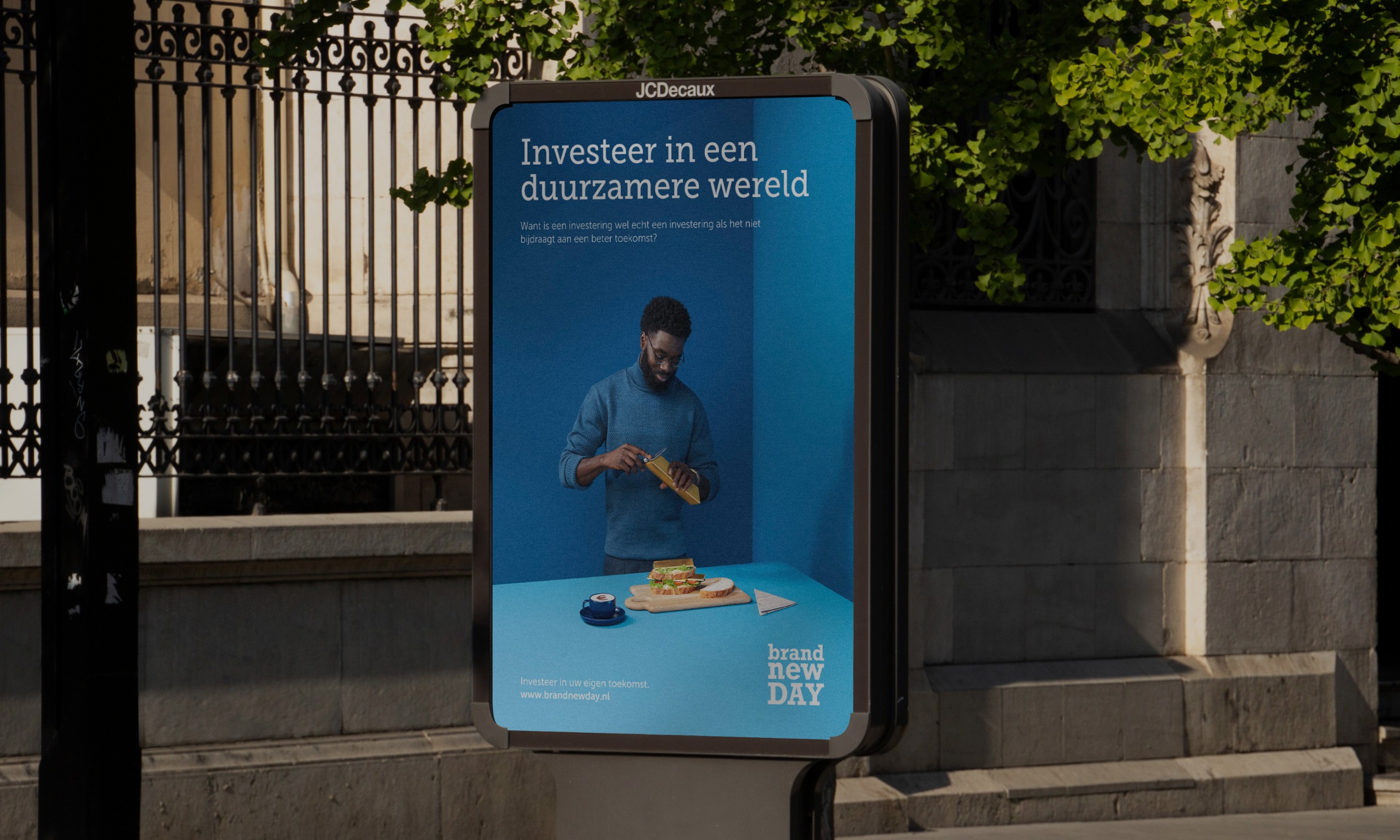
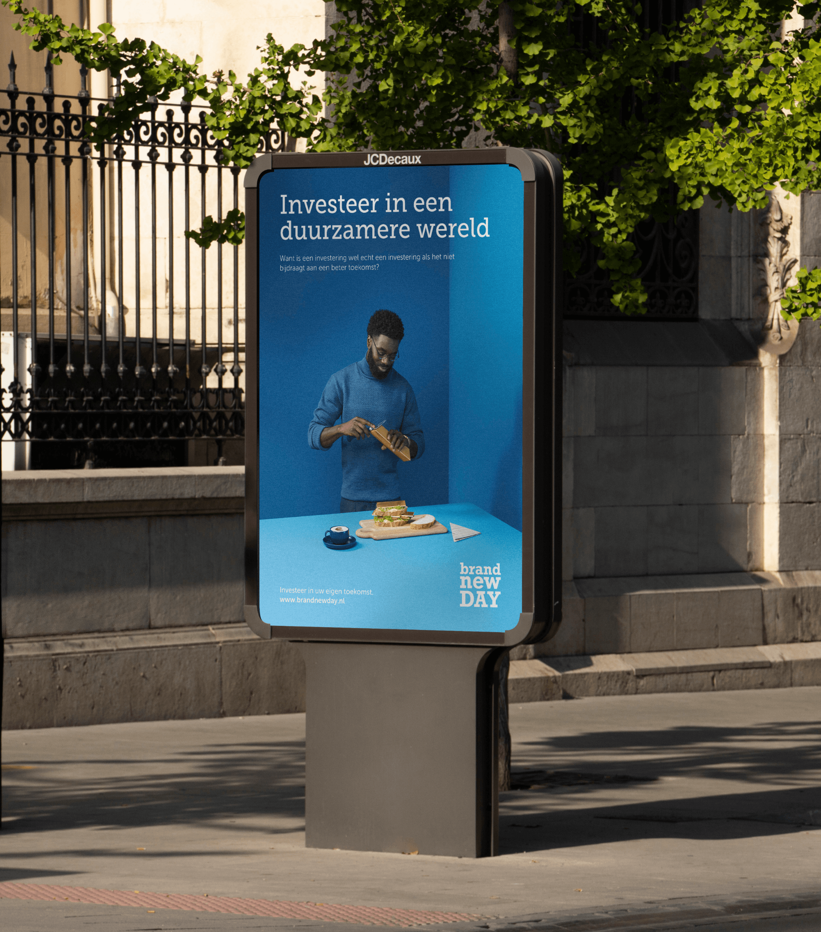
Like all successful brands, Brand New Day transcended their initial branding and was in need of a more unified brand expression.
Like all successful brands, Brand New Day transcended their initial branding and was in need of a more unified brand expression.
Like all successful brands, Brand New Day transcended their initial branding and was in need of a more unified brand expression.
Like all successful brands, Brand New Day transcended their initial branding and was in need of a more unified brand expression.
In the sea of sterile branding in the finance industry, Brand New Day is distinguished by their quirky persona and vivid colour palette.
We wanted to evolve Brand New Day’s brand expression. This meant that instead of discarding the quirkiness and vibrancy that made Brand New Day unique, we decided to amplify them by introducing versatility and depth to better communicate their brand’s vision.
Brand New Day had requested to retain their existing logo.
Behind the scenes
Behind the scenes
Behind the scenes
Behind the scenes
Before we dived into the execution, we had sessions with the clients to define the direction we want to head towards. These are snippets of mood boards used in the process.
Before we dived into the execution, we had sessions with the clients to define the direction we want to head towards. These are snippets of mood boards used in the process.
Before we dived into the execution, we had sessions with the clients to define the direction we want to head towards. These are snippets of mood boards used in the process.
Before we dived into the execution, we had sessions with the clients to define the direction we want to head towards. These are snippets of mood boards used in the process.
People at the heart and centre
People at the heart and centre
People at the heart and centre
People at the heart and centre
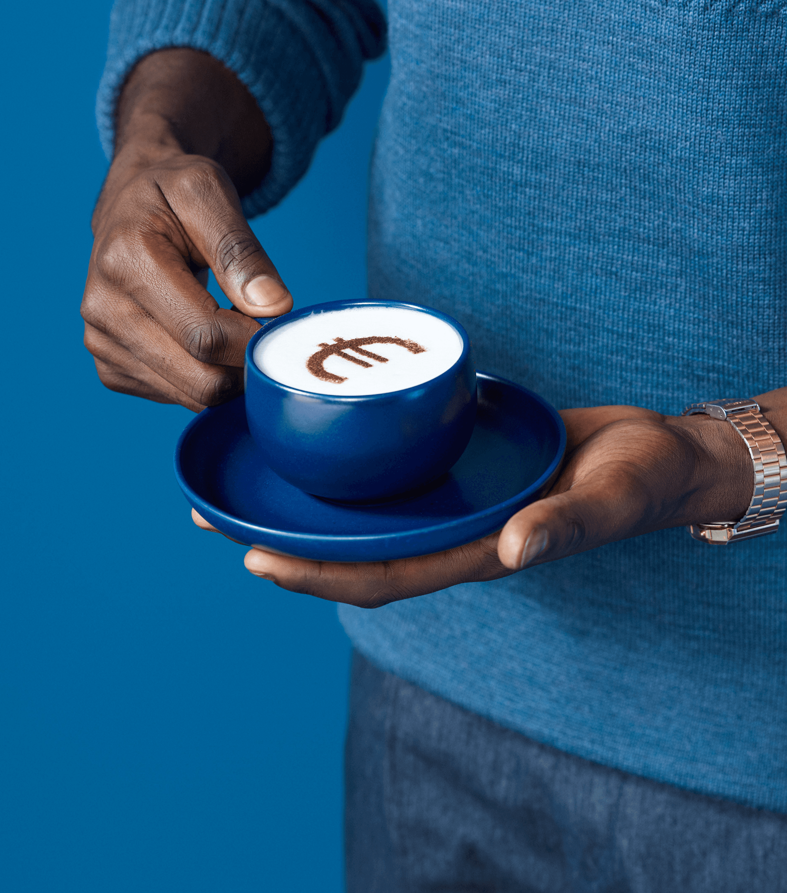
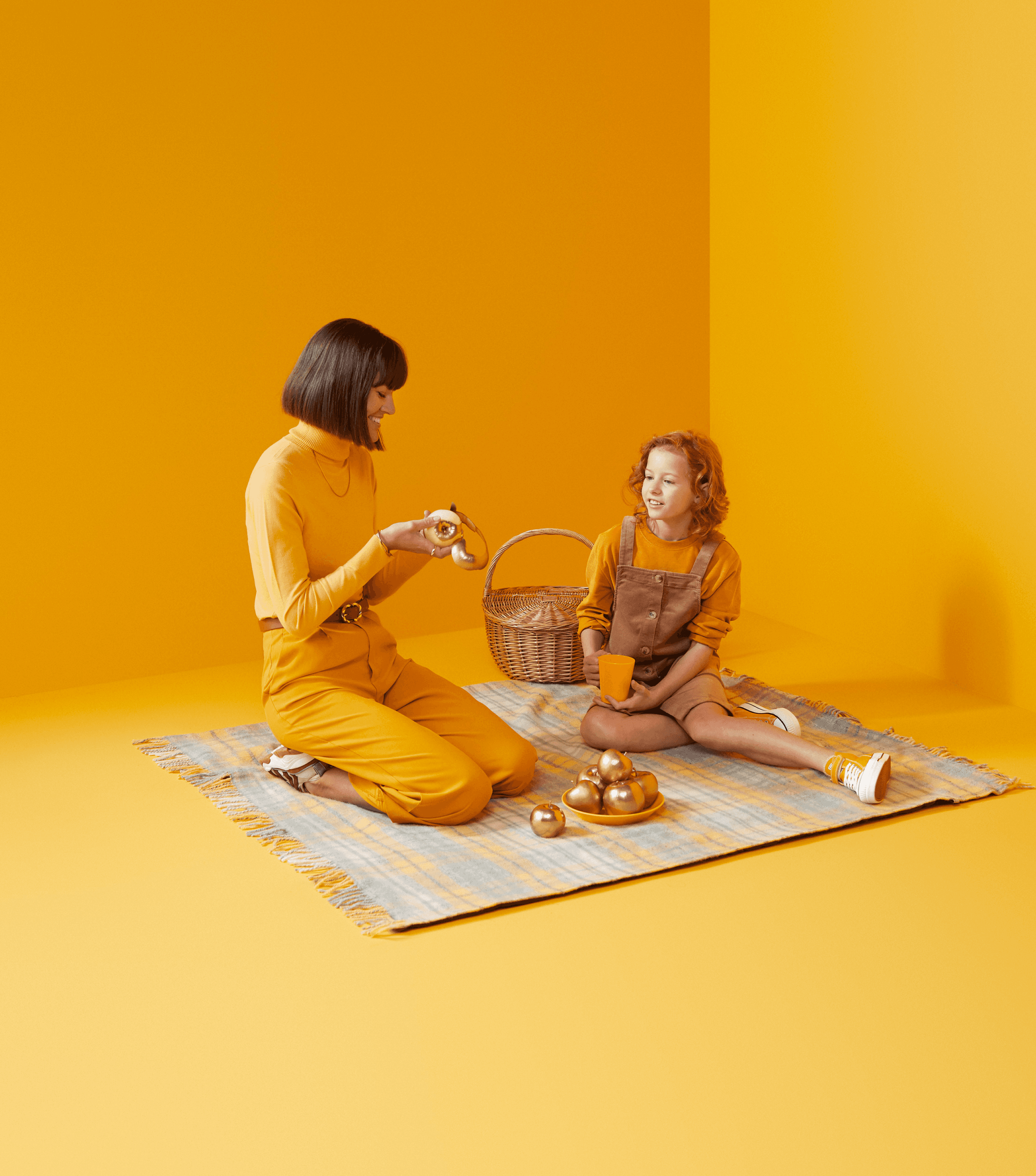
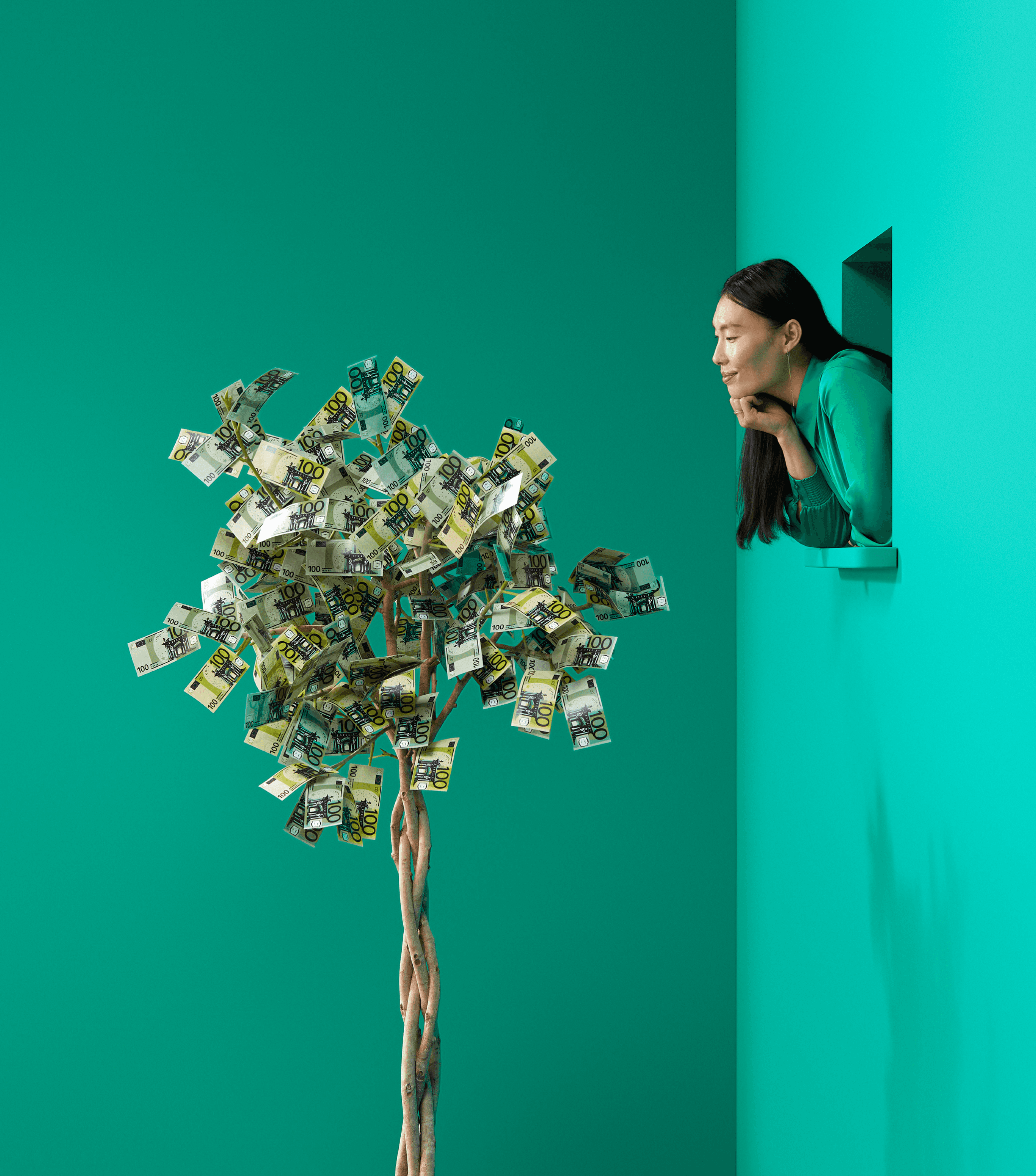
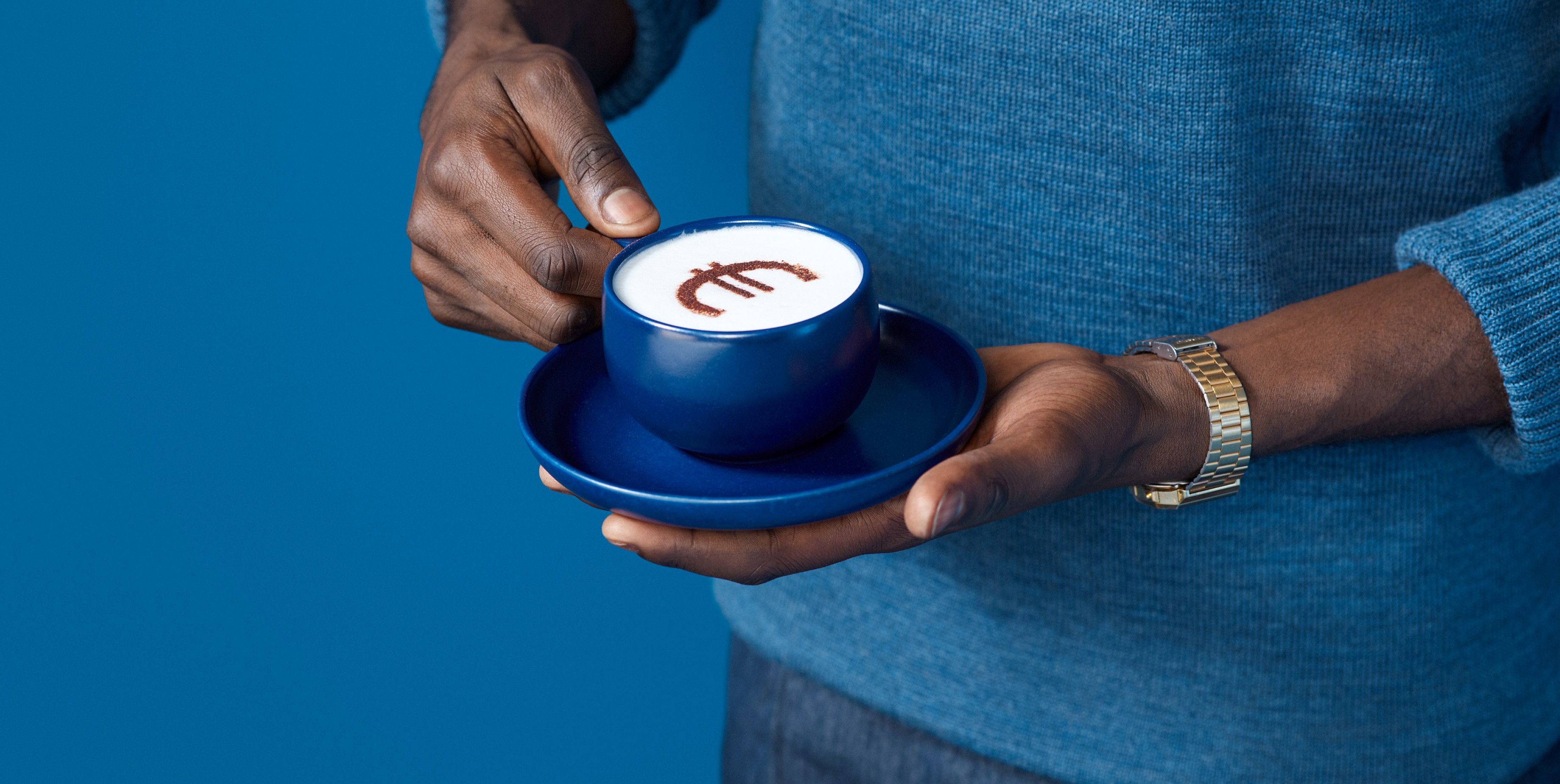
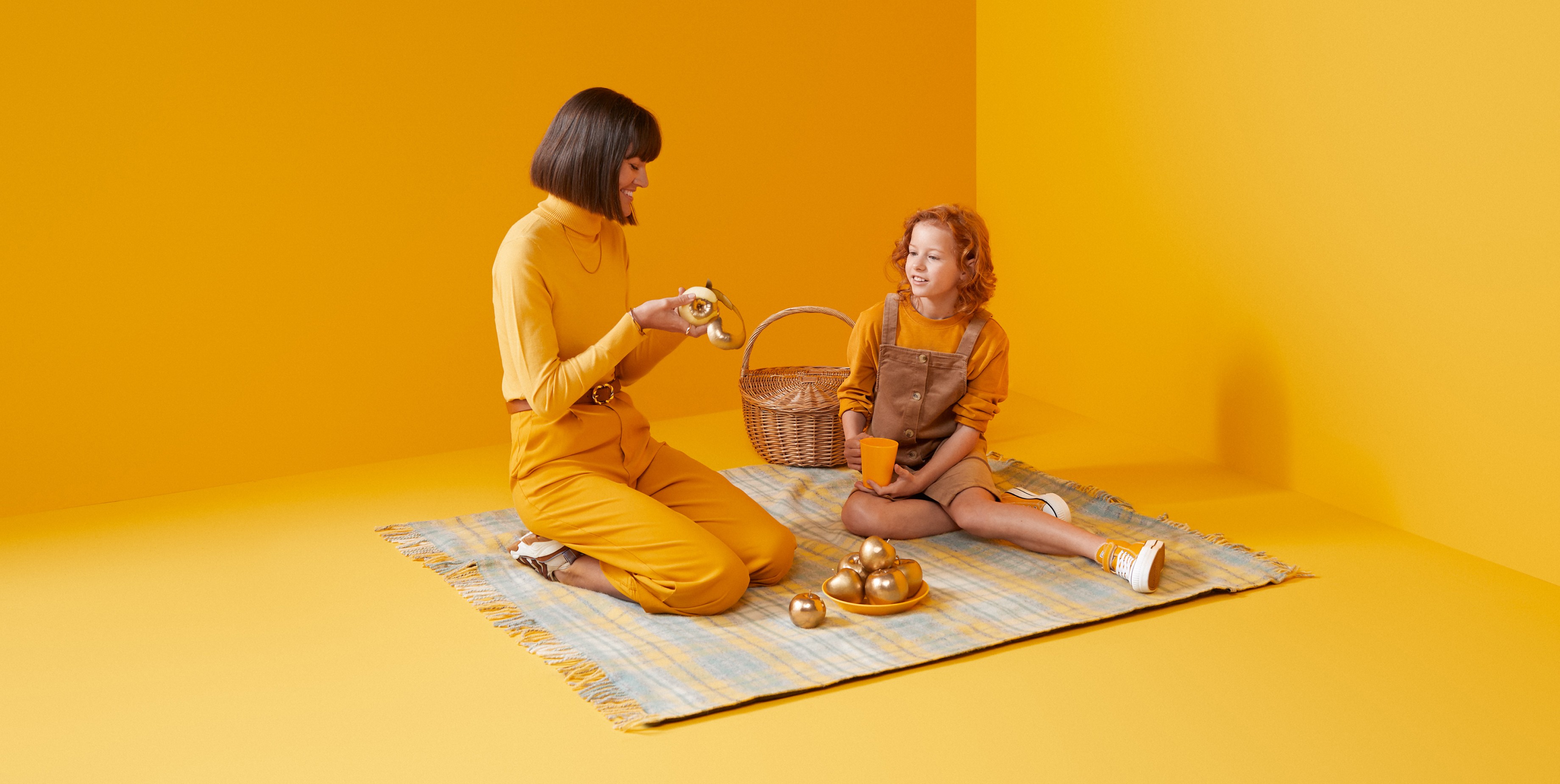
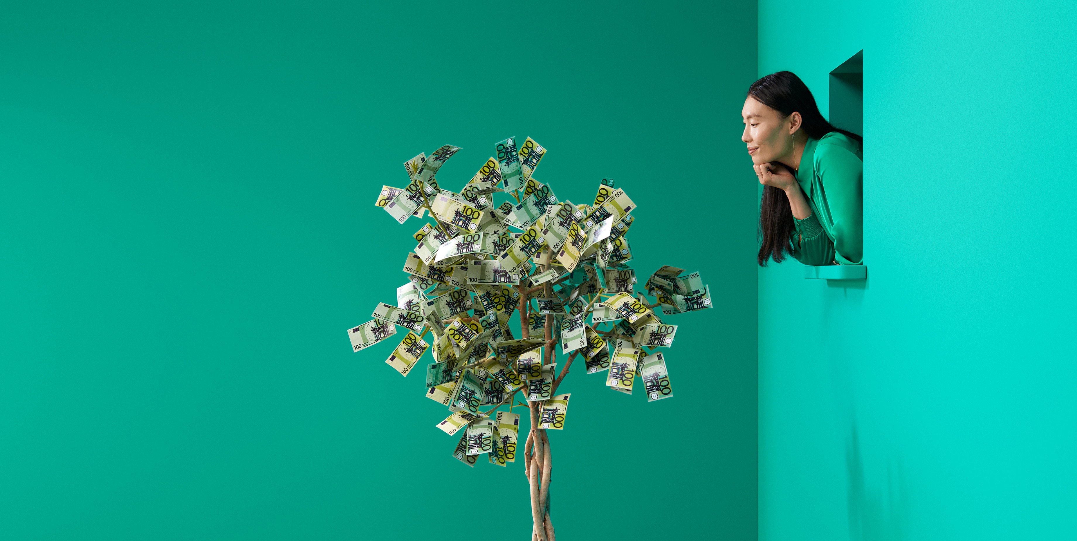
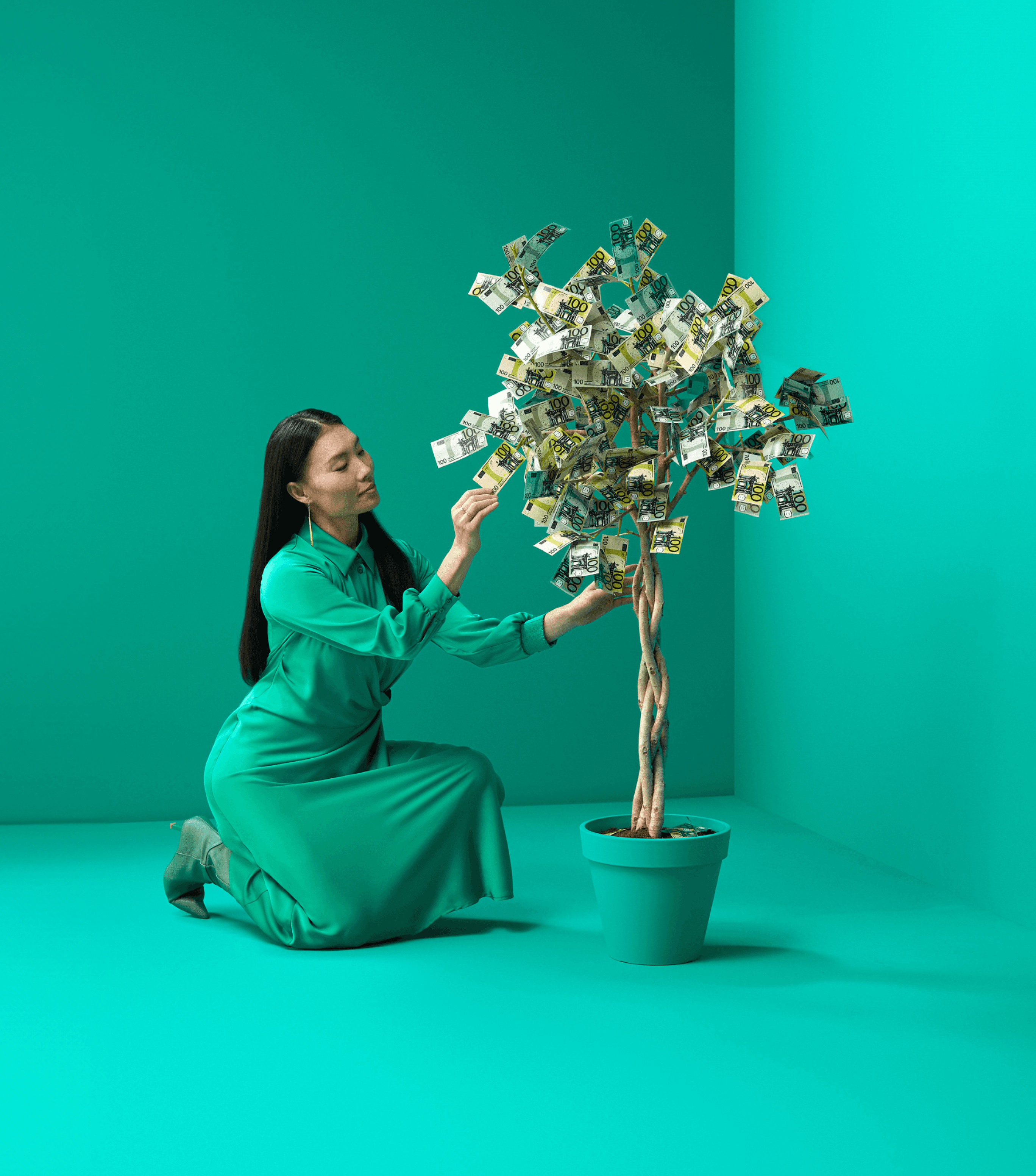
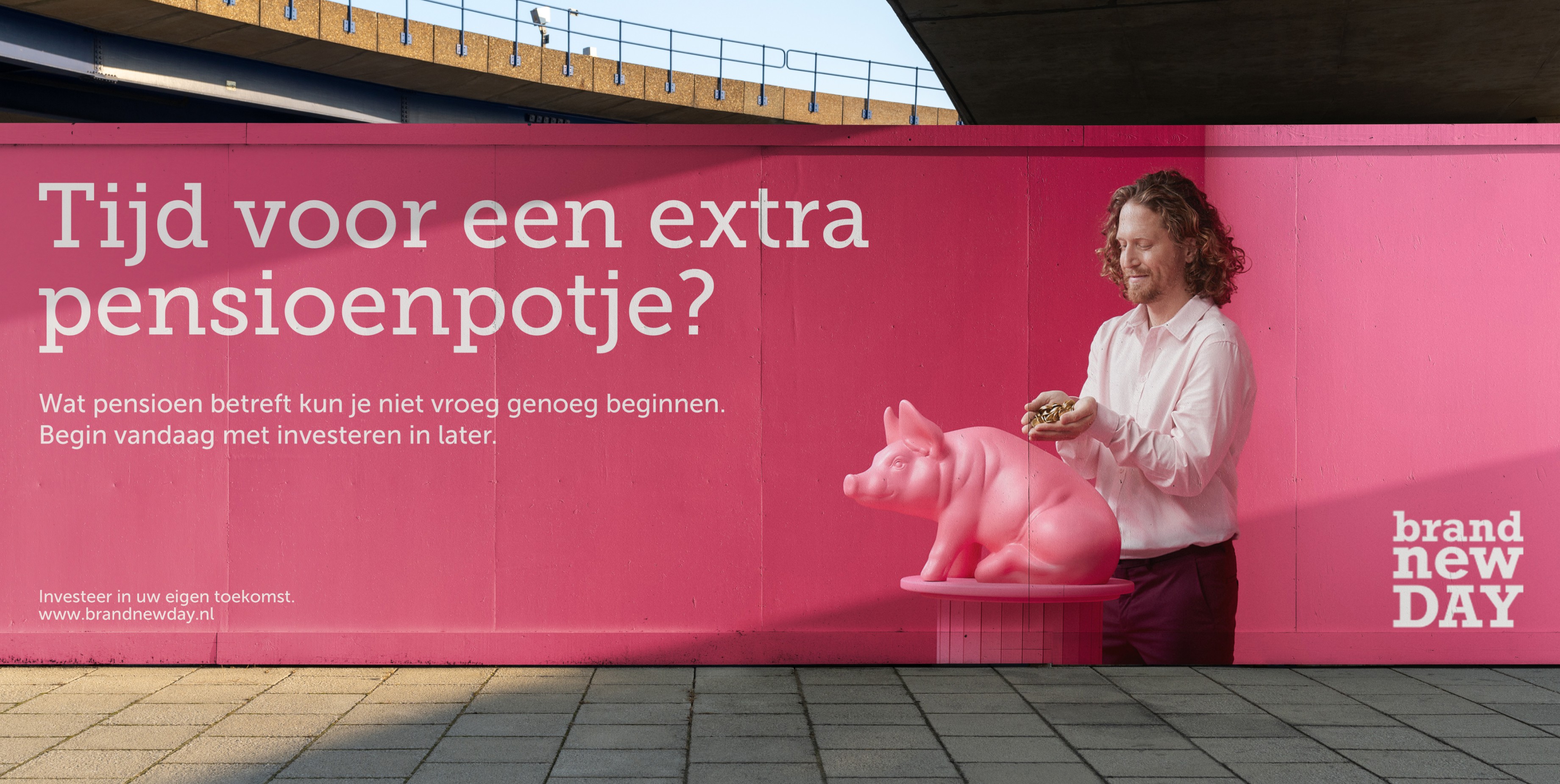
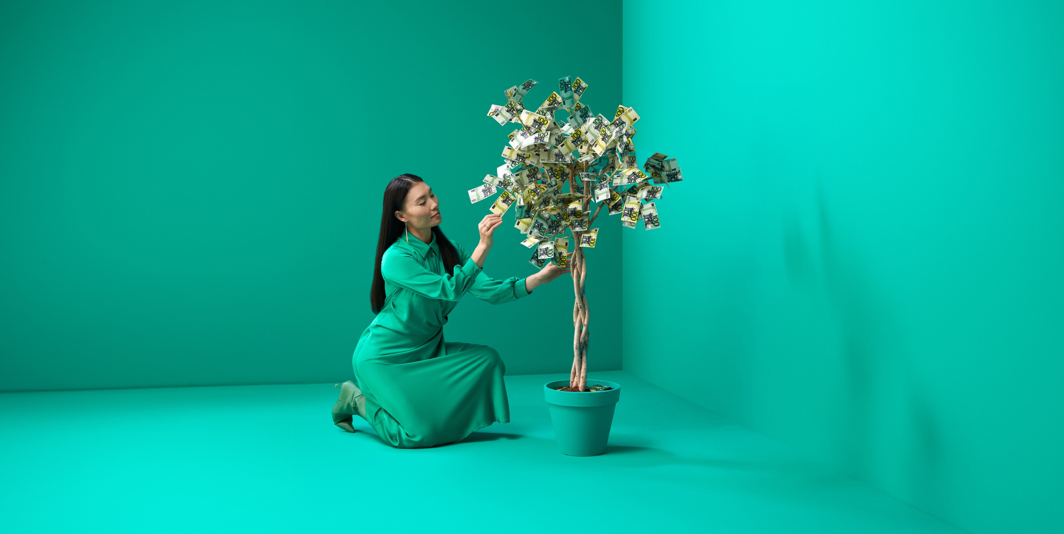
Our photography approach captures people in situations that visually depict financial subjects through clever figurative concepts. A considered tone is maintained, avoiding excessive attempts at humour.
Our photography approach captures people in situations that visually depict financial subjects through clever figurative concepts. A considered tone is maintained, avoiding excessive attempts at humour.
Our photography approach captures people in situations that visually depict financial subjects through clever figurative concepts. A considered tone is maintained, avoiding excessive attempts at humour.
Our photography approach captures people in situations that visually depict financial subjects through clever figurative concepts. A considered tone is maintained, avoiding excessive attempts at humour.
Channelling depth through typography
Channelling depth through typography
Channelling depth through typography
Channelling depth through typography
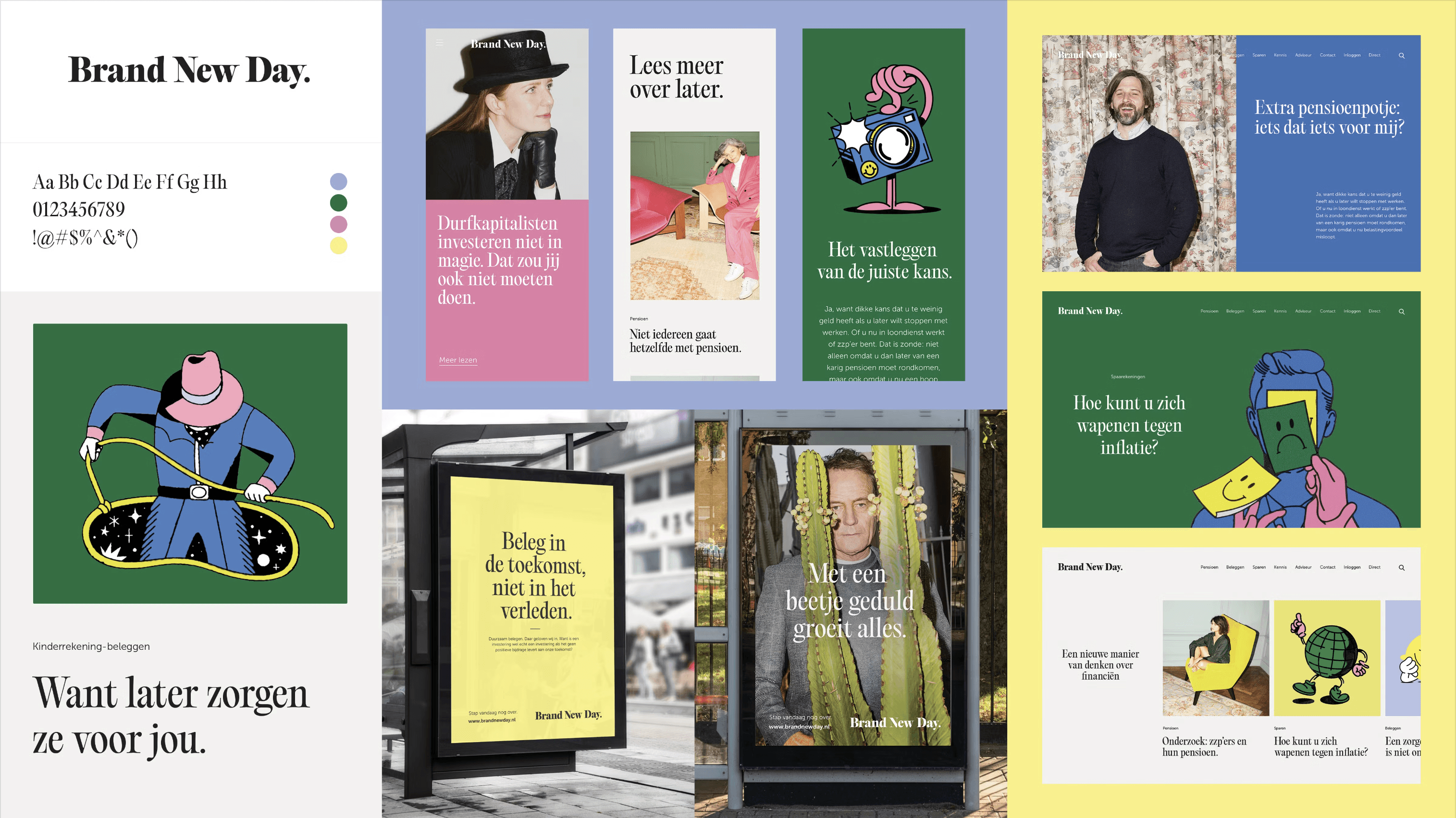
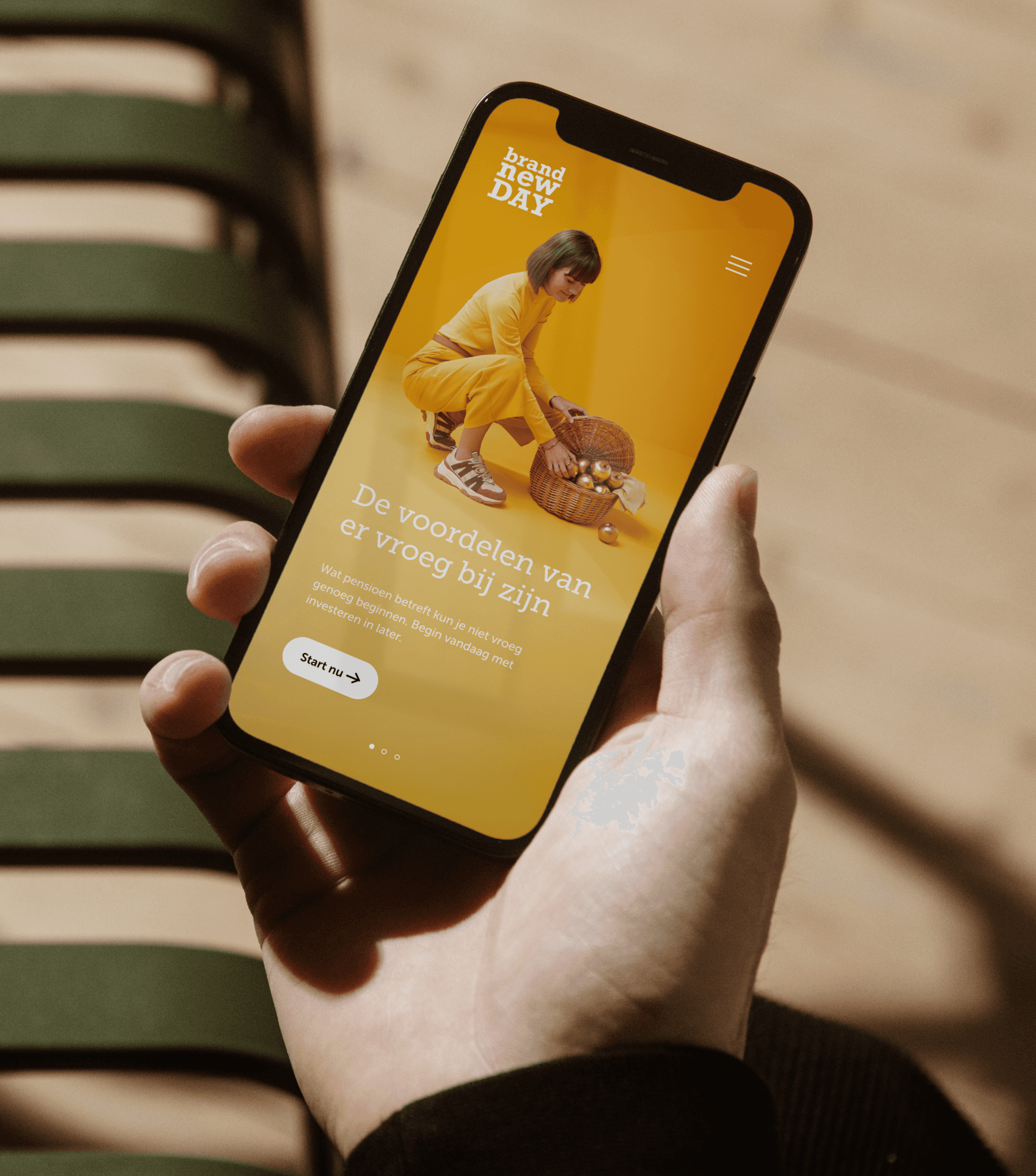
Prior to the brand refresh, Brand New Day used Museo Sans as its’ typeface. With the direction we are taking the brand, we needed to show more depth through our brand’s personality. We chose to channel it through the typography of Brand New Day. This meant that we needed a typeface that exudes the right amount of intellect, without feeling out of character. After a long search, we felt that Museo Slab was apt. It brought the subtle change that we needed.
Prior to the brand refresh, Brand New Day used Museo Sans as its’ typeface. With the direction we are taking the brand, we needed to show more depth through our brand’s personality. We chose to channel it through the typography of Brand New Day. This meant that we needed a typeface that exudes the right amount of intellect, without feeling out of character. After a long search, we felt that Museo Slab was apt. It brought the subtle change that we needed.
Prior to the brand refresh, Brand New Day used Museo Sans as its’ typeface. With the direction we are taking the brand, we needed to show more depth through our brand’s personality. We chose to channel it through the typography of Brand New Day. This meant that we needed a typeface that exudes the right amount of intellect, without feeling out of character. After a long search, we felt that Museo Slab was apt. It brought the subtle change that we needed.
Prior to the brand refresh, Brand New Day used Museo Sans as its’ typeface. With the direction we are taking the brand, we needed to show more depth through our brand’s personality. We chose to channel it through the typography of Brand New Day. This meant that we needed a typeface that exudes the right amount of intellect, without feeling out of character. After a long search, we felt that Museo Slab was apt. It brought the subtle change that we needed.
A flexible and user-friendly system that celebrates the brand
A flexible and user-friendly system that celebrates the brand
A flexible and user-friendly system that celebrates the brand
A flexible and user-friendly system that celebrates the brand
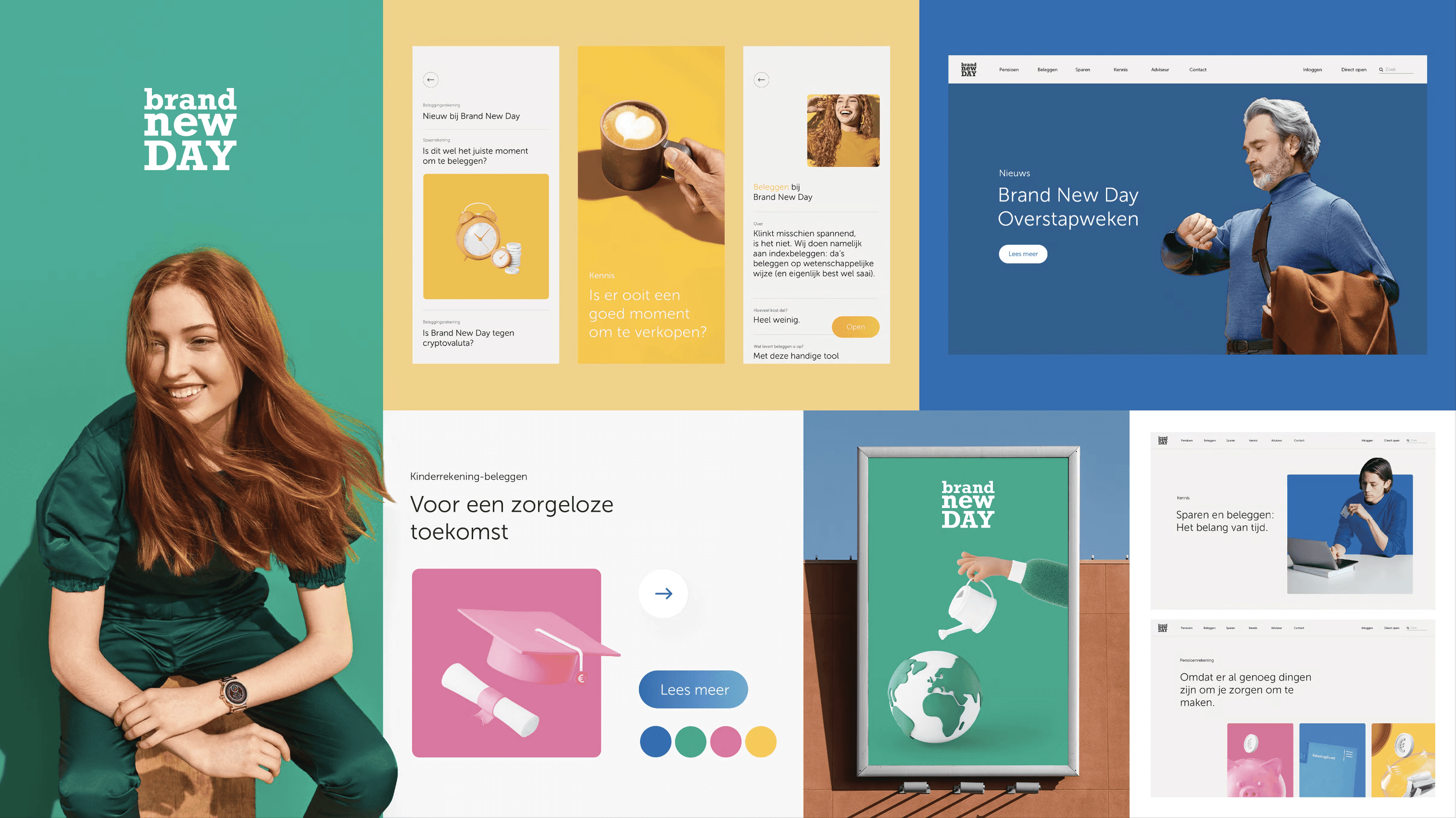
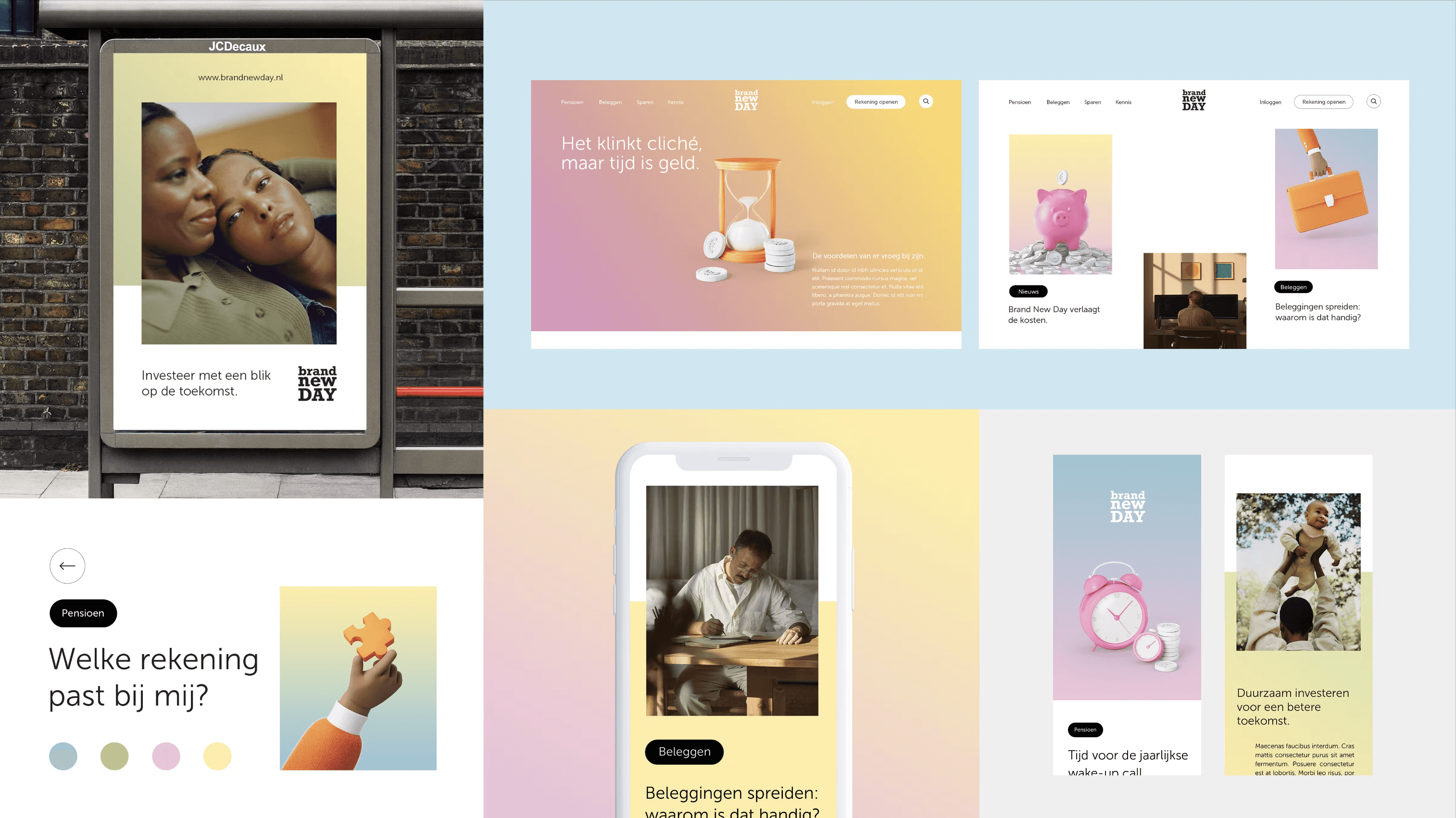
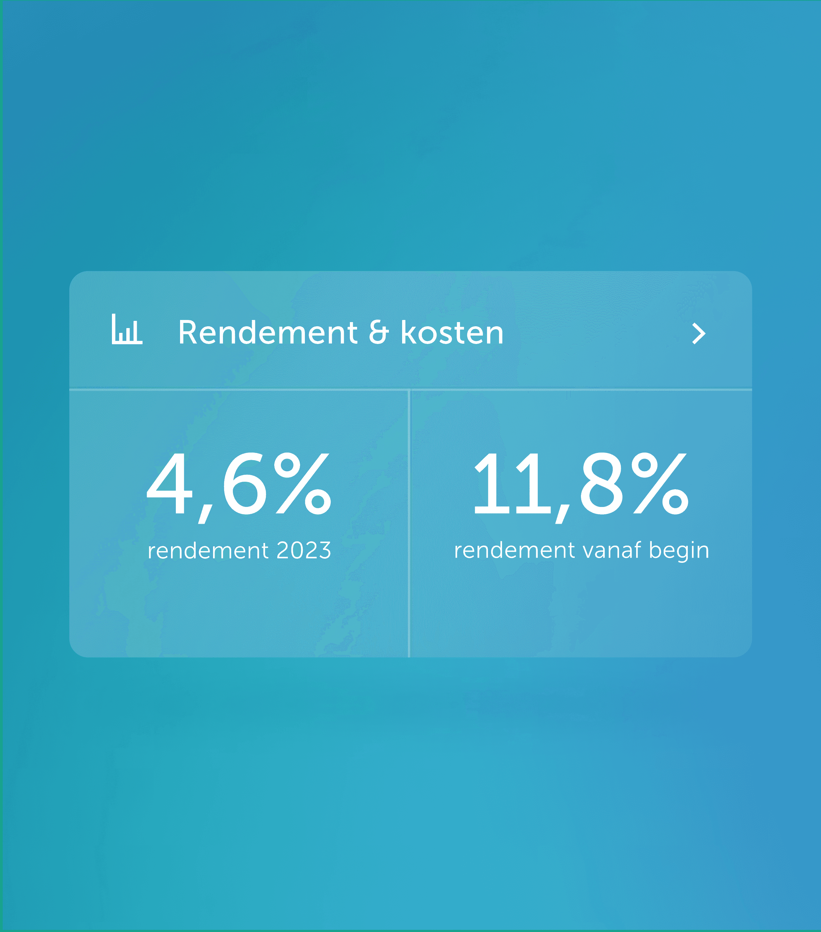
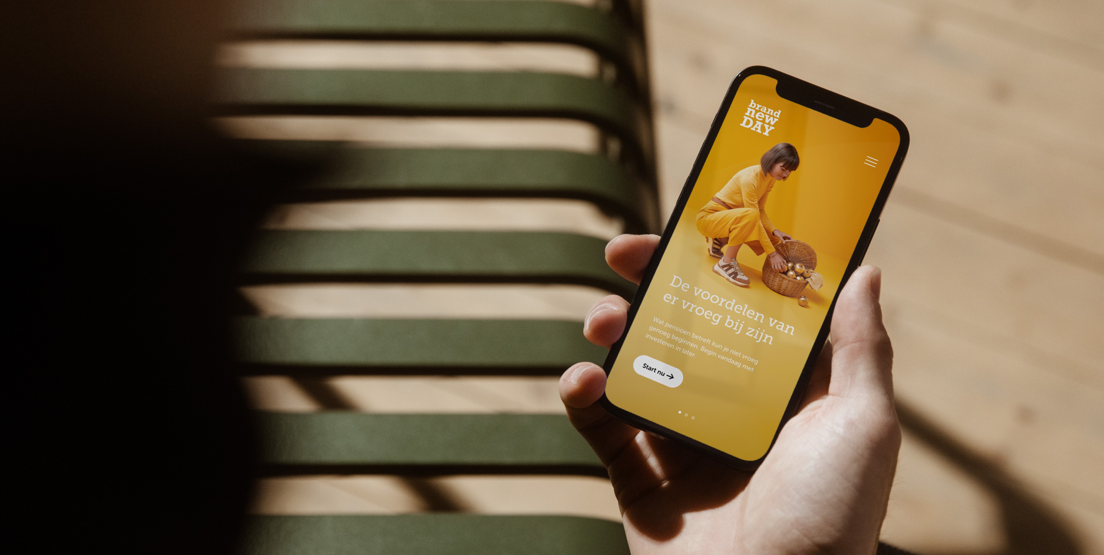
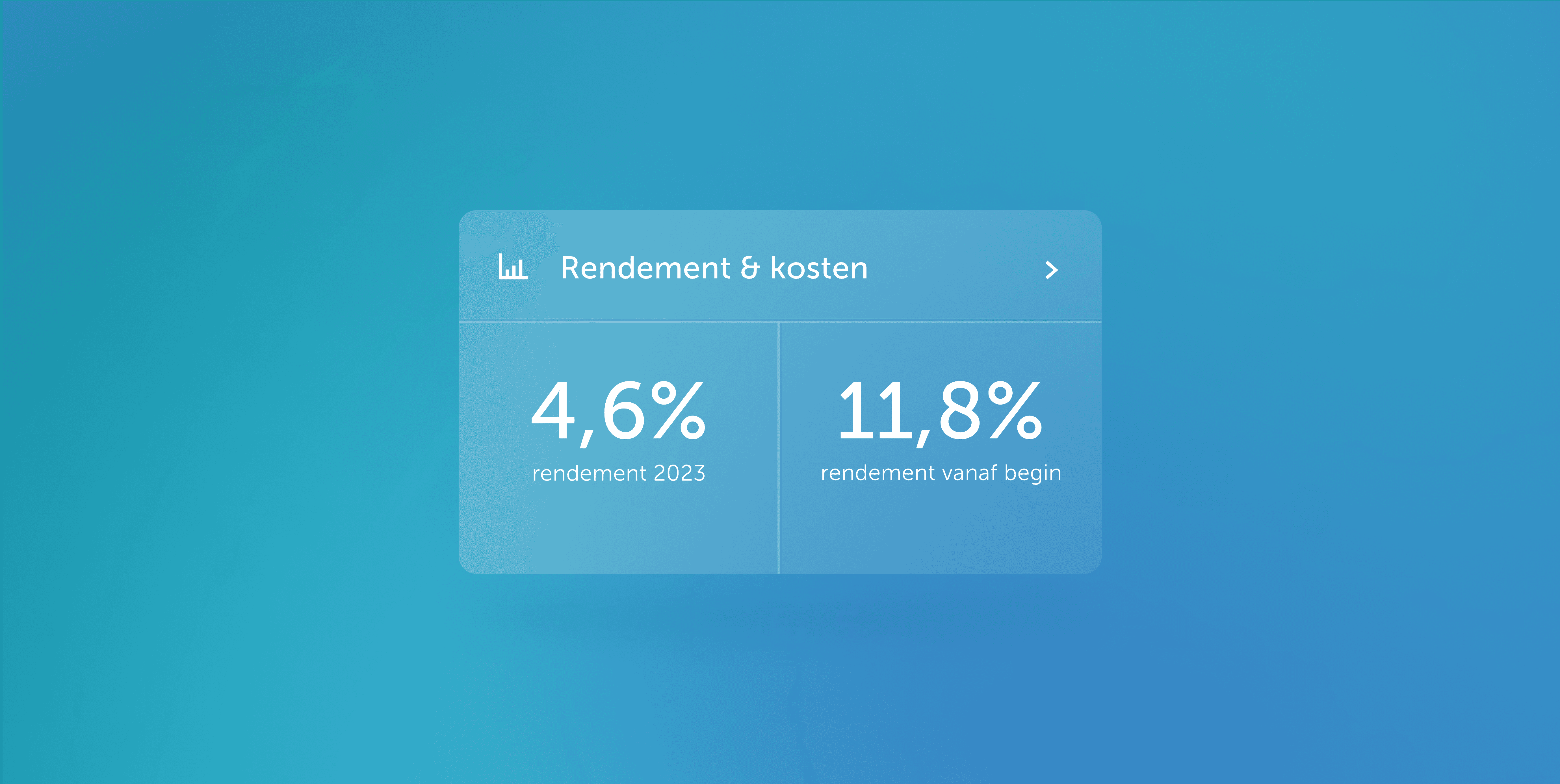
The outcome of the brand refresh is a unified brand system, easy and friendly to use. Gradients are often easy to misinterpret, but a system was devised to avoid that.
Most importantly, this new visual expression upholds what makes Brand New Day unique and drives their brand vision across the different touch points.
Team at Rōnin Amsterdam
Team at Rōnin Amsterdam
Team at Rōnin Amsterdam
Team at Rōnin Amsterdam
Creative Direction: Yordy van der Werff, Toby Mok
Strategy: Ewoud Offenberg
Copywriting: Yordy van der Werff
Design, Art Direction: Cassie Ng, Yordy van der Werff
Project Management: Robin van Bezouw
Creative Direction: Yordy van der Werff, Toby Mok
Strategy: Ewoud Offenberg
Copywriting: Yordy van der Werff
Design, Art Direction: Cassie Ng, Yordy van der Werff
Project Management: Robin van Bezouw
Creative Direction: Yordy van der Werff, Toby Mok
Strategy: Ewoud Offenberg
Copywriting: Yordy van der Werff
Design, Art Direction: Cassie Ng, Yordy van der Werff
Project Management: Robin van Bezouw
Creative Direction: Yordy van der Werff, Toby Mok
Strategy: Ewoud Offenberg
Copywriting: Yordy van der Werff
Design, Art Direction: Cassie Ng, Yordy van der Werff
Project Management: Robin van Bezouw
(Contact)
Email
hey@thisiscas.com
Phone
06.196.414.78
(Social)
(Contact)
Email
hey@thisiscas.com
Phone
06.196.414.78
(Social)
(Contact)
Email
hey@thisiscas.com
Phone
06.196.414.78
(Social)
(Contact)
Email
hey@thisiscas.com
Phone
06.196.414.78
(Social)
