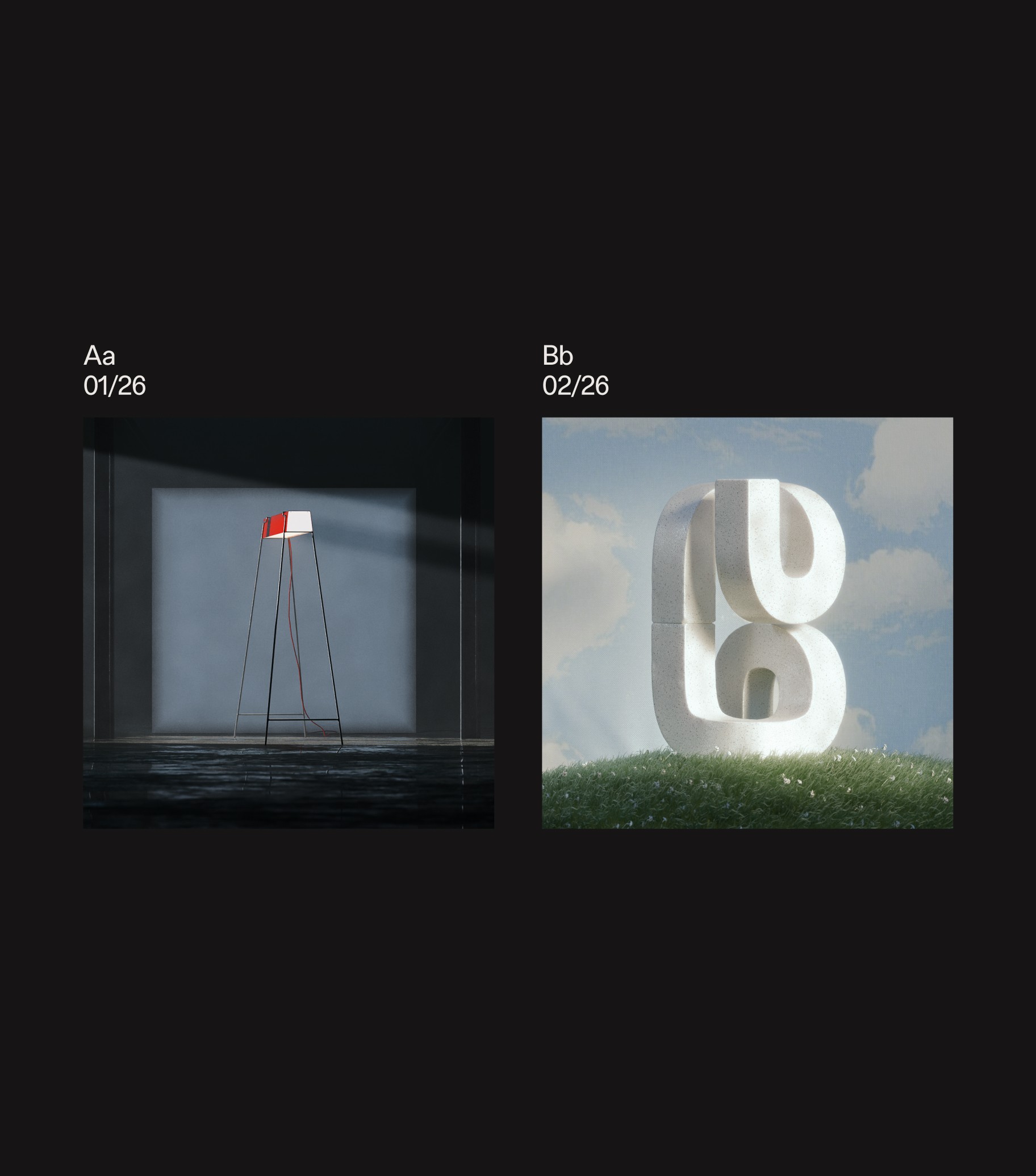
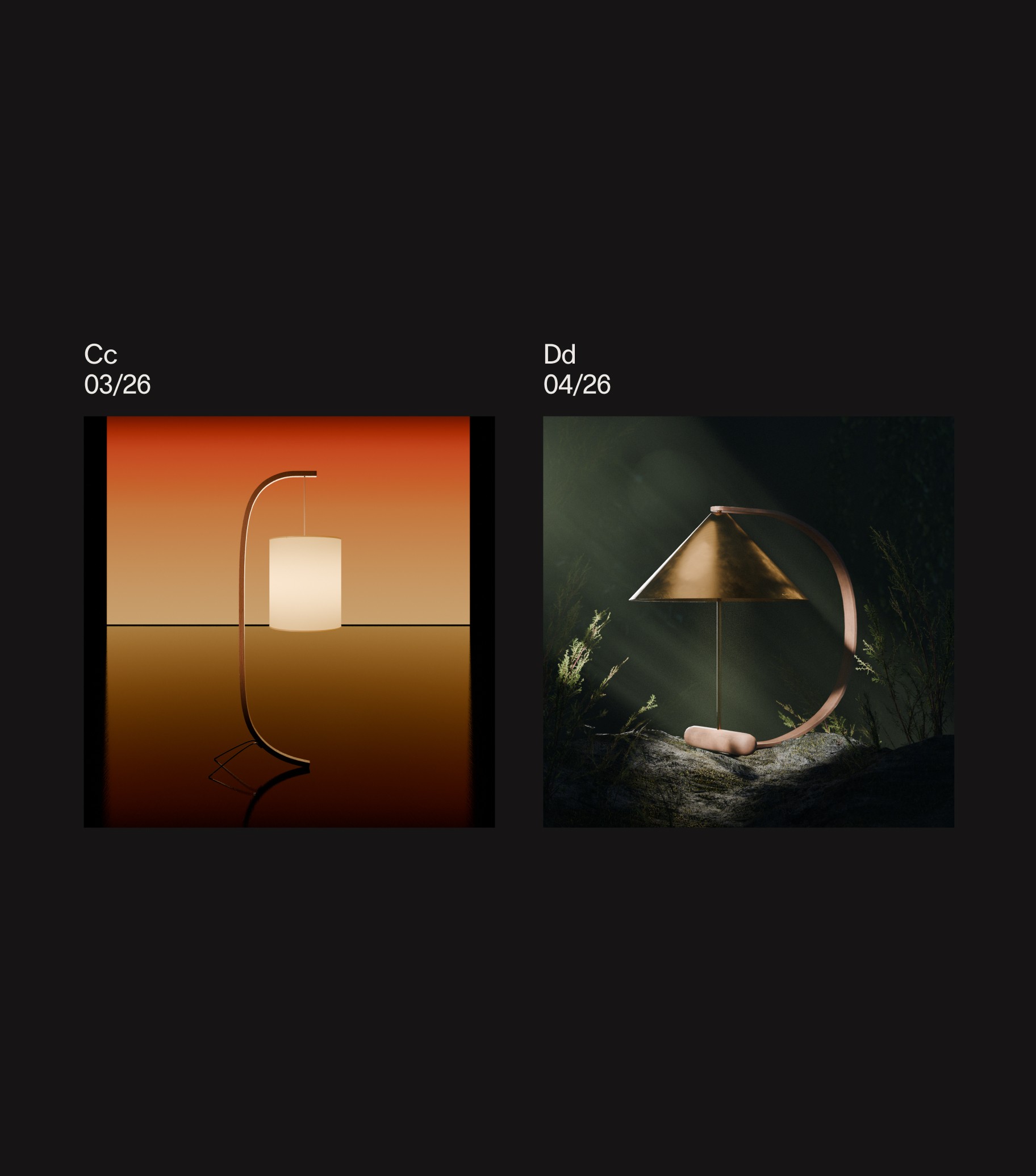
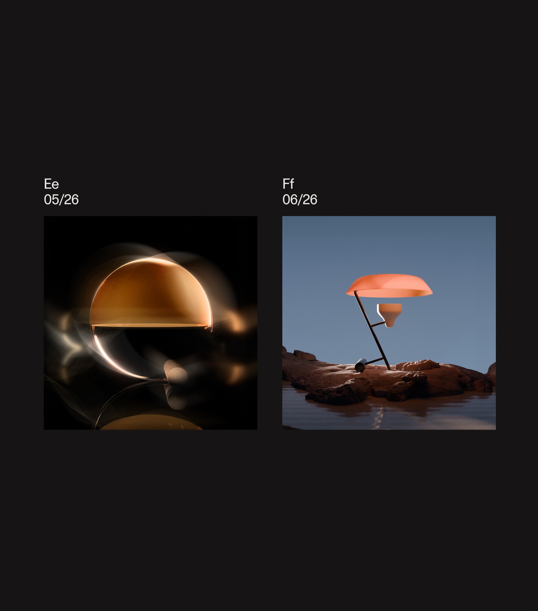
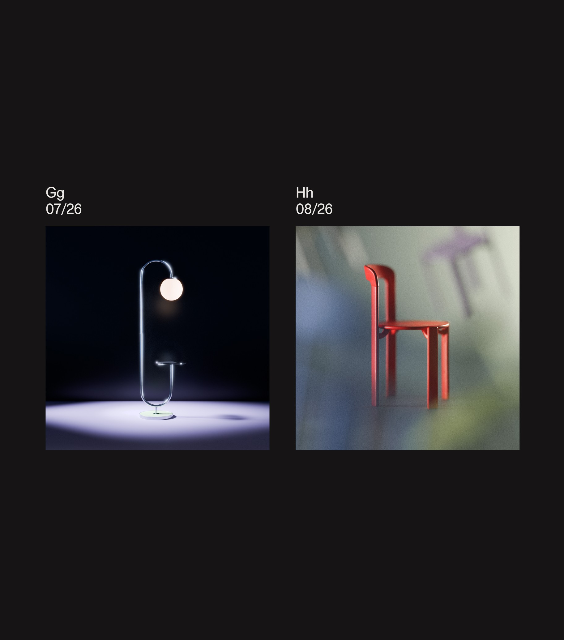
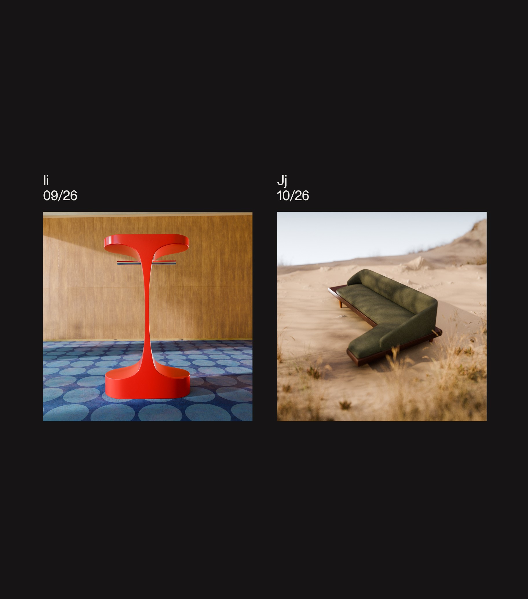
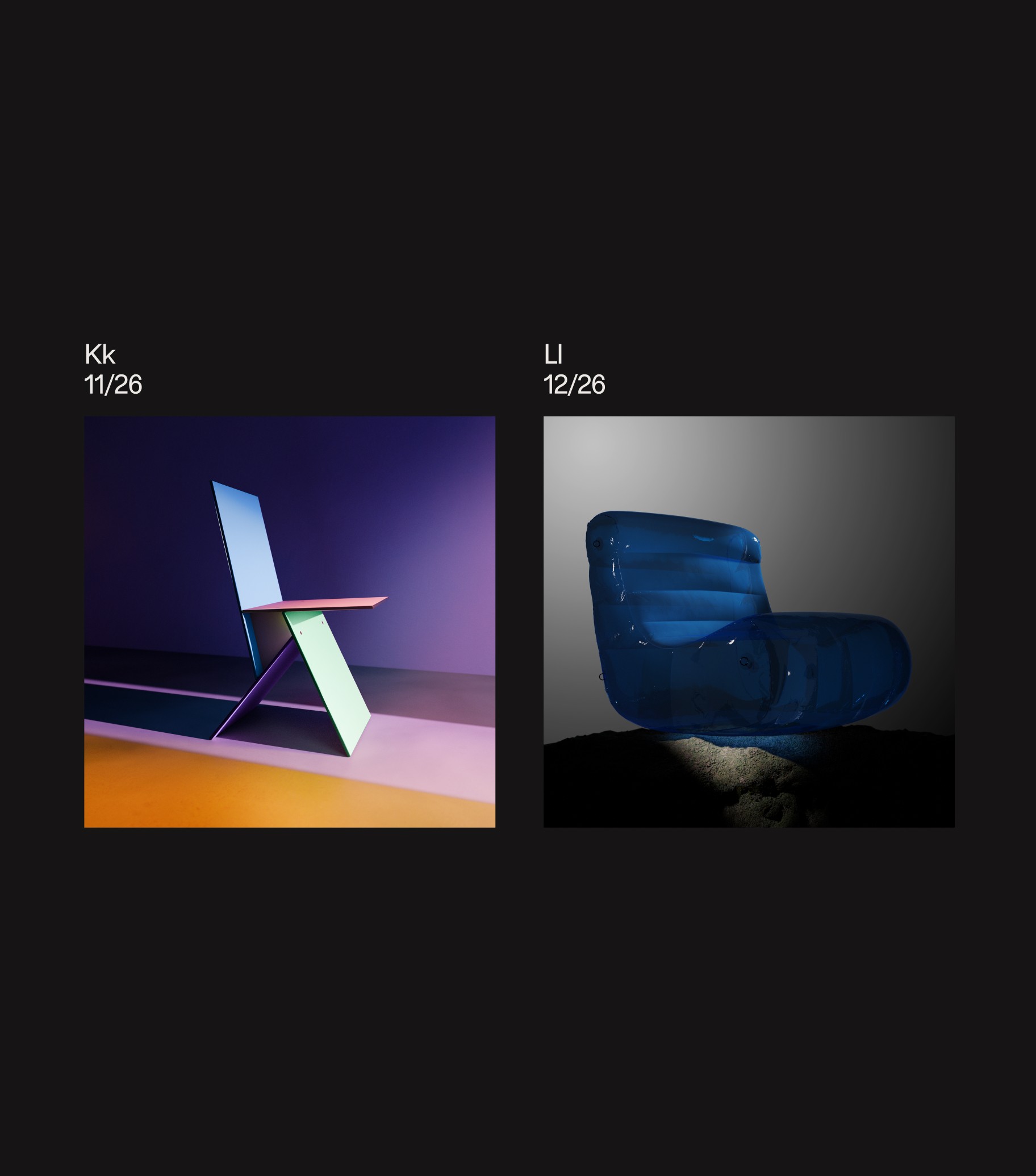
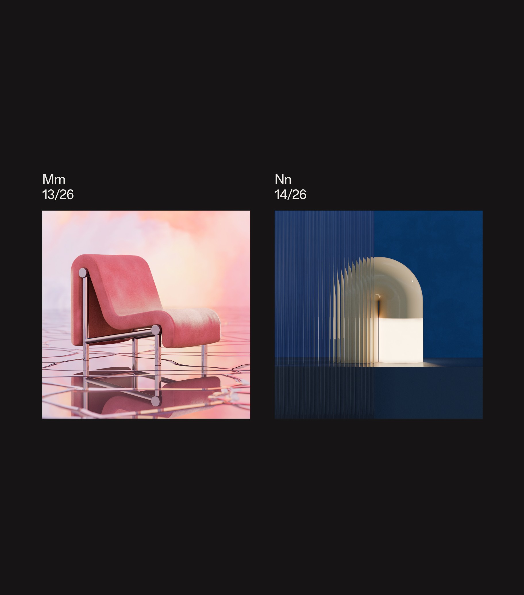
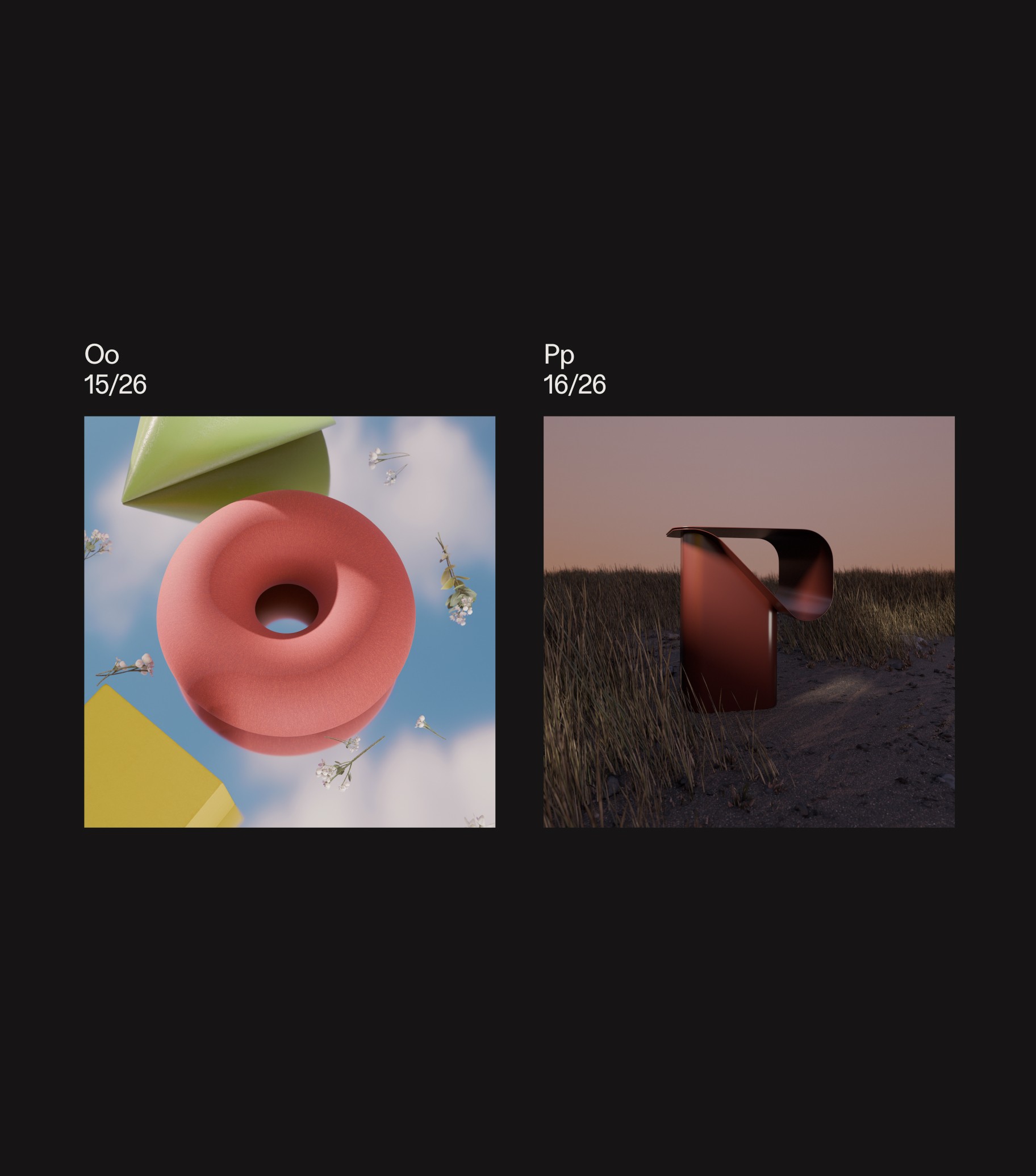
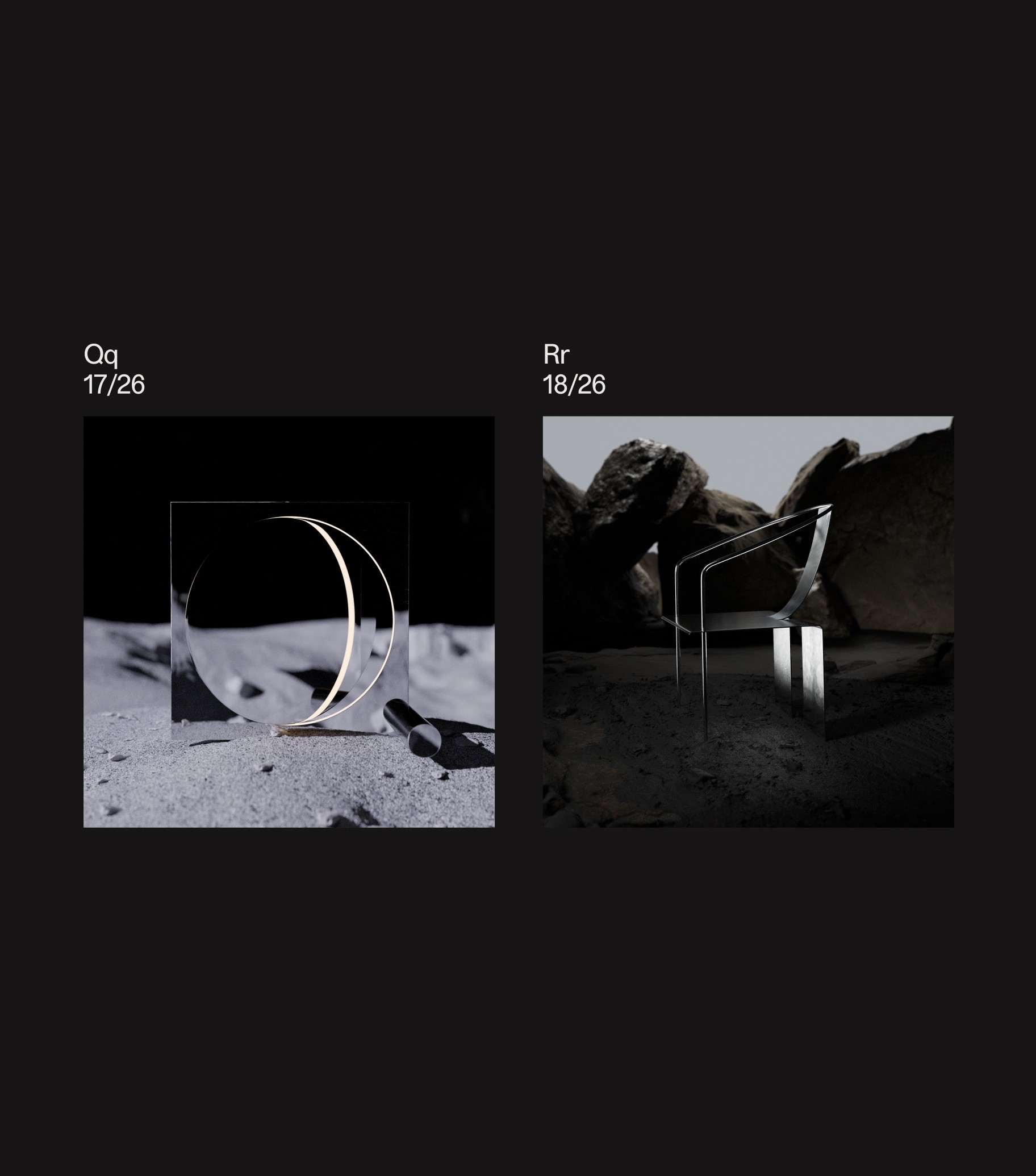
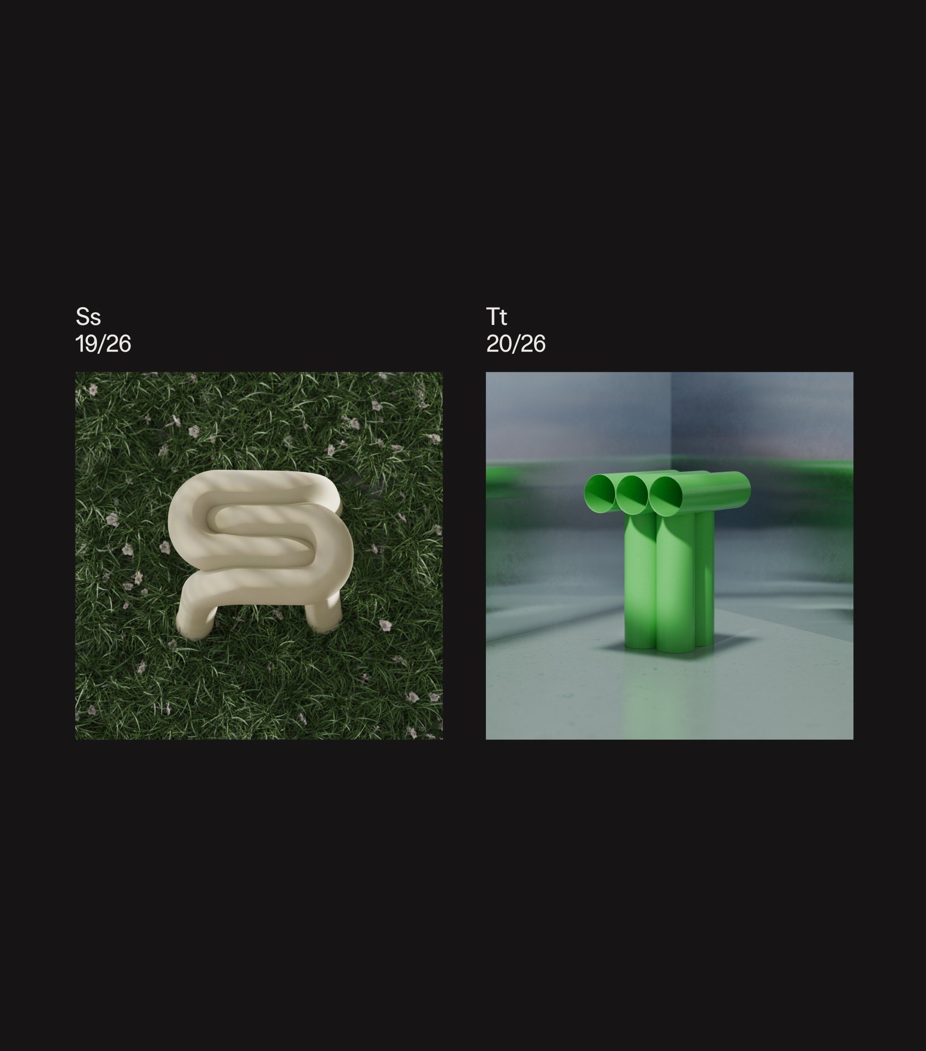
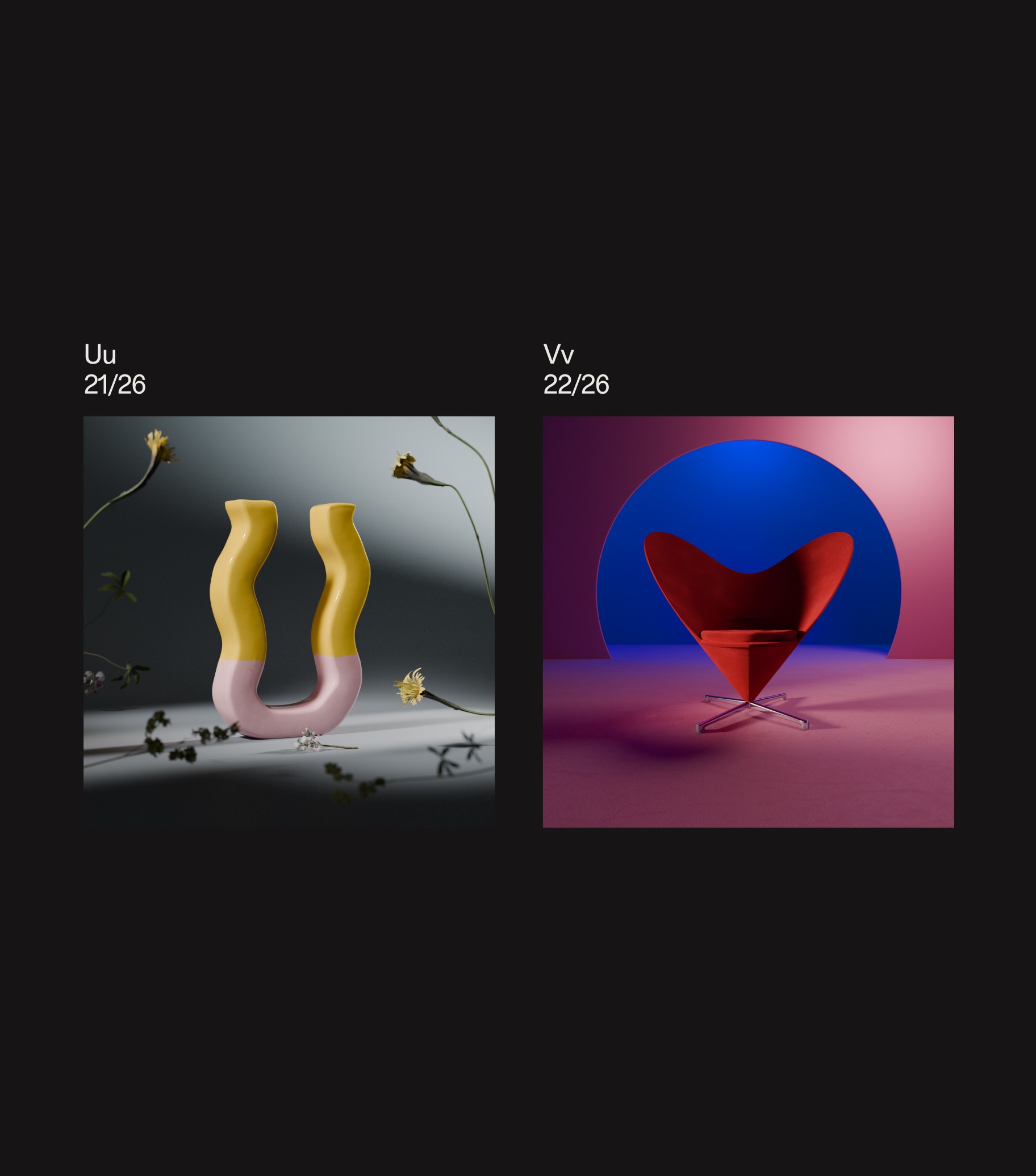
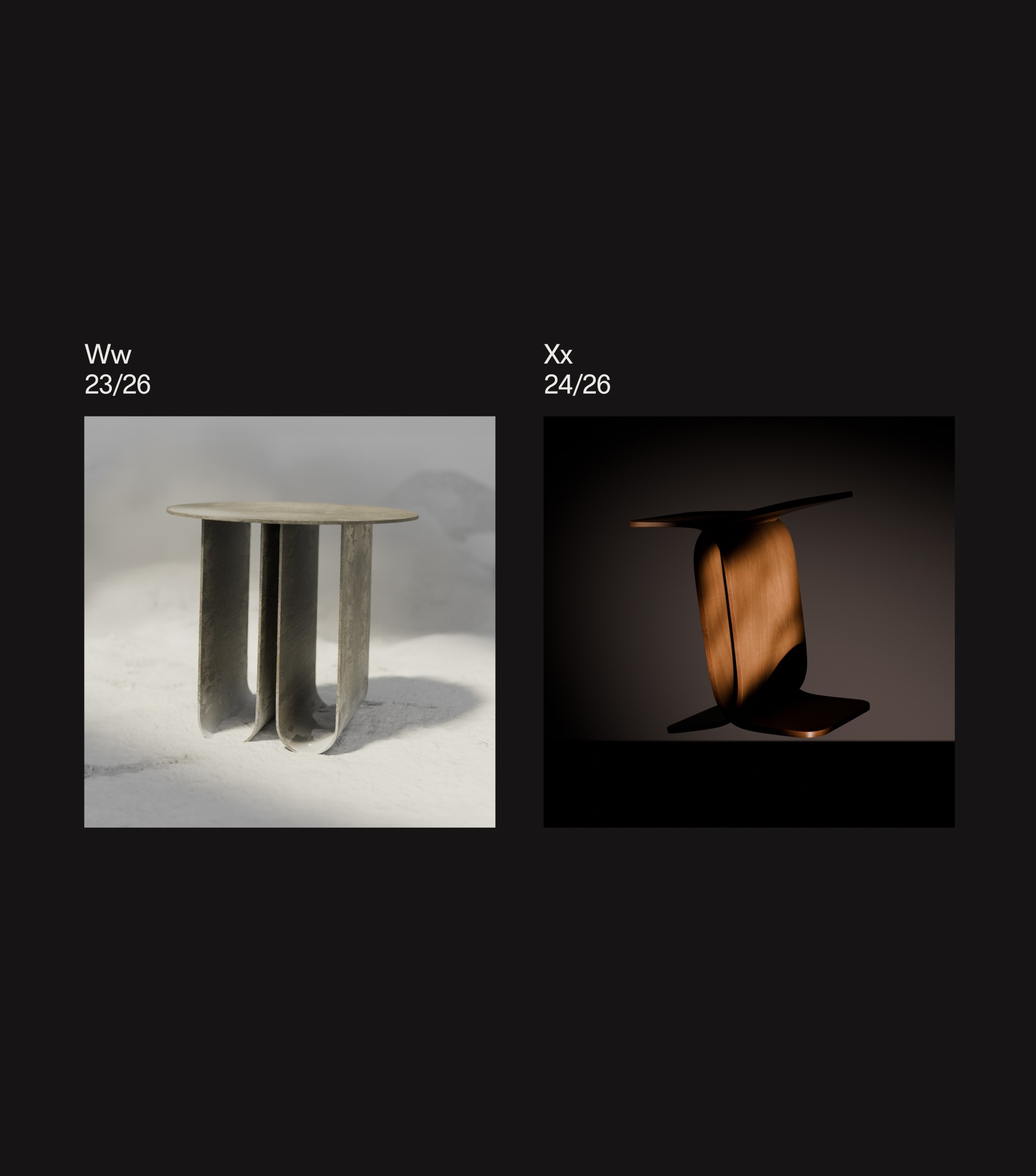
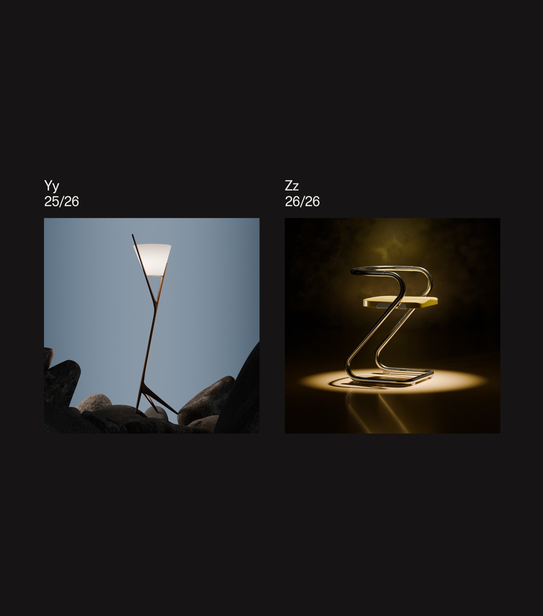
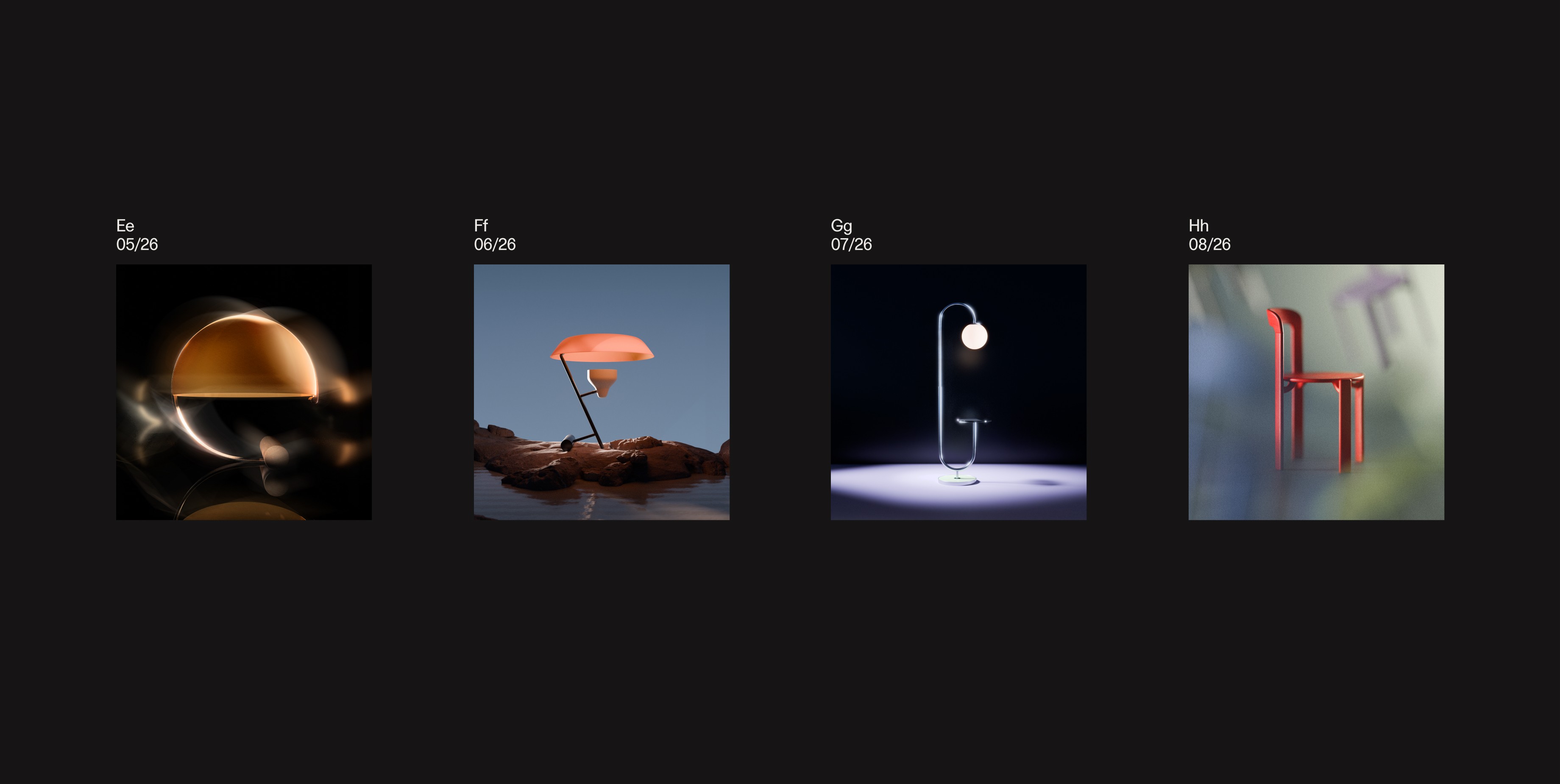
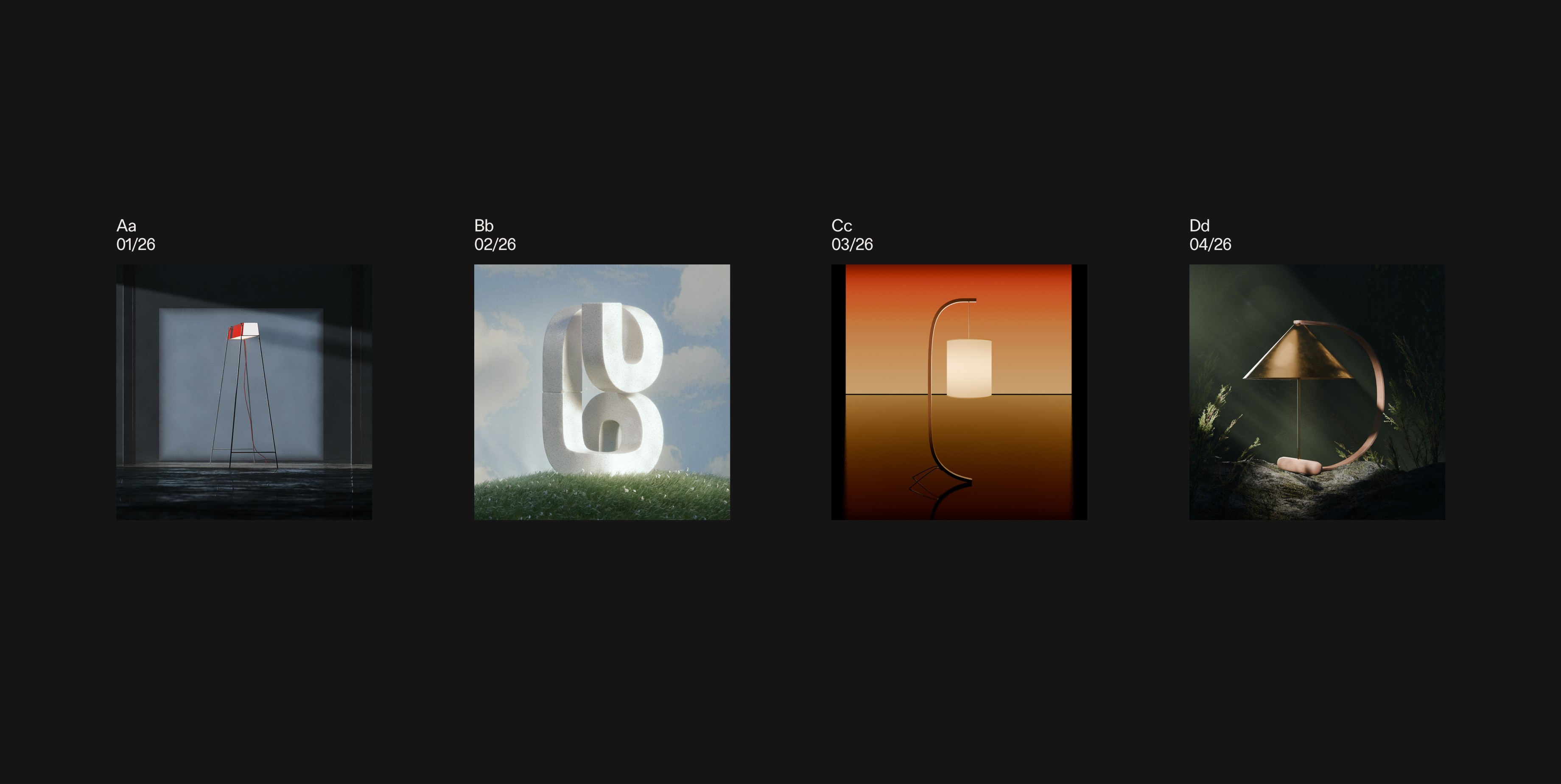
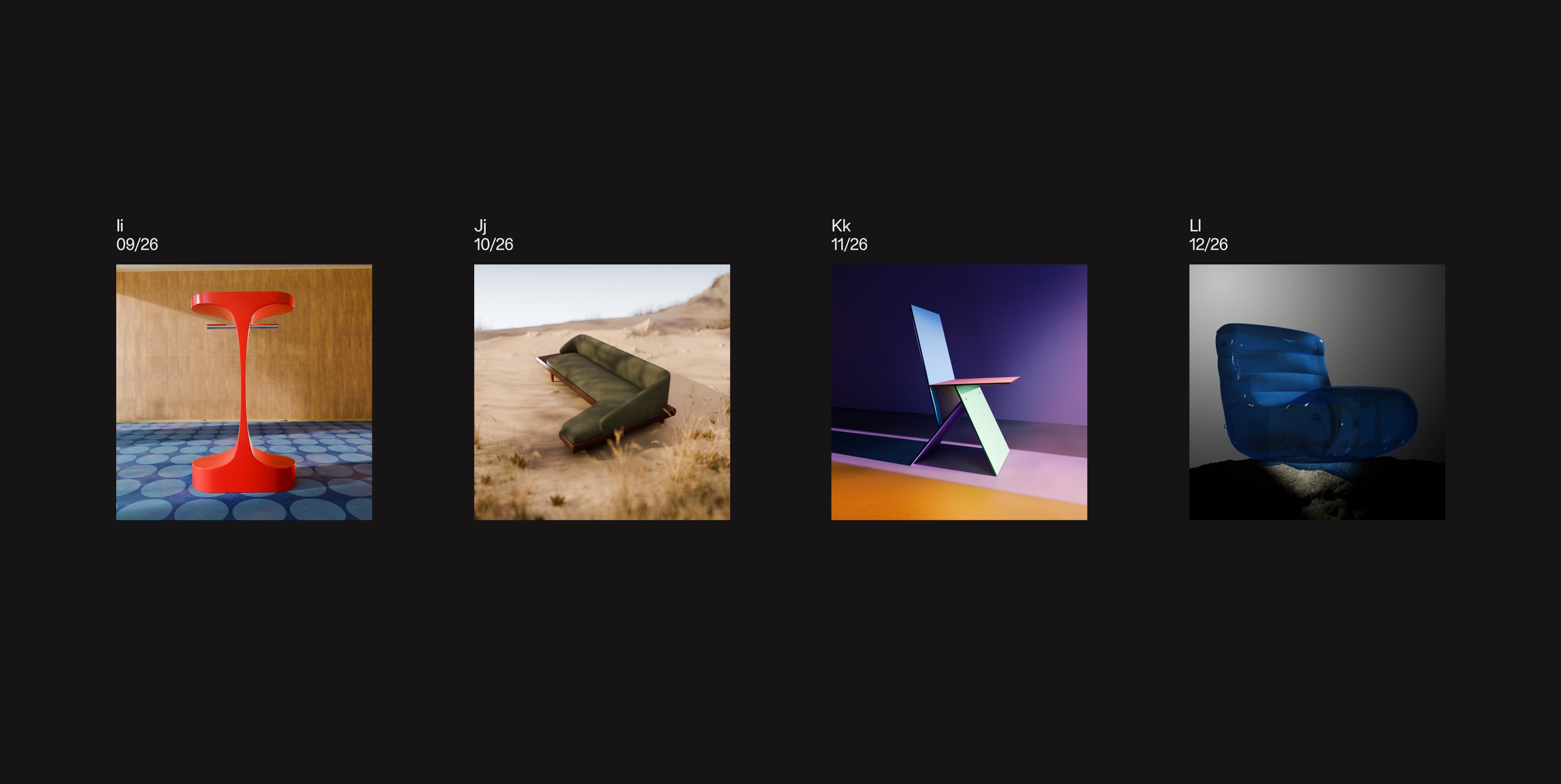
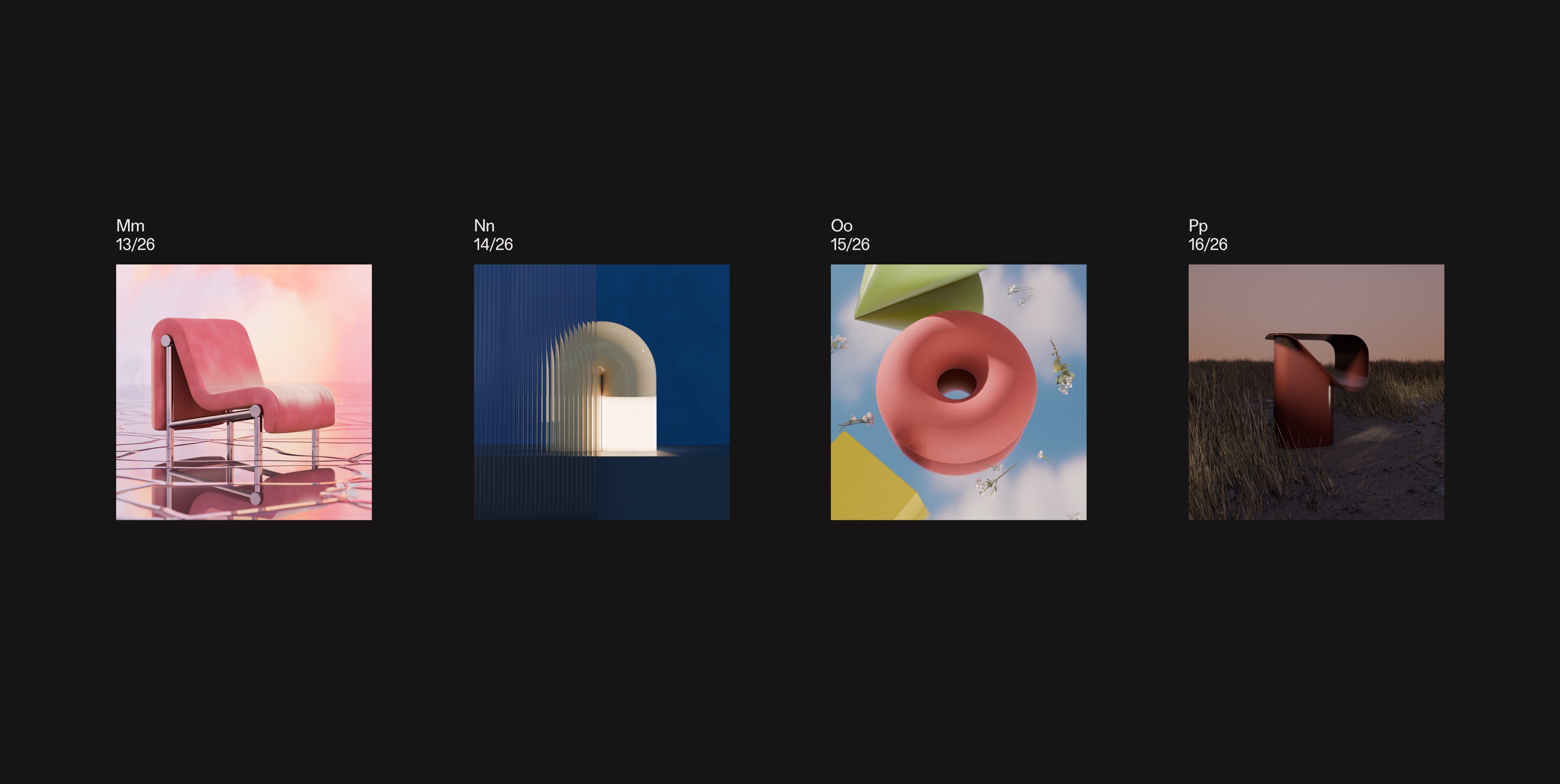
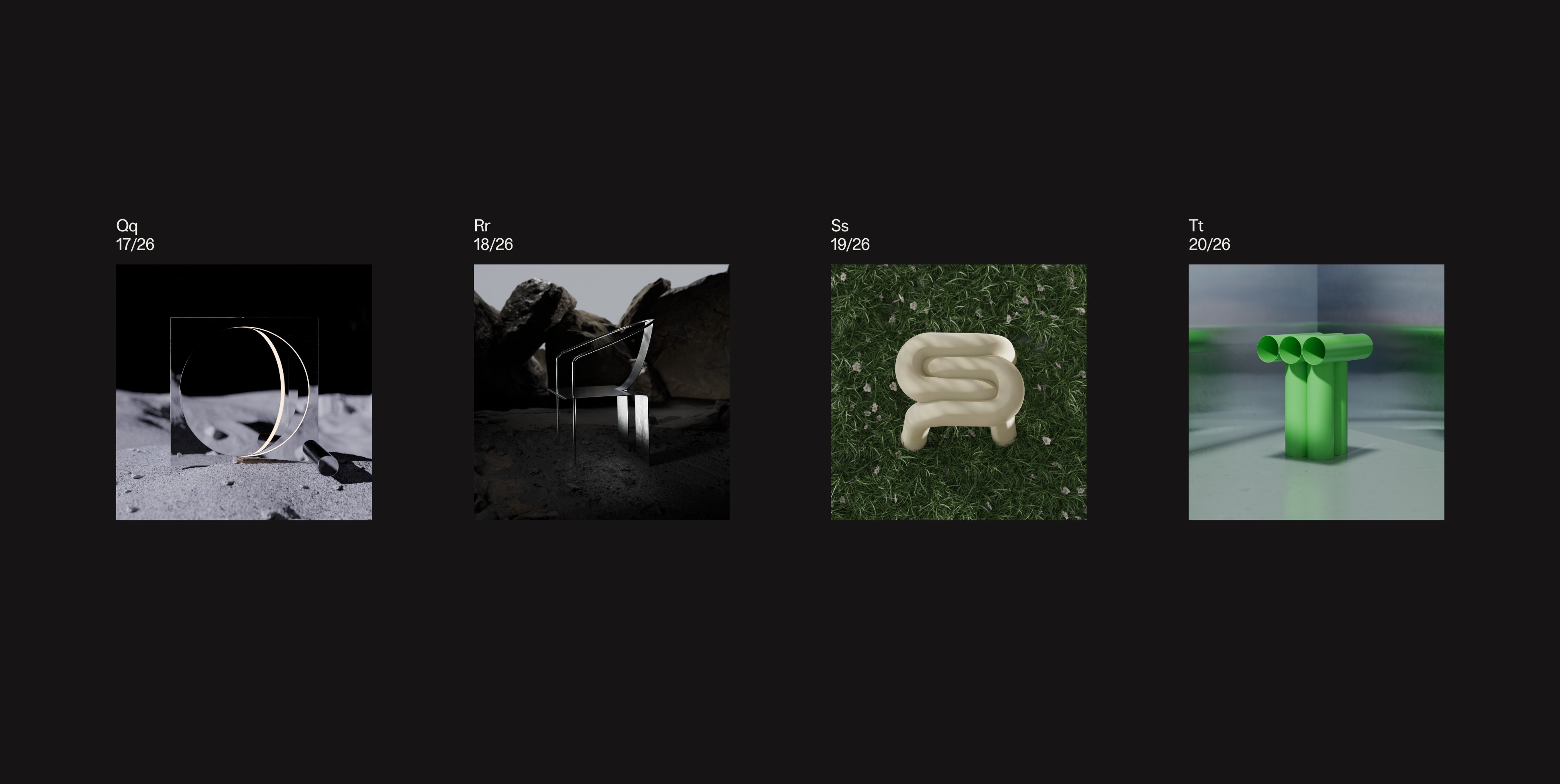
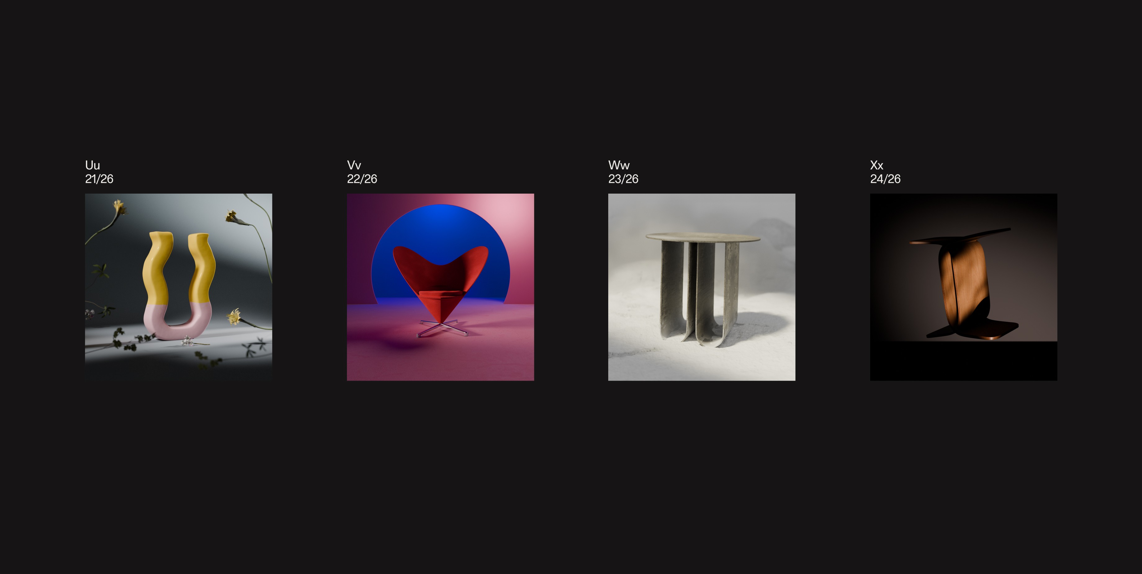
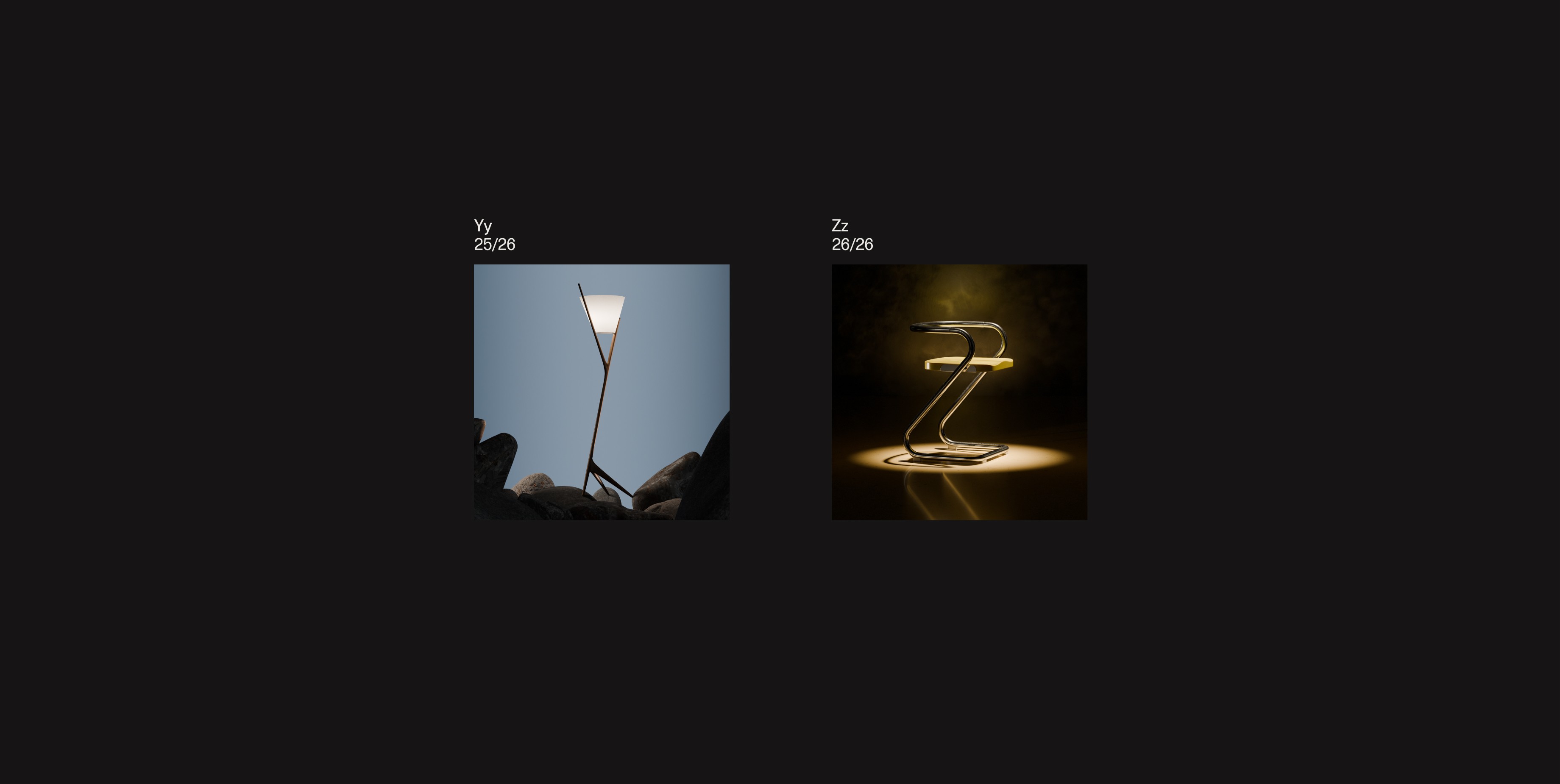
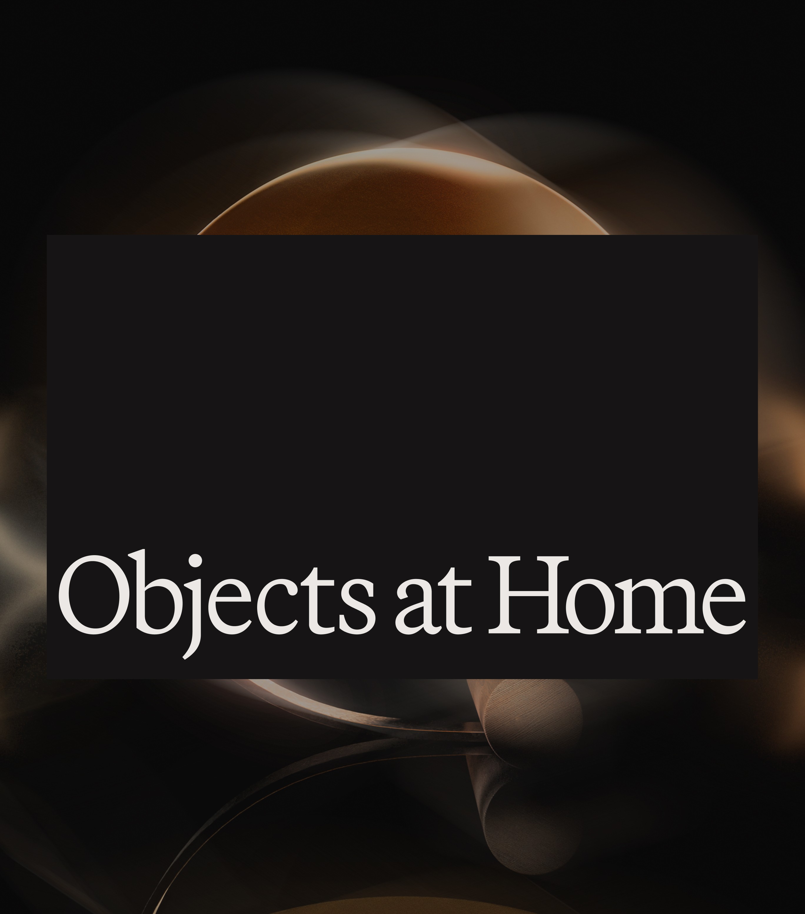
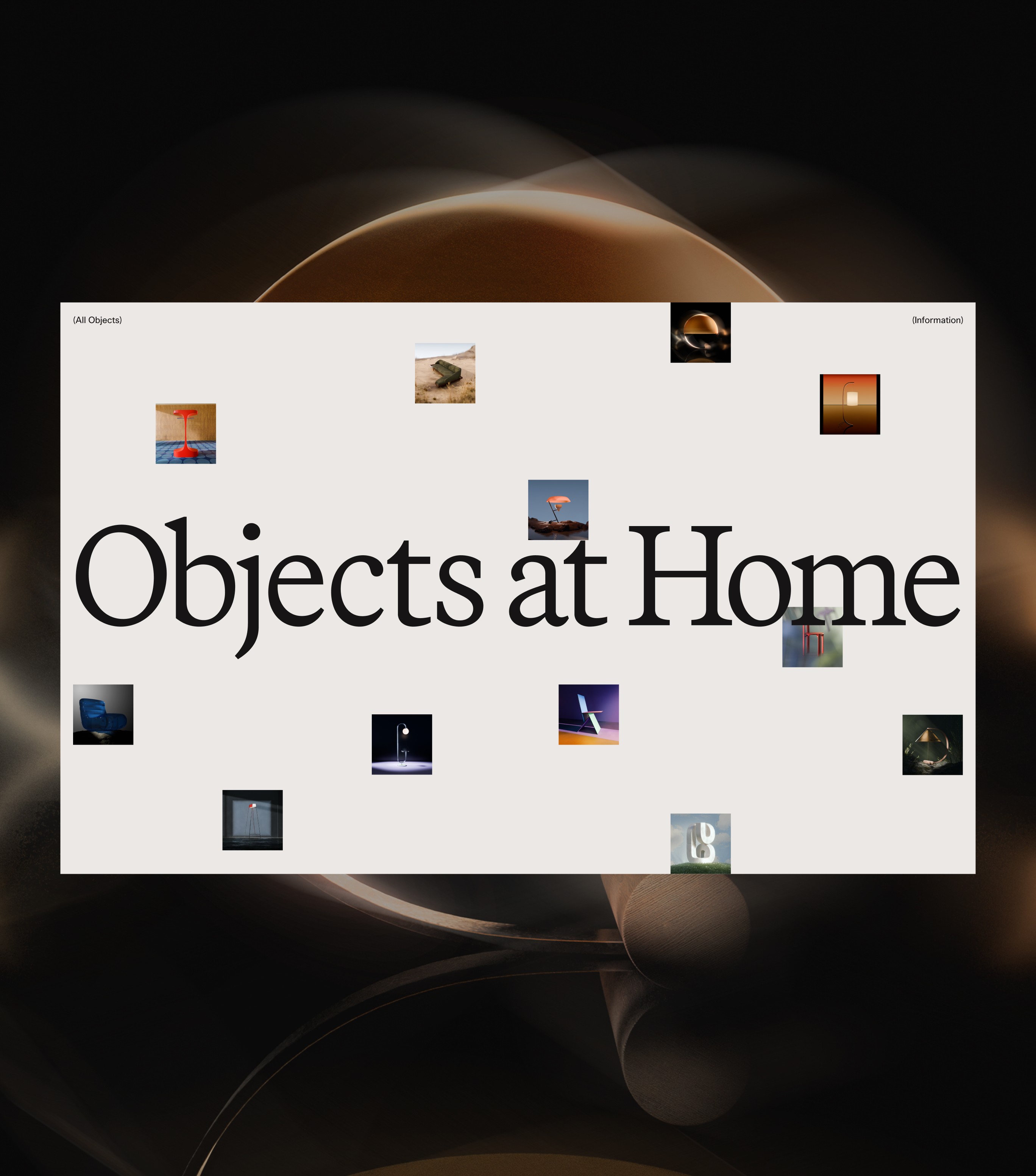
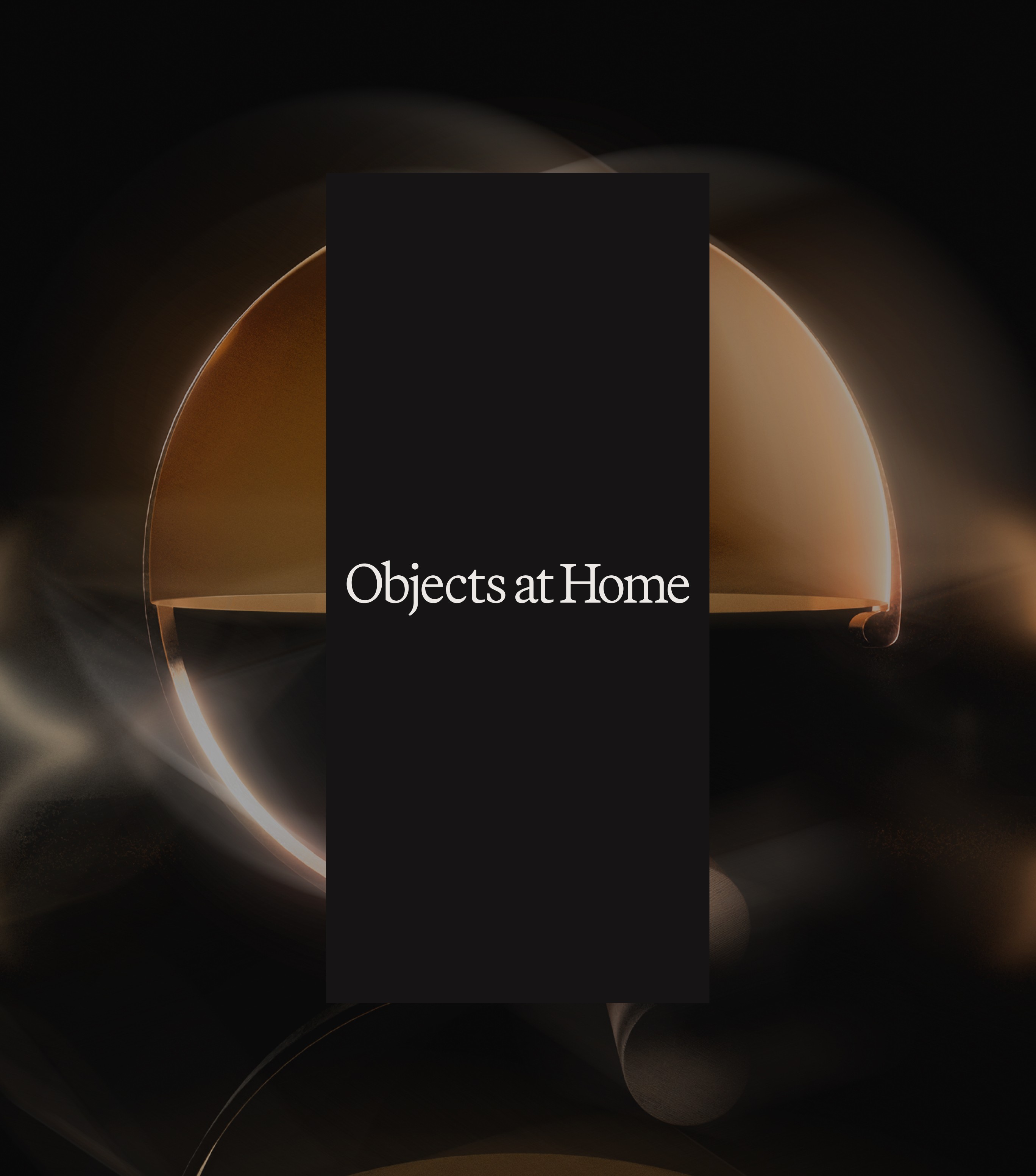
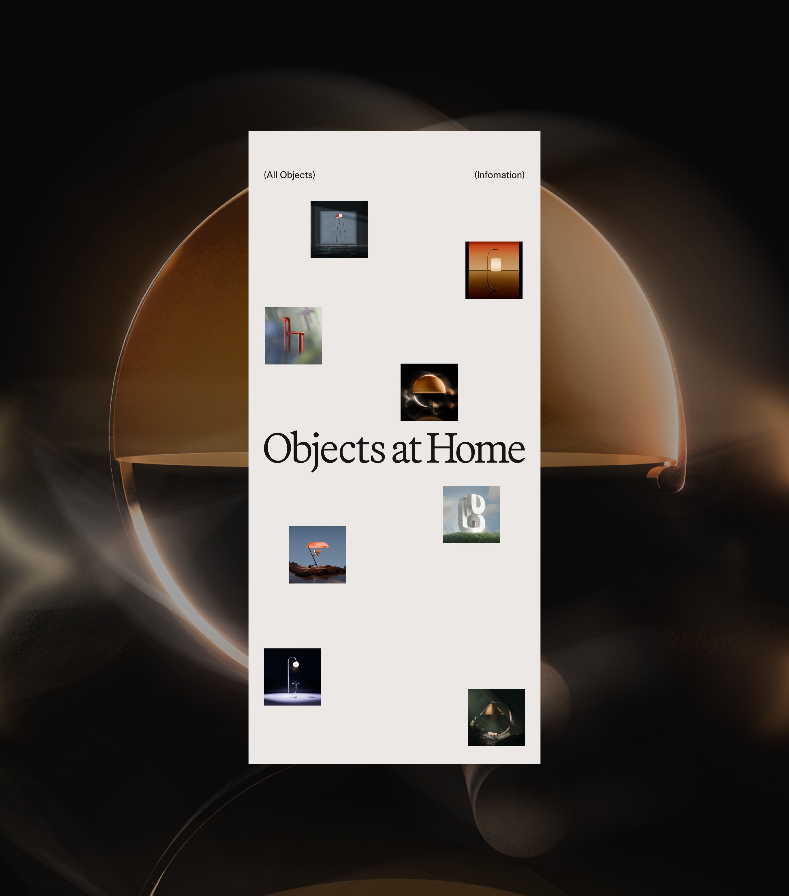
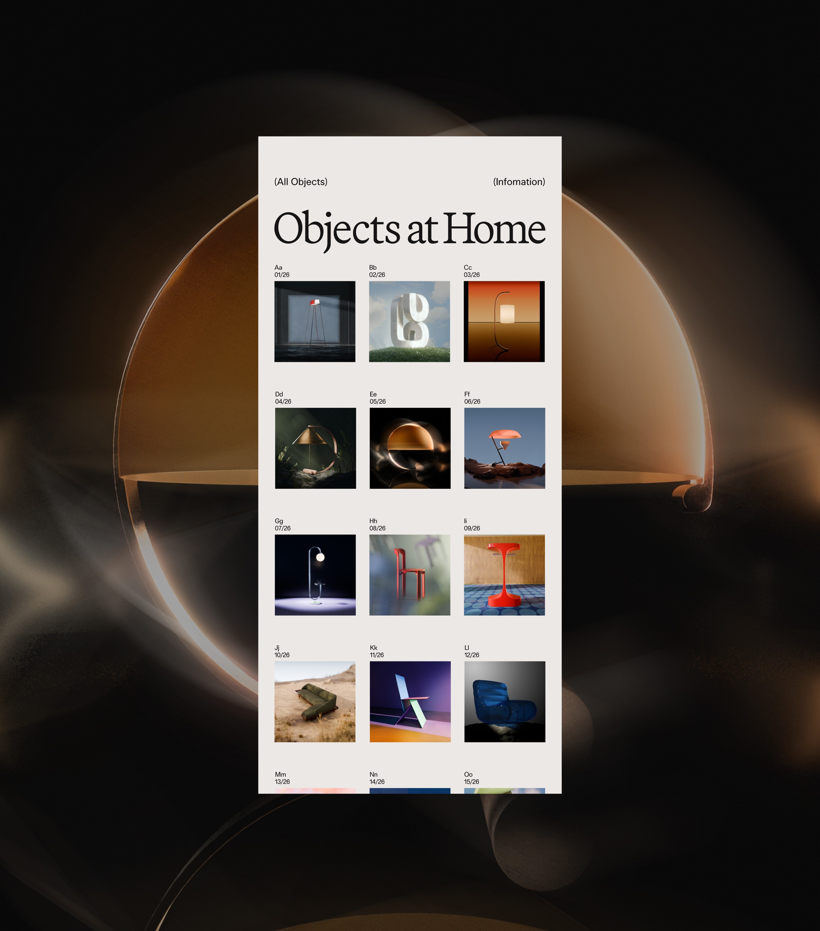
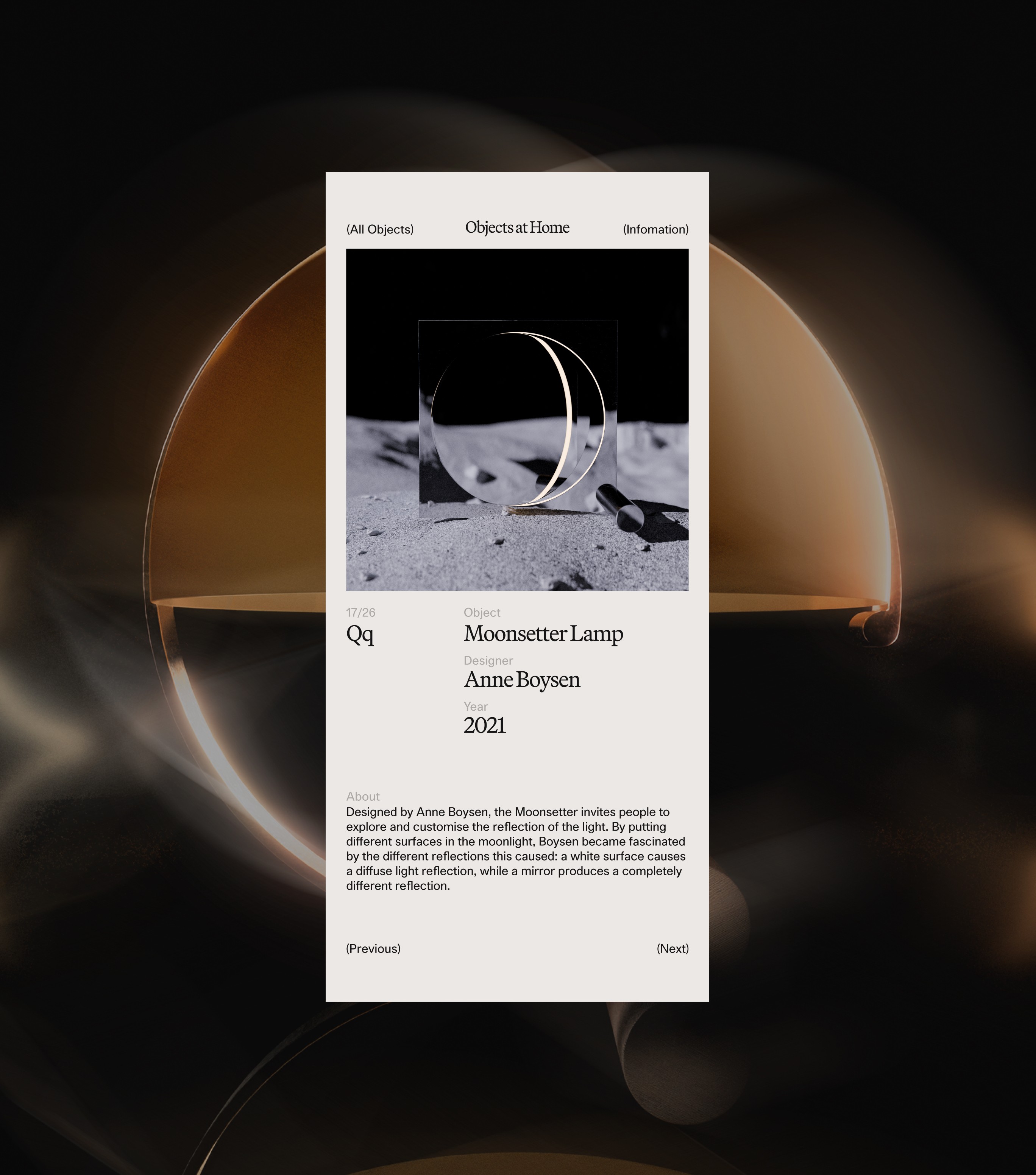
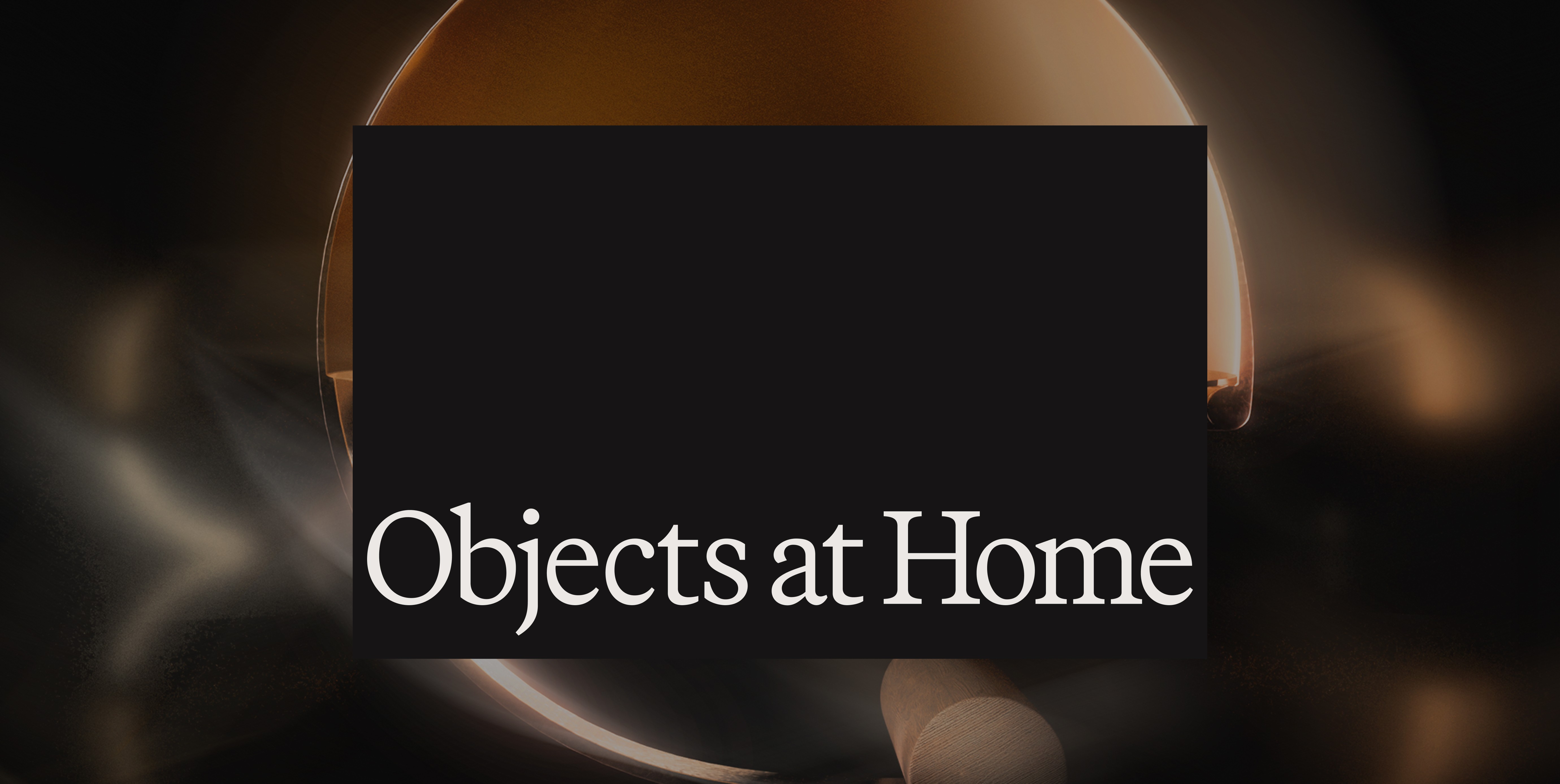
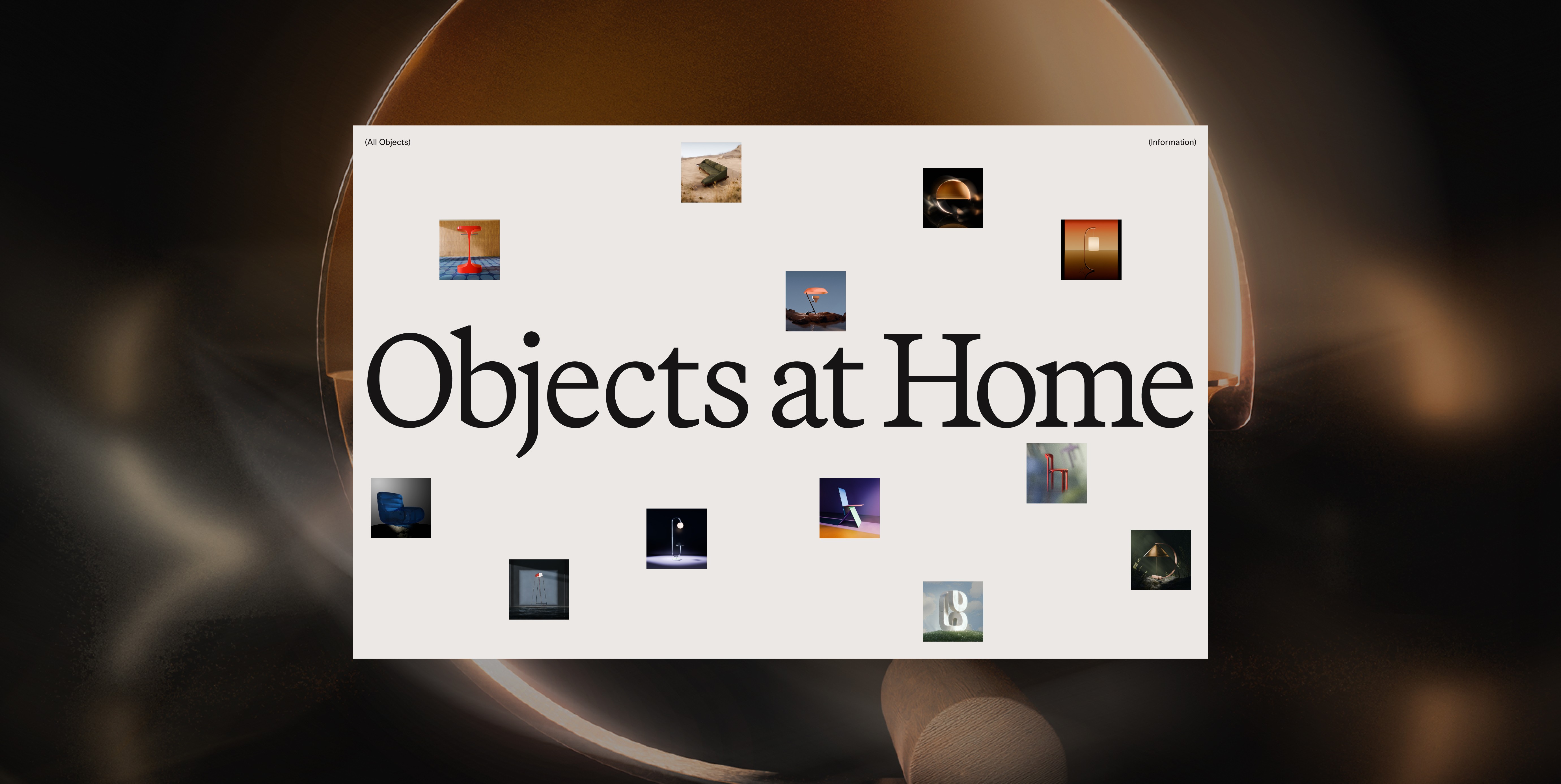
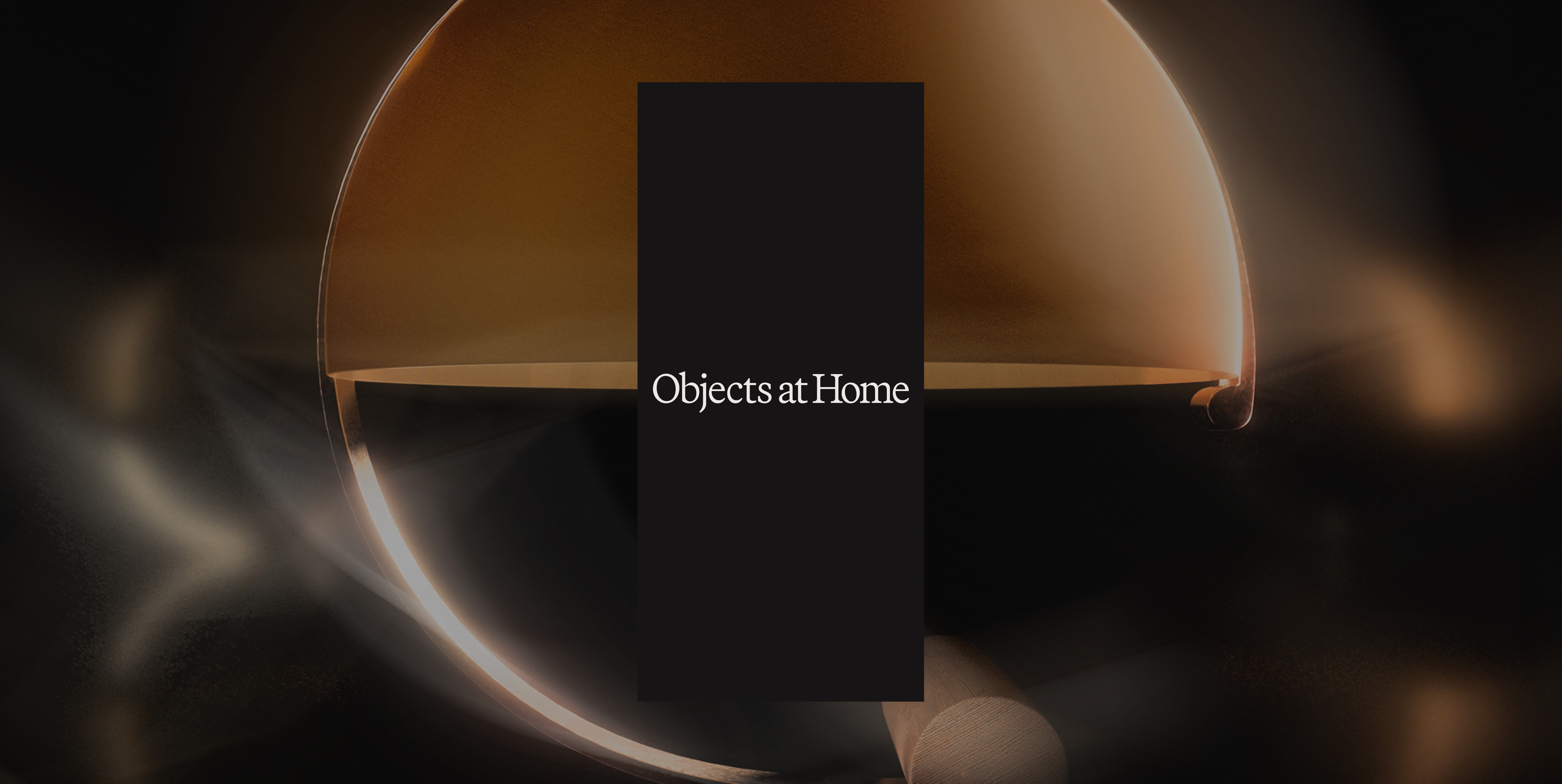
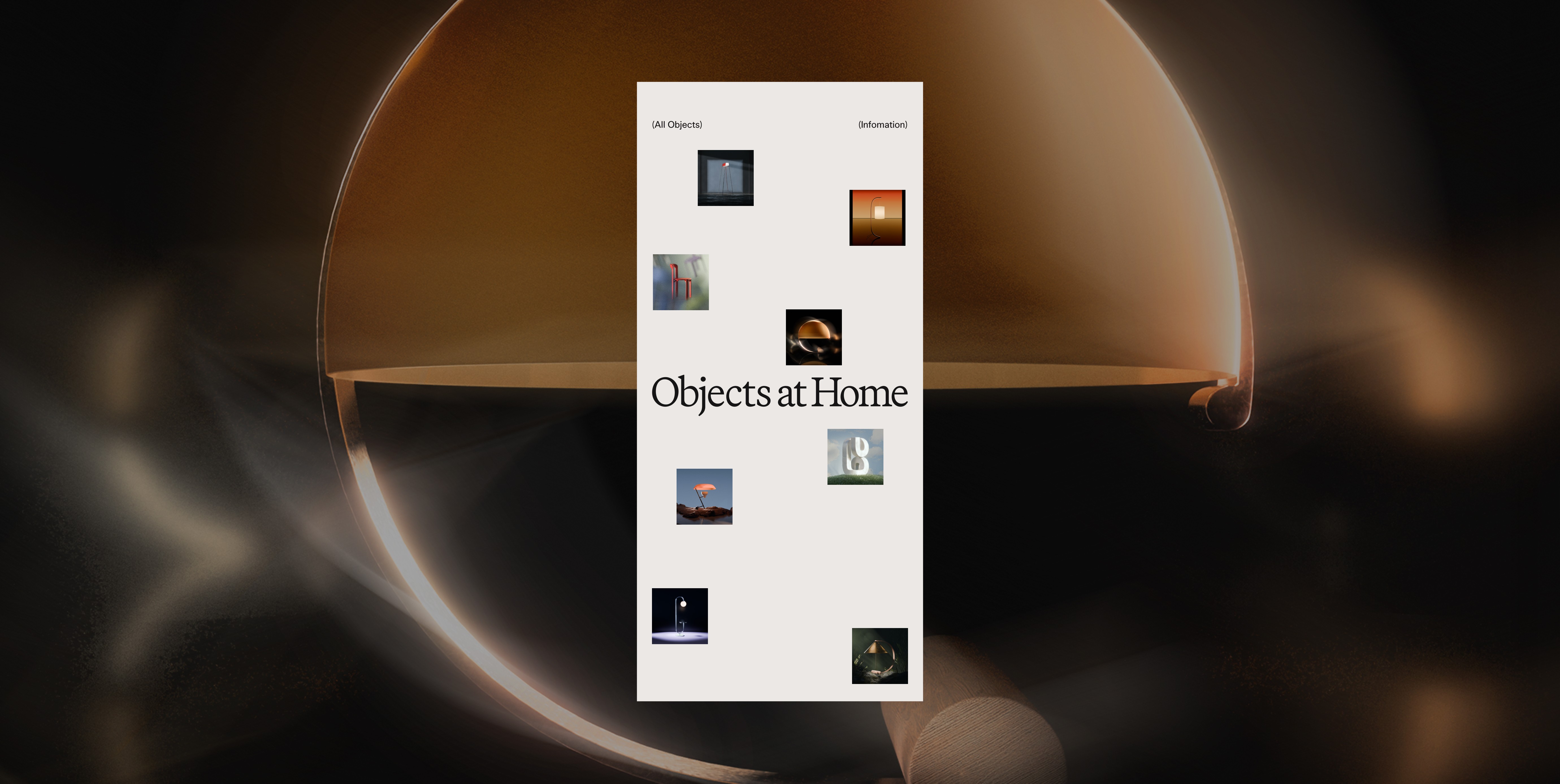
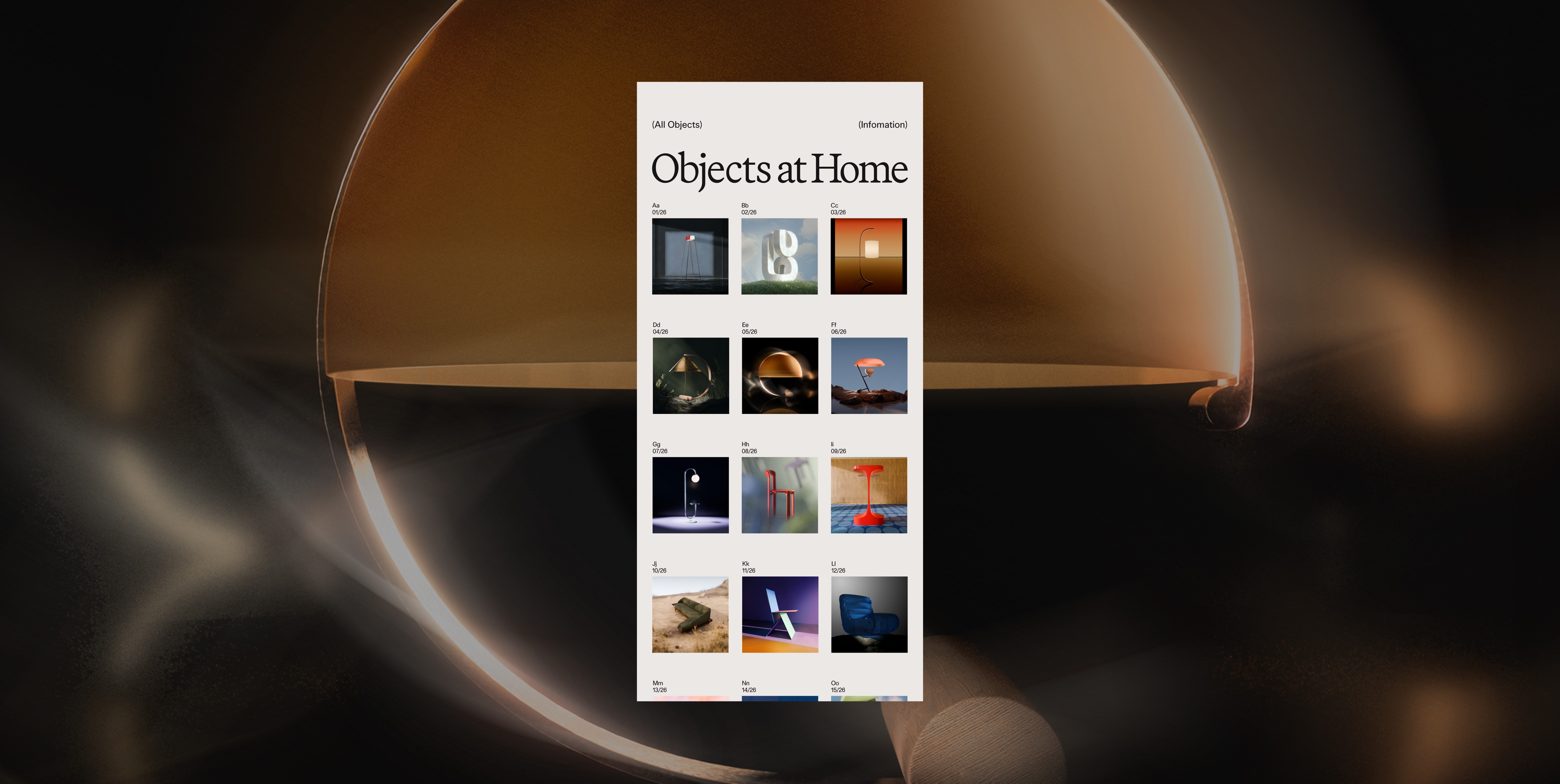
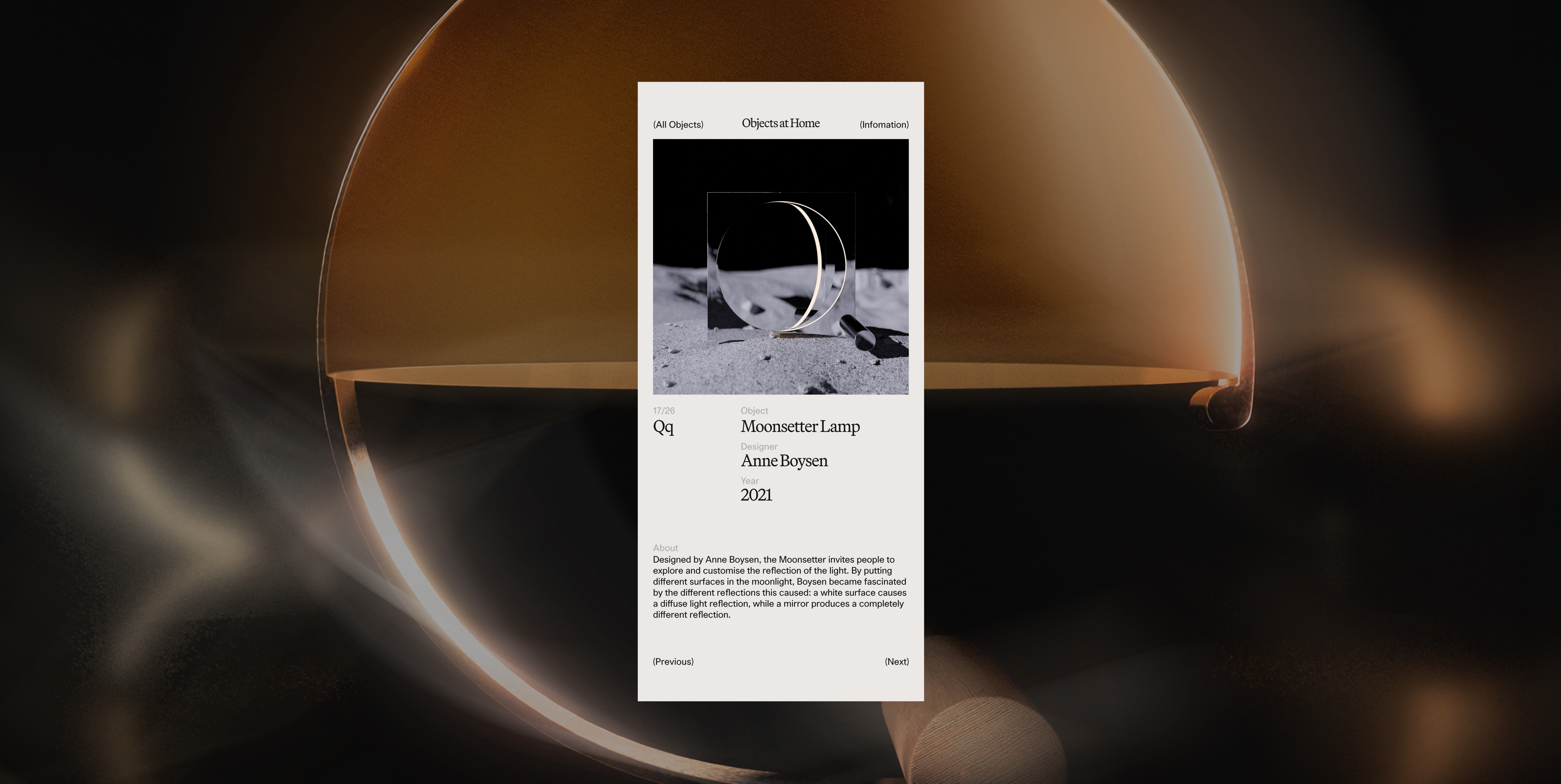
A curation of objects resembling the Latin alphabets. A homage to some of the most iconic interior accessories and furniture. A self-initiated project.
(Role)
Concept, Interface Design
(Team)
Joost Rutten
(Year)
2024
A curation of objects resembling the Latin alphabets. A homage to some of the most iconic interior accessories and furniture. A self-initiated project.
(Role)
Concept, Interface Design
(Team)
Joost Rutten
(Year)
2024
A curation of objects resembling the Latin alphabets. A homage to some of the most iconic interior accessories and furniture. A self-initiated project.
(Role)
Concept, Interface Design
(Team)
Joost Rutten
(Year)
2024
A curation of objects resembling the Latin alphabets. A homage to some of the most iconic interior accessories and furniture. A self-initiated project.
(Role)
Concept, Interface Design
(Team)
Joost Rutten
(Year)
2024
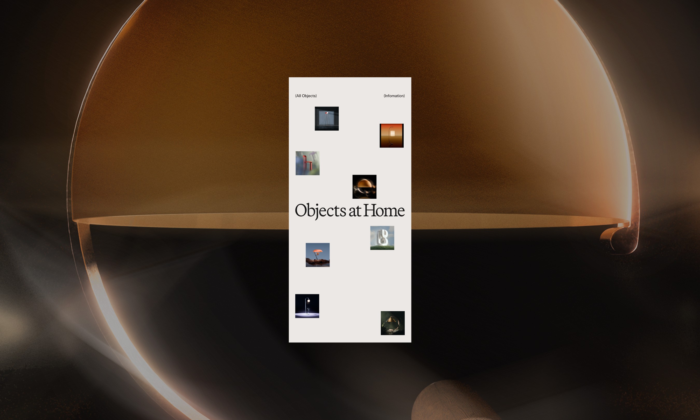
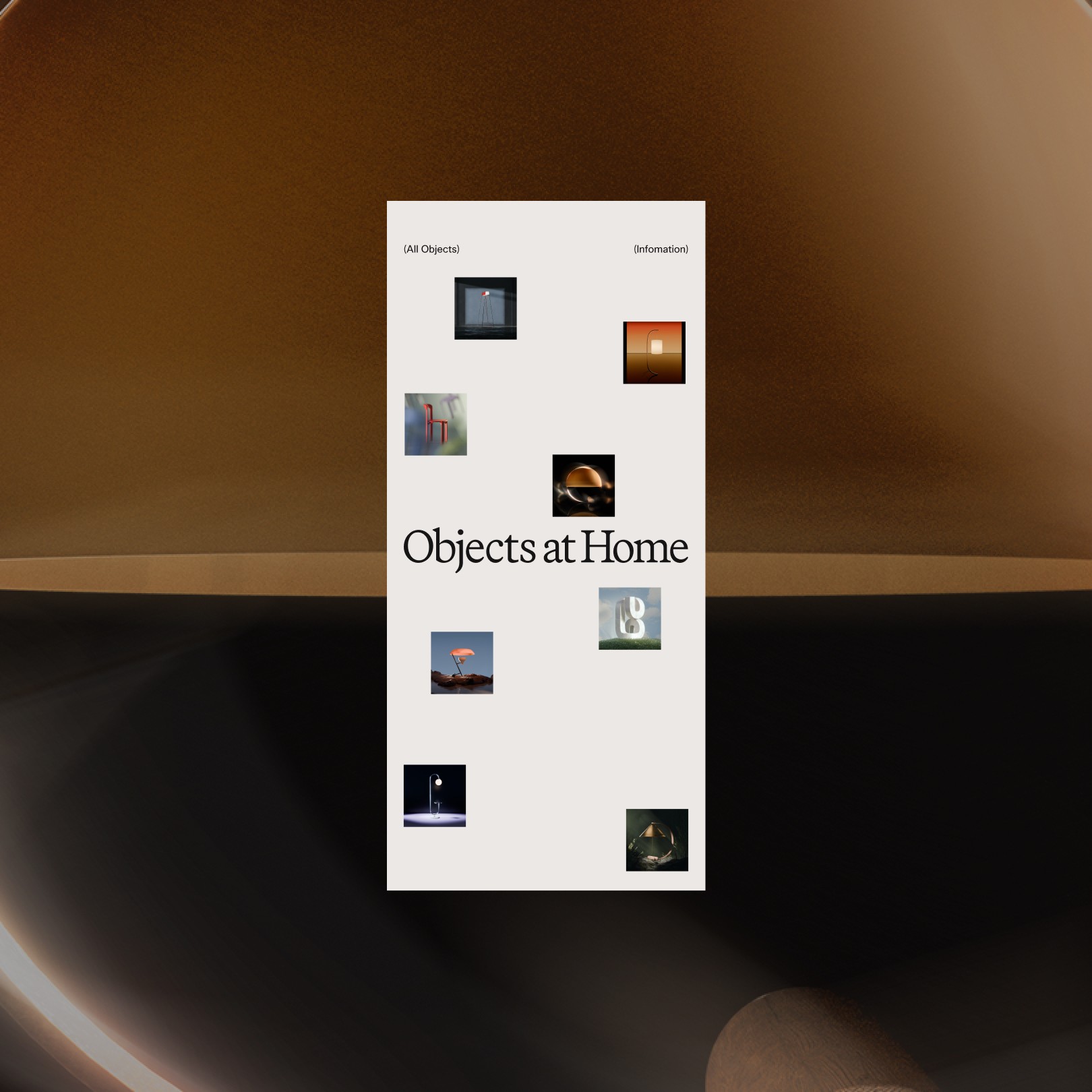
An after-work project fuelled by our never-ending wish lists and adoration for curated objects at home from the different time periods.
An after-work project fuelled by our never-ending wish lists and adoration for curated objects at home from the different time periods.
An after-work project fuelled by our never-ending wish lists and adoration for curated objects at home from the different time periods.
An after-work project fuelled by our never-ending wish lists and adoration for curated objects at home from the different time periods.
This is a participation in the unofficial 2024 edition of 26* Days of Type. The Objects at Home edition features interior accessories, furniture and lamps resembling the Latin alphabets.
This is a participation in the unofficial 2024 edition of 26* Days of Type. The Objects at Home edition features interior accessories, furniture and lamps resembling the Latin alphabets.
This is a participation in the unofficial 2024 edition of 26* Days of Type. The Objects at Home edition features interior accessories, furniture and lamps resembling the Latin alphabets.
This is a participation in the unofficial 2024 edition of 26* Days of Type. The Objects at Home edition features interior accessories, furniture and lamps resembling the Latin alphabets.
An opportunity to learn
An opportunity to learn
An opportunity to learn
An opportunity to learn
In 2023, I decided to focus more on learning 3D. This project was the perfect opportunity to tackle that learning curve. Joost led the entire track of 3D work, while I had contributed through the creative direction and UI design work. Under his guidance, I was able to get a better understanding of the basics and the 3D workflow process.
In 2023, I decided to focus more on learning 3D. This project was the perfect opportunity to tackle that learning curve. Joost led the entire track of 3D work, while I had contributed through the creative direction and UI design work. Under his guidance, I was able to get a better understanding of the basics and the 3D workflow process.
In 2023, I decided to focus more on learning 3D. This project was the perfect opportunity to tackle that learning curve. Joost led the entire track of 3D work, while I had contributed through the creative direction and UI design work. Under his guidance, I was able to get a better understanding of the basics and the 3D workflow process.
In 2023, I decided to focus more on learning 3D. This project was the perfect opportunity to tackle that learning curve. Joost led the entire track of 3D work, while I had contributed through the creative direction and UI design work. Under his guidance, I was able to get a better understanding of the basics and the 3D workflow process.
Striking a balance with the myriad of visual styles
Striking a balance with the myriad of visual styles
Striking a balance with the myriad of visual styles
Striking a balance with the myriad of visual styles
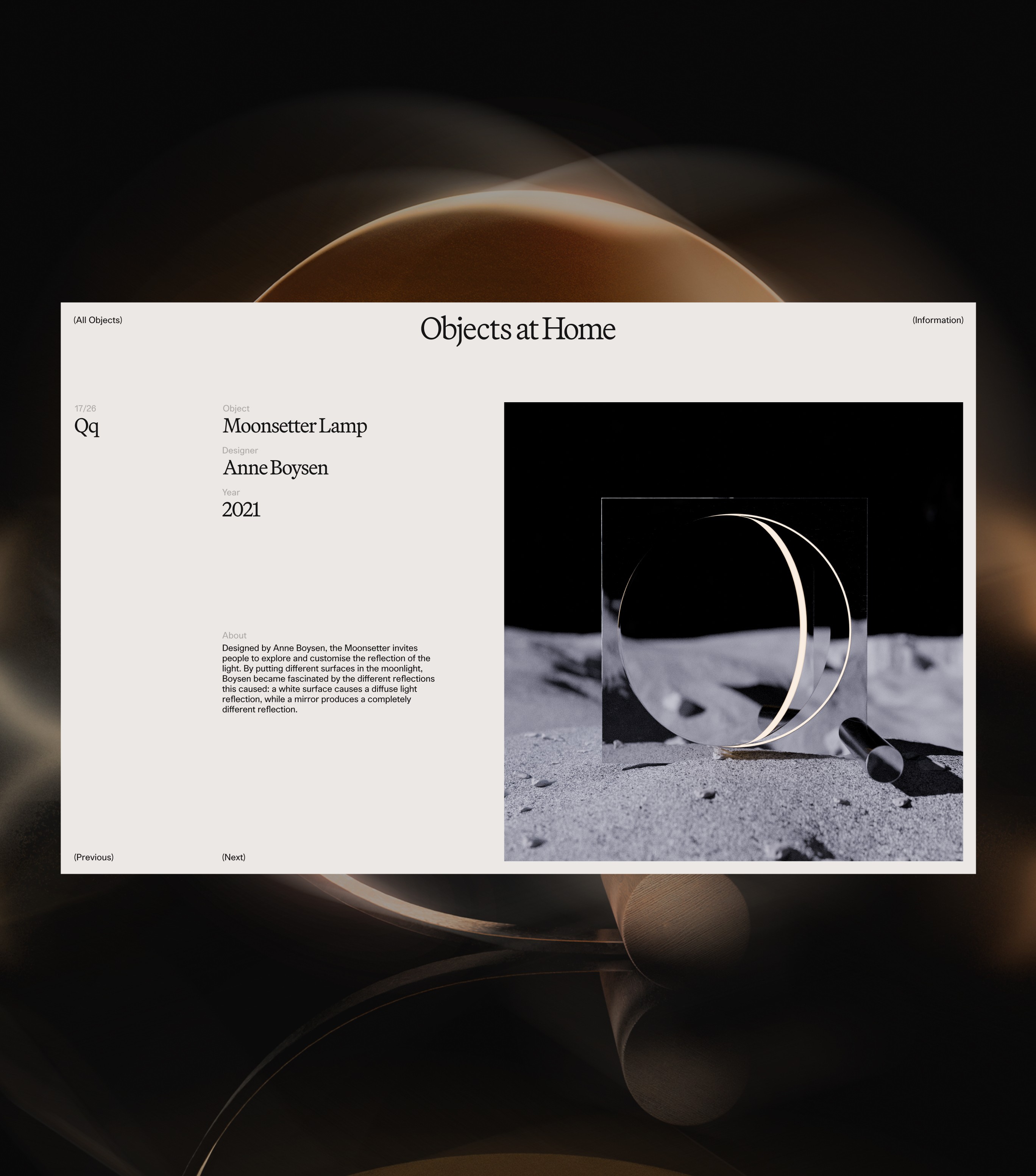
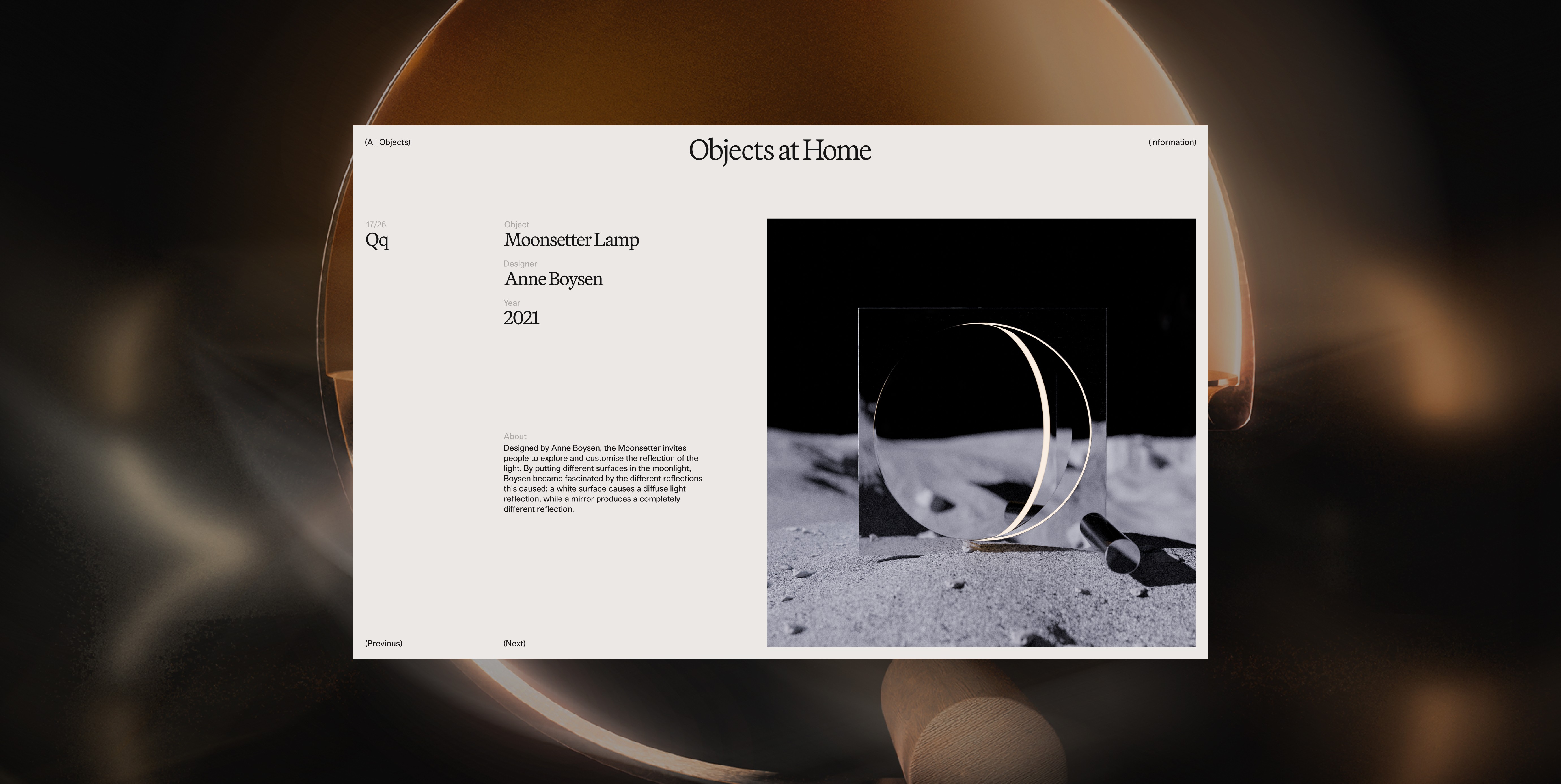
This is a breakdown of the basic elements that make up the visual repository. The myriad of visual styles meant that things can easily become overwhelming.
Hence it was important to have a generous amount of negative space and a type pairing that exudes an approachable yet confident character — as I did not want a cold, utilitarian outcome, as most indices often are.
Neutral and confident
Neutral and confident
Neutral and confident
Neutral and confident
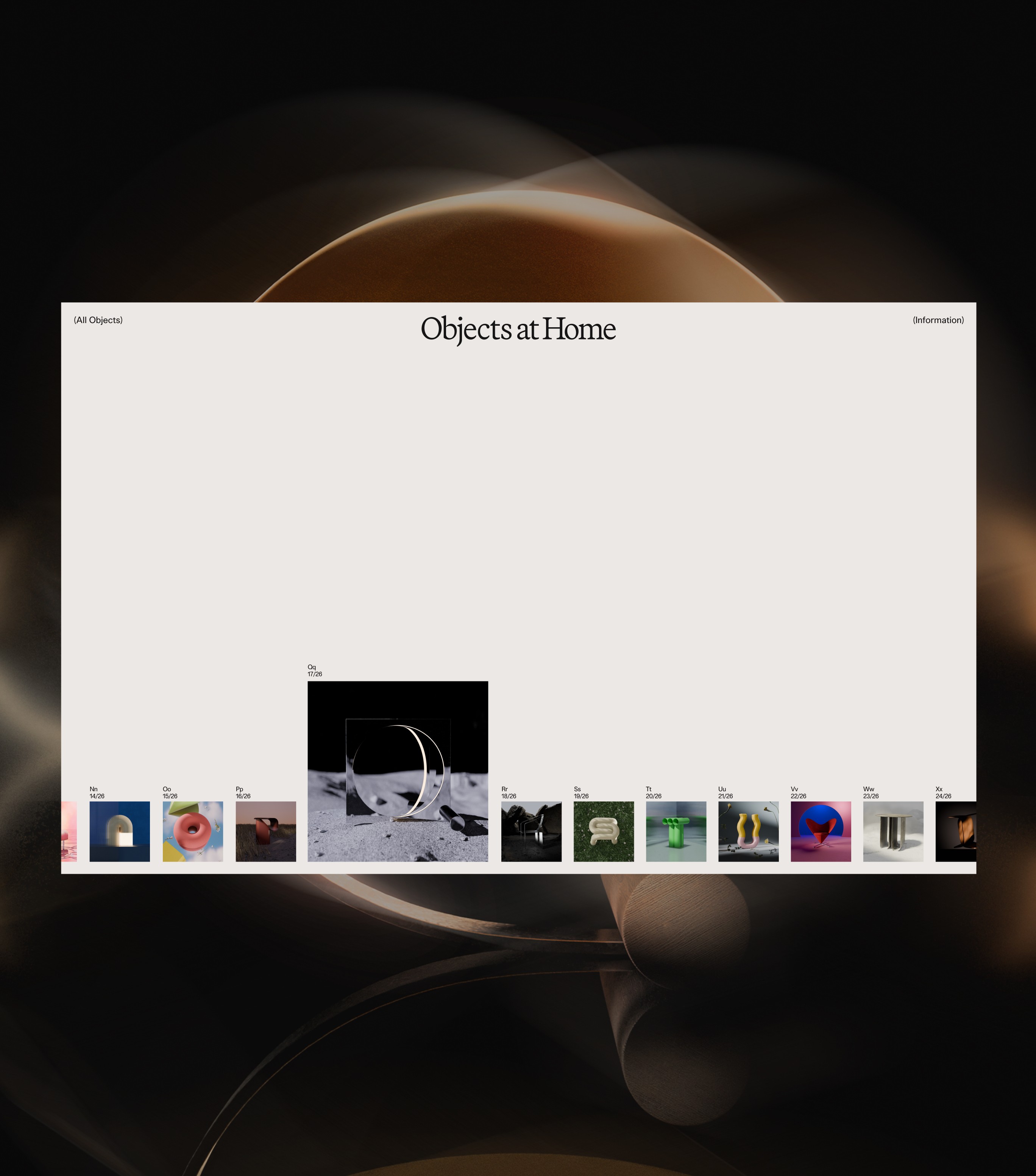
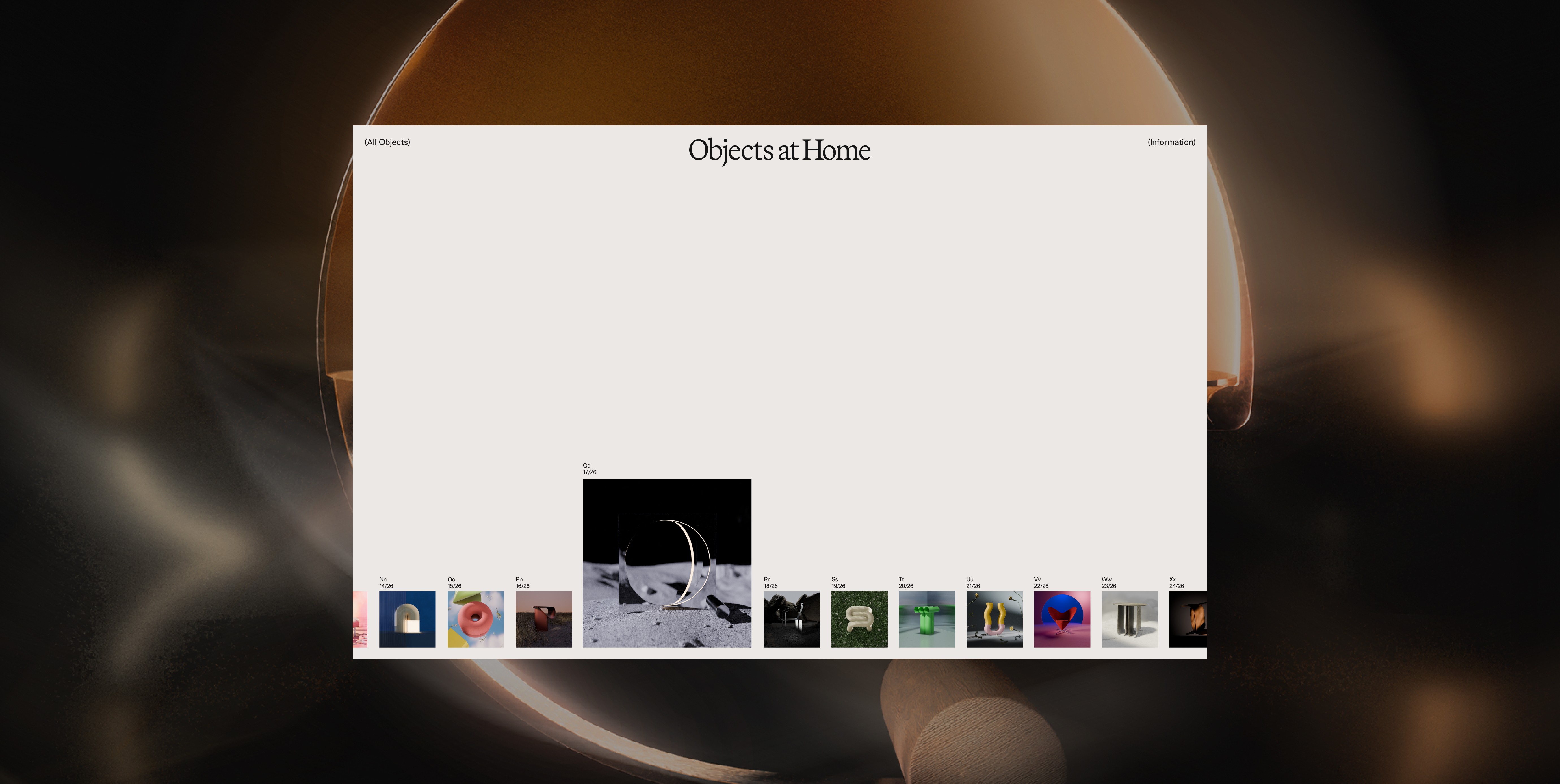
Inspired by indices and catalogs, the quiet and confident approach's intention is to allow the myriad of visual styles co-exist in harmony. Users can scroll horizontally on desktop and vertically on mobile to get an idea of the breadth of visual varieties without becoming overwhelmed.
Inspired by indices and catalogs, the quiet and confident approach's intention is to allow the myriad of visual styles co-exist in harmony. Users can scroll horizontally on desktop and vertically on mobile to get an idea of the breadth of visual varieties without becoming overwhelmed.
Inspired by indices and catalogs, the quiet and confident approach's intention is to allow the myriad of visual styles co-exist in harmony. Users can scroll horizontally on desktop and vertically on mobile to get an idea of the breadth of visual varieties without becoming overwhelmed.
Inspired by indices and catalogs, the quiet and confident approach's intention is to allow the myriad of visual styles co-exist in harmony. Users can scroll horizontally on desktop and vertically on mobile to get an idea of the breadth of visual varieties without becoming overwhelmed.
Bringing it to life
Bringing it to life
Bringing it to life
Bringing it to life
With the first part of the project completed, the intention is to develop this repository and give Objects at Home it's own real estate on the www. Stay tuned.
With the first part of the project completed, the intention is to develop this repository and give Objects at Home it's own real estate on the www. Stay tuned.
With the first part of the project completed, the intention is to develop this repository and give Objects at Home it's own real estate on the www. Stay tuned.
With the first part of the project completed, the intention is to develop this repository and give Objects at Home it's own real estate on the www. Stay tuned.
Team
Team
Team
Team
Concept: Cassie Ng, Joost Rutten
UI Design: Cassie Ng
3D Design, Motion: Joost Rutten
Concept: Cassie Ng, Joost Rutten
UI Design: Cassie Ng
3D Design, Motion: Joost Rutten
Concept: Cassie Ng, Joost Rutten
UI Design: Cassie Ng
3D Design, Motion: Joost Rutten
Concept: Cassie Ng, Joost Rutten
UI Design: Cassie Ng
3D Design, Motion: Joost Rutten
(Contact)
Email
hey@thisiscas.com
Phone
06.196.414.78
(Social)
(Contact)
Email
hey@thisiscas.com
Phone
06.196.414.78
(Social)
More projects → I have ① Found a fashionably mindful journey through the city ② Helped a yachtmaker go from builder to brand ③ Designed a calming financial experience for a bank
(Contact)
Email
hey@thisiscas.com
Phone
06.196.414.78
(Social)
(Contact)
Email
hey@thisiscas.com
Phone
06.196.414.78
(Social)
