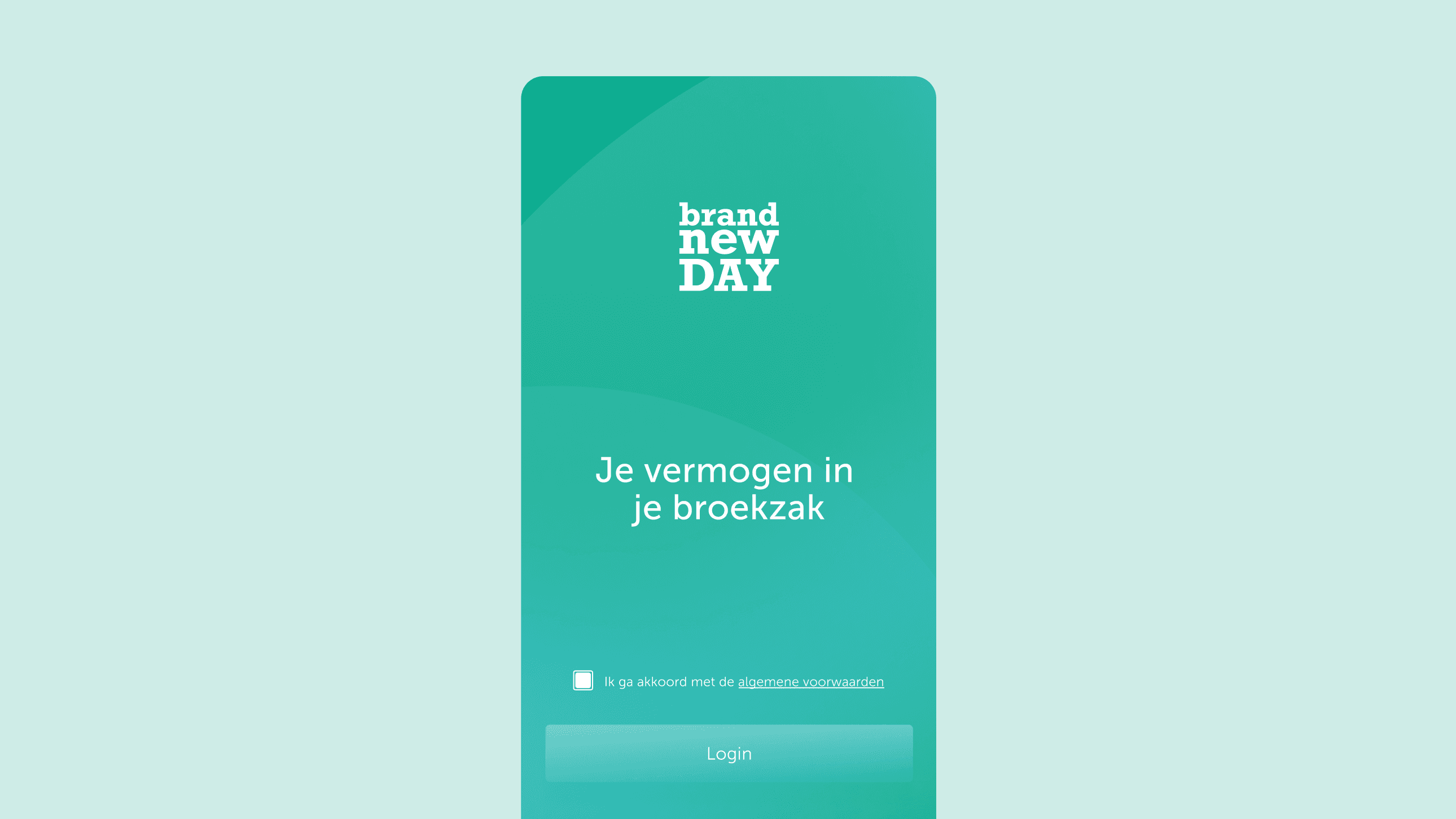
In a finance industry full of sterile, interchangeable branding, Brand New Day stood apart through a quirky persona and a vivid colour palette. But like any brand that outgrows its first look, it had reached the point where that early identity no longer held together as one coherent expression. The work fell into two connected chapters: first rebuilding the brand, then giving it a home in the bank's very first mobile app.

The intention

We made a deliberate choice not to sand down the quirkiness and vibrancy that made the bank recognisable. Instead, we carried those values into the app, while staying true to our core intent: designing for assurance and calm through volatility.

year

2023

Brand Elements
Serifs that ground the personality
The first decision that gave the refreshed identity its new weight: Typography shifted from Museo Sans to Museo Slab, a subtle move but one that lend the brand more depth of character without feeling out of place.
Visual Language
Giving the experience a clear, material structure
To form an overall calming feeling and distinguish between the branded and functional worlds, the app had two distinct visual language: The neumorphic and frosted look.
The Experience
Designing for calmness and assurance
The app became Brand New Day's first, and its guiding insight reframed the whole design problem. When markets spike or plunge, composure is hard to hold, and since interface and content shape how people use an app, the team consciously chose not to design for interaction, but for assurance.
The Experience
Assurance through simplicity
Users will be greeted with calm yet energised gradients where they will be able to get an overview of the information that matters to them.
The Experience
Clarity through emphasis
Data visualisations need not be overwhelming. This is why we use soft elevations to enhance and emphasise what is important to the user, without overwhelming them.
The Experience
Accessible financial knowledge
Brand New Day wanted to make financial knowledge accessible. We brought this to life through assets like photography and illustrations that are easy to understand and complements the content.

Outcomes

From guidelines to product experience
The success of the rebrand came down to one question: could the brand survive contact with a real product? We answered it by carrying principles, not assets. Instead of decorating screens with identity, we let the brand's promise of accessible, human finance become the logic the app was built on. The personality and colour that made Brand New Day stand out were never sanded down to fit the interface. They were translated into it, expressed through components, motion and hierarchy that read as the brand while quietly doing the work of assurance. The result is a brand and a product that feel like one thing rather than two, held together by a scalable design system we documented and handed to the internal team to carry forward.
On staying relevant
The rebrand set out to give a growing brand a more unified expression. Rather than discarding the quirky personality and vivid colour palette that set Brand New Day apart in an otherwise sterile finance sector We collaborated closely with the internal design team within Brand New Day for on-boarding, handover and guidance so they were able to continue with the app's new features in future.

Responsibilities

My role was to create scalable components, maintain and document the behaviours of the components and interaction patterns. Through the delivery of the app, we were able to establish a unified design system for Brand New Day.

Made with this colorful crew

Toby Mok, Yordy van der Werff, Joeri Kiekebosch, Elian Duits, Fernanda Arouca and the internal Brand New Day design team.

Responsibilities

My role was to create scalable components, maintain and document the behaviours of the components and interaction patterns. Through the delivery of the app, we were able to establish a unified design system for Brand New Day.

Made with this colorful crew

Toby Mok, Yordy van der Werff, Joeri Kiekebosch, Elian Duits, Fernanda Arouca and the internal Brand New Day design team.

I am a designer with a practice focused on all things related to brand, digital design, visual systems, art direction and concept. I am based in Haarlem, The Netherlands but will be happy to collaborate remotely in the EU / US and on site in the Netherlands and Singapore.

Amsterdam, The Netherlands

Glimpses

2024 - 2026

I am a designer with a practice focused on all things related to brand, digital design, visual systems, art direction and concept. I am based in Haarlem, The Netherlands but will be happy to collaborate remotely in the EU / US and on site in the Netherlands and Singapore.

Amsterdam, The Netherlands

Glimpses

2024 - 2026