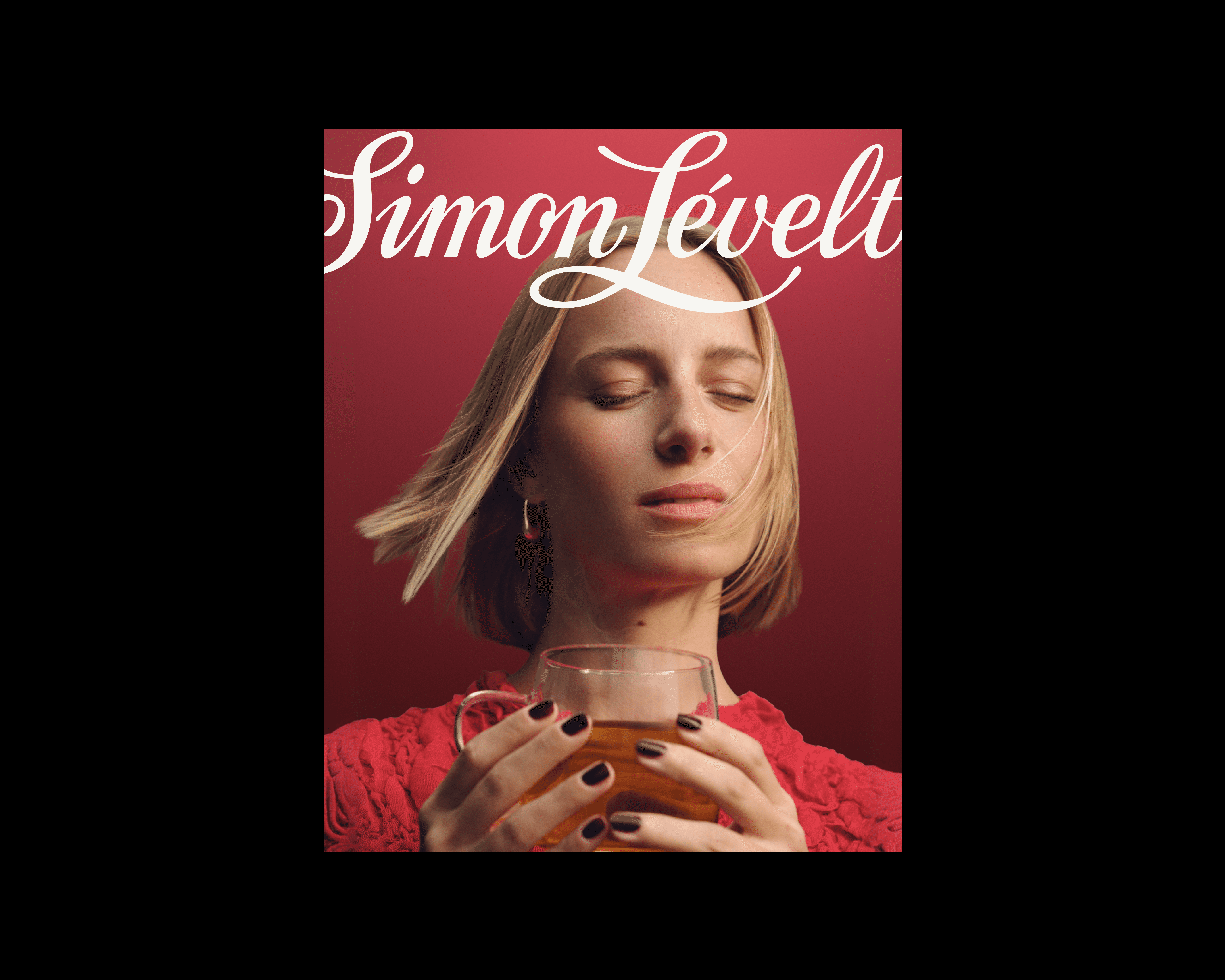
After nearly two centuries as a beloved specialist, Simon Lévelt came to us at a defining moment of growth. The brand is stepping beyond the specialty store and into a broader retail landscape, reaching people who are meeting the brand for the first time.

After nearly two centuries as a beloved specialist, Simon Lévelt came to us at a defining moment of growth. The brand is stepping beyond the specialty store and into a broader retail landscape, reaching people who are meeting the brand for the first time.

The intention

The rebrand translates this heritage into a brand identity strong enough to resonate with a broad retail audience, without losing the authenticity that sets it apart.

Year

2025

Logo System
A mark for every moment
That flexibility lives in the building blocks. The logo now works as a family rather than a single mark, with the wordmark, monogram, and stamp each playing a role depending on the format. Three placement modes, expressive, editorial, and practical, let the brand take centre stage on a campaign poster or support a layout on a supermarket wobbler.
Photography
The whole of one sensory world
Photography is where the world of Simon Lévelt becomes something you can almost feel. The visual language moves across three distinct perspectives: People, Textures, and Atmosphere. Across all three, the approach is deliberate and uncluttered: refined, sensory, and always genuine. While portraying people, they are caught mid-enjoyment in the moment.
Photography
The visual language of flavour
Textures is where flavour becomes visible up close and Atmosphere, where a single object or gesture carries the whole feeling. Together they turn the experience of taste, origin, and craftsmanship into images that invite people into an adventurous, tactile world of flavour.
Typography
The same feeling, now in type
The system is built on two voices in conversation. Parnaso Small, a high-contrast serif with presence and refined proportions, carries the warmth, personality, and feeling of something carefully made, a nod to nearly 200 years of craft. Neue Haas Grotesk Display Pro answers with clean geometry and quiet precision, bringing the legibility and ease a broad retail audience expects across body copy, navigation, and calls to action.
Colour
A colour palette ready for adventure
The foundational primary colors used in the logo system and backgrounds are natural and grounded. It is a homage to origin, giving the brand its timeless character, while a palette drawn from the flavour wheel turns every taste and aroma into colour. Vivid accents add moments of action. Together, they make a palette with room to wander from an everyday cup of coffee to the discovery of something new.
Grid System
A robust grid and layout system
Simon Lévelt's layout system is built on a single proportional formula that works across any size or aspect ratio, from an in-store poster to a social post. Each layout carries a different intention: to set a mood, to show a range, to tell a story, or to guide through detail, all drawn from the same grid. Together, the system does exactly what the broader rebrand set out to do: it gives every application room to flex while keeping the brand unmistakably consistent.

Outcomes

Going From Heritage to Reach
One of the central challenges of the project was ensuring our visual tone could broaden appeal to a curious new audience without alienating the loyal connoisseurs who have long valued the brand's craft, origin and organic credentials. We had taken a contemporary, modern and accessible approach to the visual language, taking a departure from a stereotypical heritage heavy, tastemaker aesthetic.

Responsibilities

Shaping the visual direction and language, visual design, establishing the brand system, UI of the digital impressions, creation of the final guidelines.

Went on a spicy adventure with

Dominique Mathijs, Robine Schmetz, Carsten Van Berkel, Thijs Bontje, Dieuwertje Matheeuwsen, Mike Kleijnen, Bastiaan Weers, Tamara Saelman, Anouk van Alfen, Anouk Huizer, Anna Bosscher, Irmgard van der Weele, Holy Fools, Lotte van Raalte, Daphné Lejeune

Responsibilities

Shaping the visual direction and language, visual design, establishing the brand system, UI of the digital impressions, creation of the final guidelines.

Went on a spicy adventure with

Dominique Mathijs, Robine Schmetz, Carsten Van Berkel, Thijs Bontje, Dieuwertje Matheeuwsen, Mike Kleijnen, Bastiaan Weers, Tamara Saelman, Anouk van Alfen, Anouk Huizer, Anna Bosscher, Irmgard van der Weele, Holy Fools, Lotte van Raalte, Daphné Lejeune

I am a designer with a practice focused on all things related to brand, digital design, visual systems, art direction and concept. I am based in Haarlem, The Netherlands but will be happy to collaborate remotely in the EU / US and on site in the Netherlands and Singapore.

Amsterdam, The Netherlands

Glimpses

2024 - 2026

I am a designer with a practice focused on all things related to brand, digital design, visual systems, art direction and concept. I am based in Haarlem, The Netherlands but will be happy to collaborate remotely in the EU / US and on site in the Netherlands and Singapore.

Amsterdam, The Netherlands

Glimpses

2024 - 2026