crafted a brand refresh bringing 200 years of craftsmanship to a new crowd for Simon Lévelt
After nearly two centuries as a category specialist, Simon Lévelt came to us at a defining moment of growth. The brand is stepping beyond the specialty store and into a broader retail landscape, reaching people who are meeting the brand for the first time. The new identity is built for exactly this moment.
A logo system for every occasion
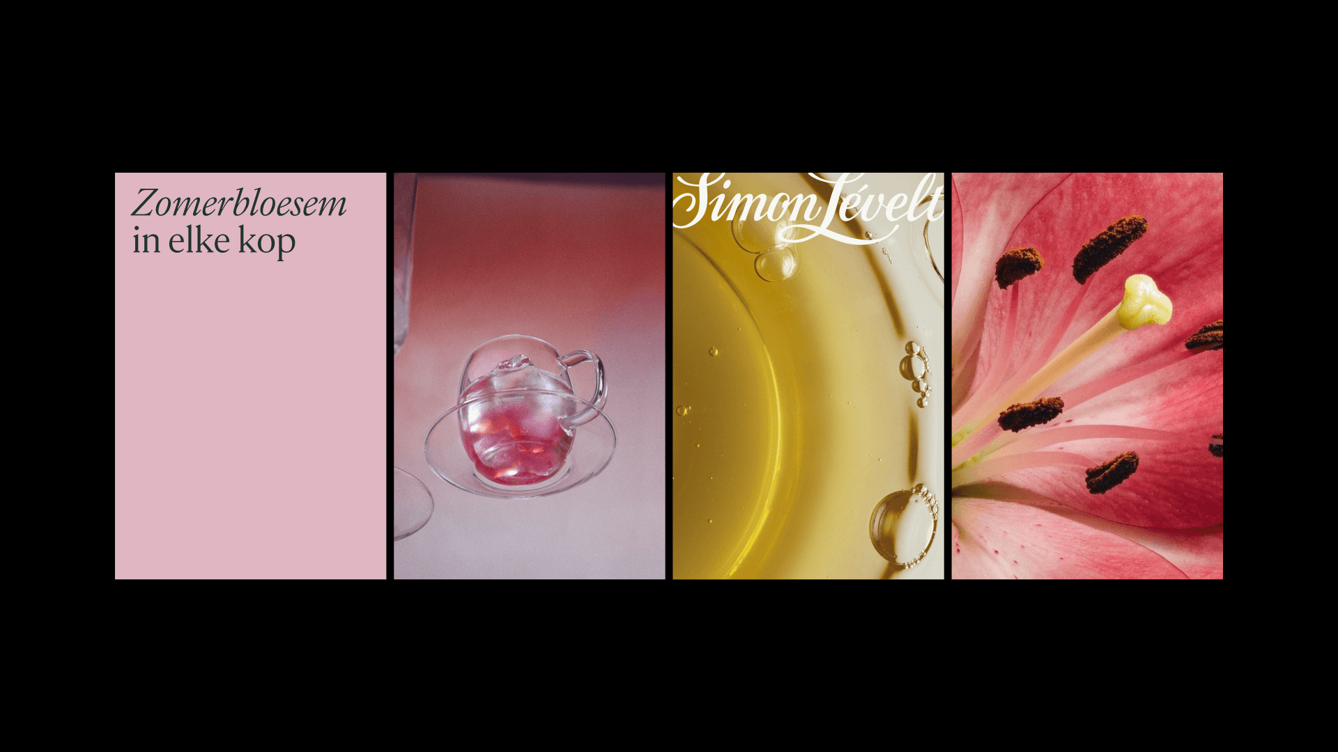
The logo now works as a family rather than a single mark, with the wordmark, monogram, and stamp each playing a role depending on the format. Three placement modes as shown on these layouts (expressive, practical, editorial respectively) allow the brand to take centre stage on a campaign poster or sit elegantly on a recipe card.

The visual language of flavor
Photography is where the world of Simon Lévelt becomes something you can almost feel. The visual language moves across three distinct perspectives: People, Textures, and Atmosphere. Across all three, the approach is deliberate and evocative: refined, sensory, and always genuine.


Conversations, in type
The system is built on two voices in conversation. Parnaso Small, a high-contrast serif with refined proportions, carries the warmth and personality of something carefully made, a nod to 200 years of craft. Neue Haas Grotesk Display Pro features clean geometry and quiet precision, bringing the legibility a broad retail audience expects across body copy, navigation, and calls to action.


A palette for the senses
The foundational colours are natural, a nod to origin that gives the brand its timeless character. Supporting them are the tertiary colours, drawn from the flavour wheel, the same tool sommeliers, chefs, and perfumers use to sort aromas and tastes into distinct families. It turns every flavour into a colour, applied across layouts to tie each product to its sensory profile.

A robust grid and layout system
Simon Lévelt's layout system is built on a single proportional formula that works across any size or aspect ratio, from an in-store poster to a social post. Each layout carries a different intention: to set a mood, to show a range, to tell a story, or to guide through detail, all drawn from the same grid.


Guidelines that empower a nimble in-house team
The flexible guidelines that adapt to context help keep the in-house team nimble. Clear principles paired with living examples keep everything unmistakably Simon Lévelt, while giving the team the flexibility to create new assets independently and make confident, on-brand decisions on their own.
Responsibilities
Shaping the visual language, visual design, design for the digital impressions, creation of the final guidelines, production design for follow up campaigns.
Credits
Dominique Matthijs, Robine Schmetz, Carsten Van Berkel, Thijs Bontje, Bastiaan Weers, Tamara Saelman, Anouk Huizer, Anna Bosscher, Maria Bodil
Available from 2027